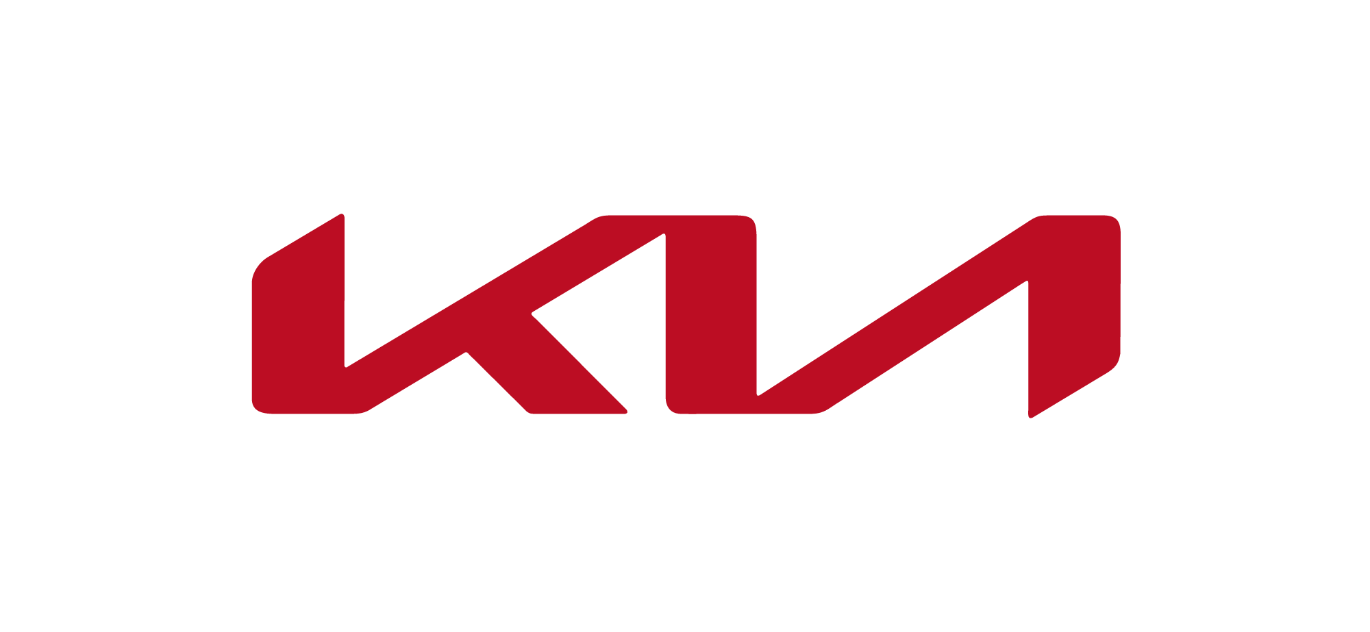
How do you like the new KIA logo?
i would have to guess what the words say, maybe if this image was on a car i would.
Clever by half; pedestrian; and as EB said, lacking in communication.
Before you write it off, read this critique.
I have mixed feelings regarding its readability, but in general, I like it.
The logotype of a small company that no one has ever heard of needs to be read in order to be understood. Kia, though, is a worldwide brand whose new logo will soon be known and recognized by hundreds of millions of people. It would be nice if it were more readily readable as Kia, but given their ubiquity, different logo dynamics apply to mega-brands.
1 Like
If you look at it in the small version I posted, it’s definitely readable.
It’s miles above their old one.
I like the simplicity and balance of it. I’m not crazy about it, but it is legible and I can totally imagine it as a chrome emblem on a car.
Looks like KN
1 Like
Only if you like Ns backwards.
1 Like
I’m not a fan of this for an automotive company. If I were completely unaware of the Kia brand and saw this, it would take a little bit to come to the conclusion that this reads “Kia.” The first thing I see is K and a backwards N. The second thing I see is all of the negative space. This could be a cool logo for an outdoor company (a mountaineering gear company that makes crampons), but it just doesn’t have an automotive vibe in my opinion.
I’m not a fan of requiring a logo to telegraph a vibe describing what the company is or does. With this one, they’ve updated the look of the old logo without going so far off-brand that no one will recognize it. This is an established brand, and you are unlikely to see the logo anywhere not accompanied by a car, or an image of a car.
I like what they did with it, but KIA is still an unfortunate name for a brand.
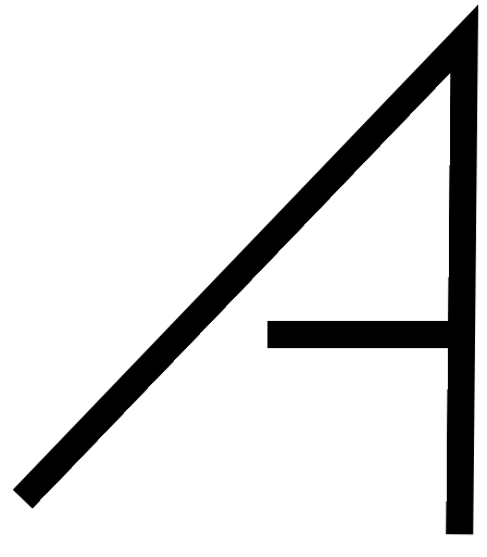
It could be TIA but looks more like TN. If you add a horizontal on the a from right side, unconnected at the left.
see below:
Not sure where you are getting a T out of any of that.
The original logo has an unbarred A.
Part of the brand carry-over is to not have one.
More iconic than their previous logo imo. While its not immediately legible, I feel like KIA as a brand has already established themselves in their space, and they aren’t trying to educate people on their name anymore. This new direction carves them out in their space a little more, makes it more unique and id imagine this helps define their brand better than the previous logo did.
Right. I mistook the Kia logo for the poster’s work. My mistake.
I just threw the “A” together to show concept, not style.
How come it is easier to read smaller than large? It’s like the letters separate more when I can see them all at the same time, instead of seeing the whole word as one…which makes me see K and backwards N.
Take the first ascender off the K and you have a “T” at 45º angle.
Okaay… why? Then maybe you’d see IT(backwards)N?
That’s a stretch.
It’s just what I noticed. I haven’t really spent enough time to say why lol. - probably because it’s the only intersection, so it creates a focal point that is stronger (to me) than the ascender on the left.
It’s actually a 3D TV.
[TV]