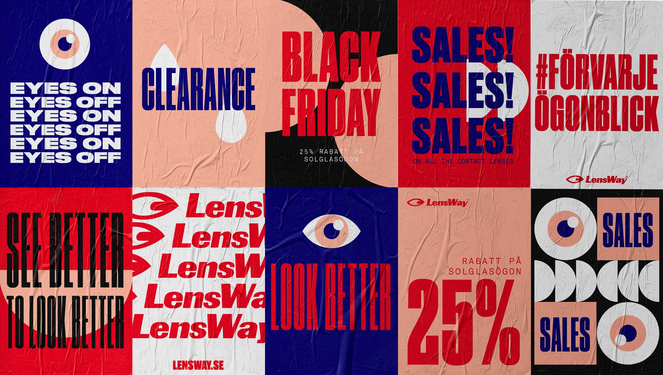
Founded in 2000 Lensway has grown to be one of Europe’s largest retailer for lenses and eye-wear. During the quick growth the brand quickly lost it’s direction and the company found itself with a great customer base but with low loyalty. The problem was that the brand lacked a personality and a tone of voice. Snask got the assignment to modernize Lensway and create a brand that had it’s own unique style as well as feel to it.
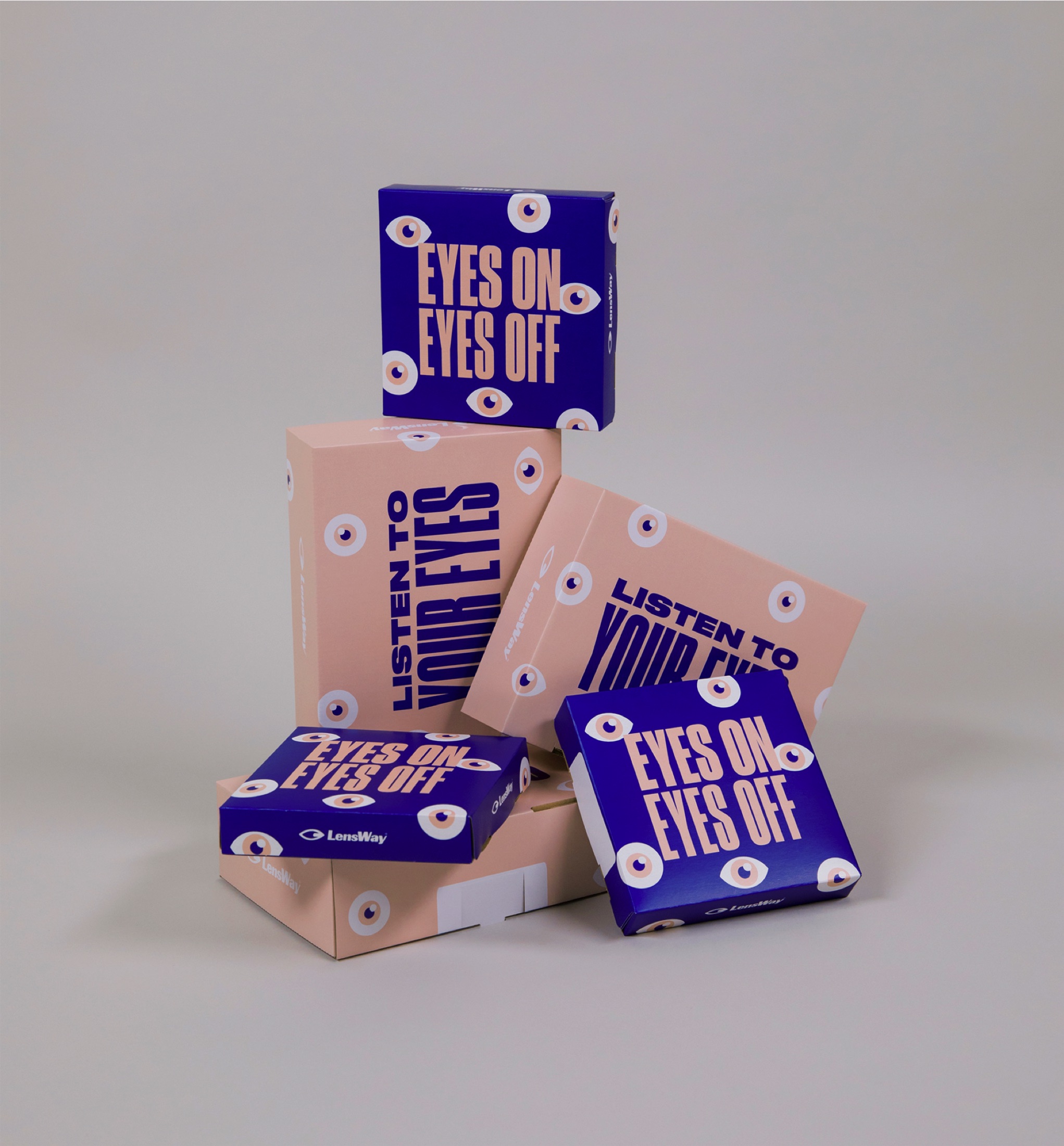
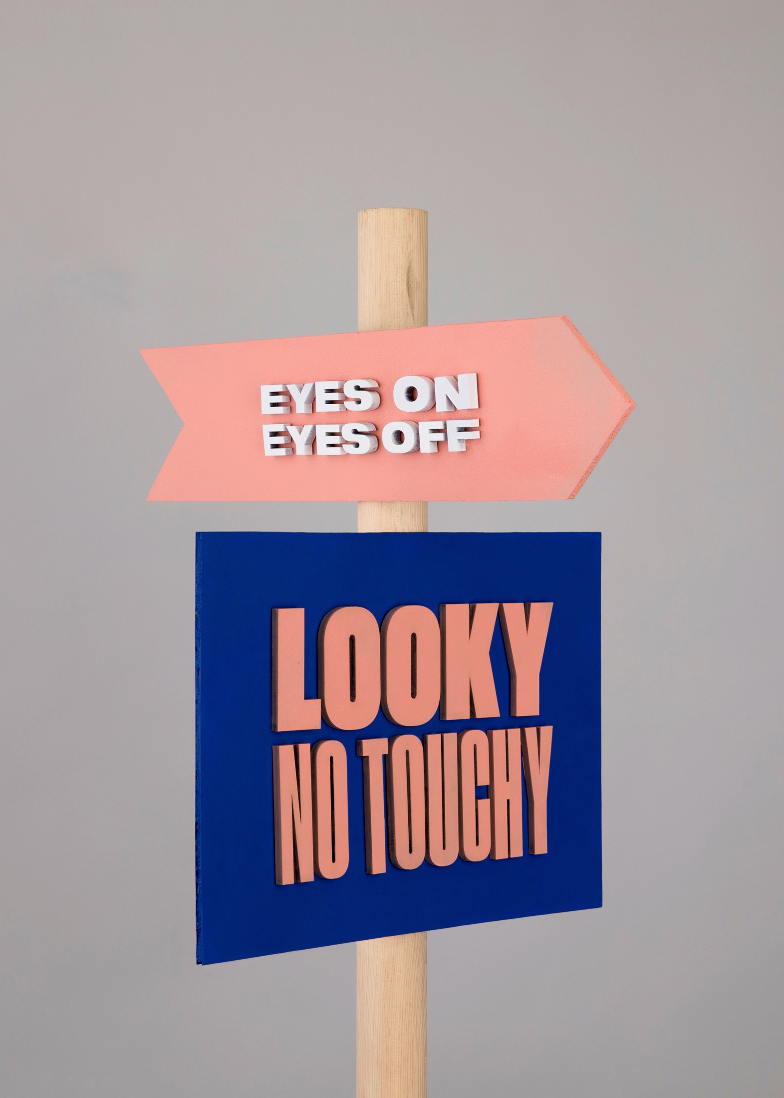
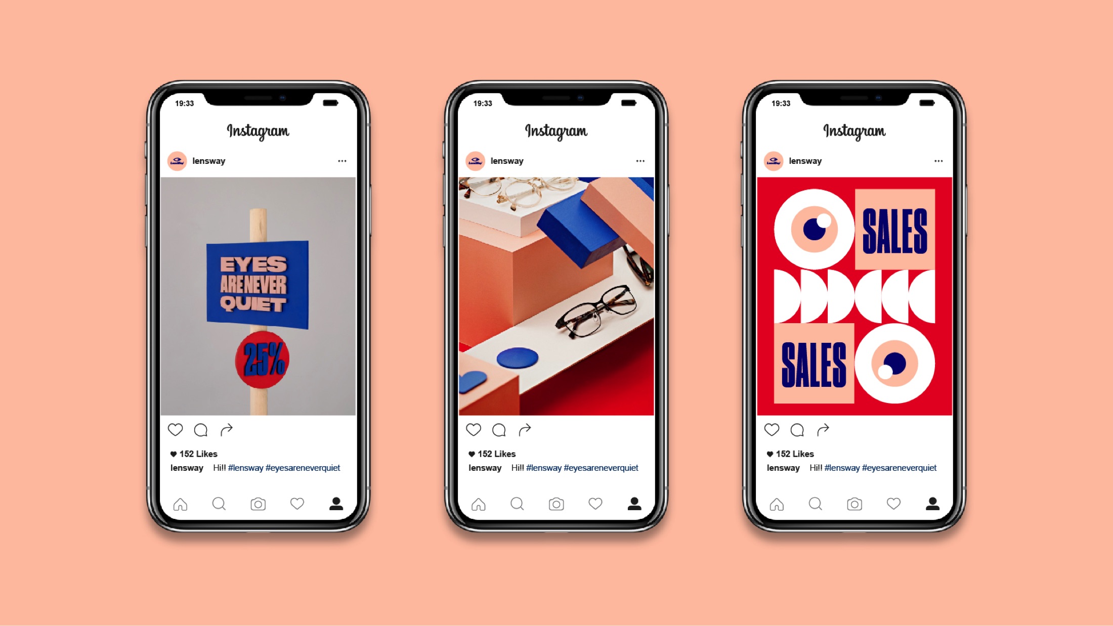
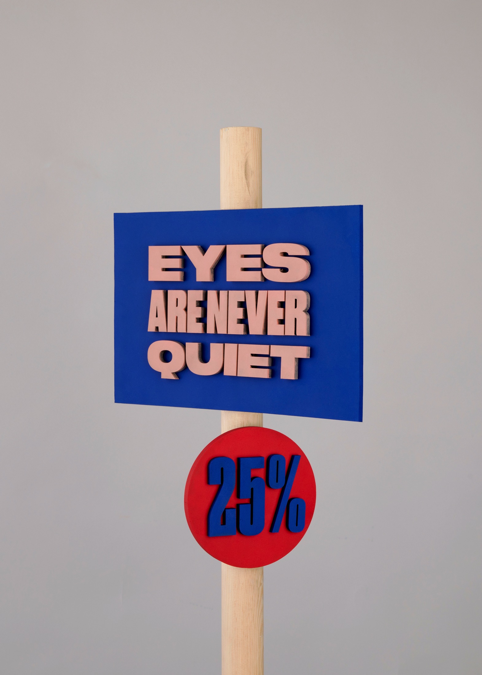
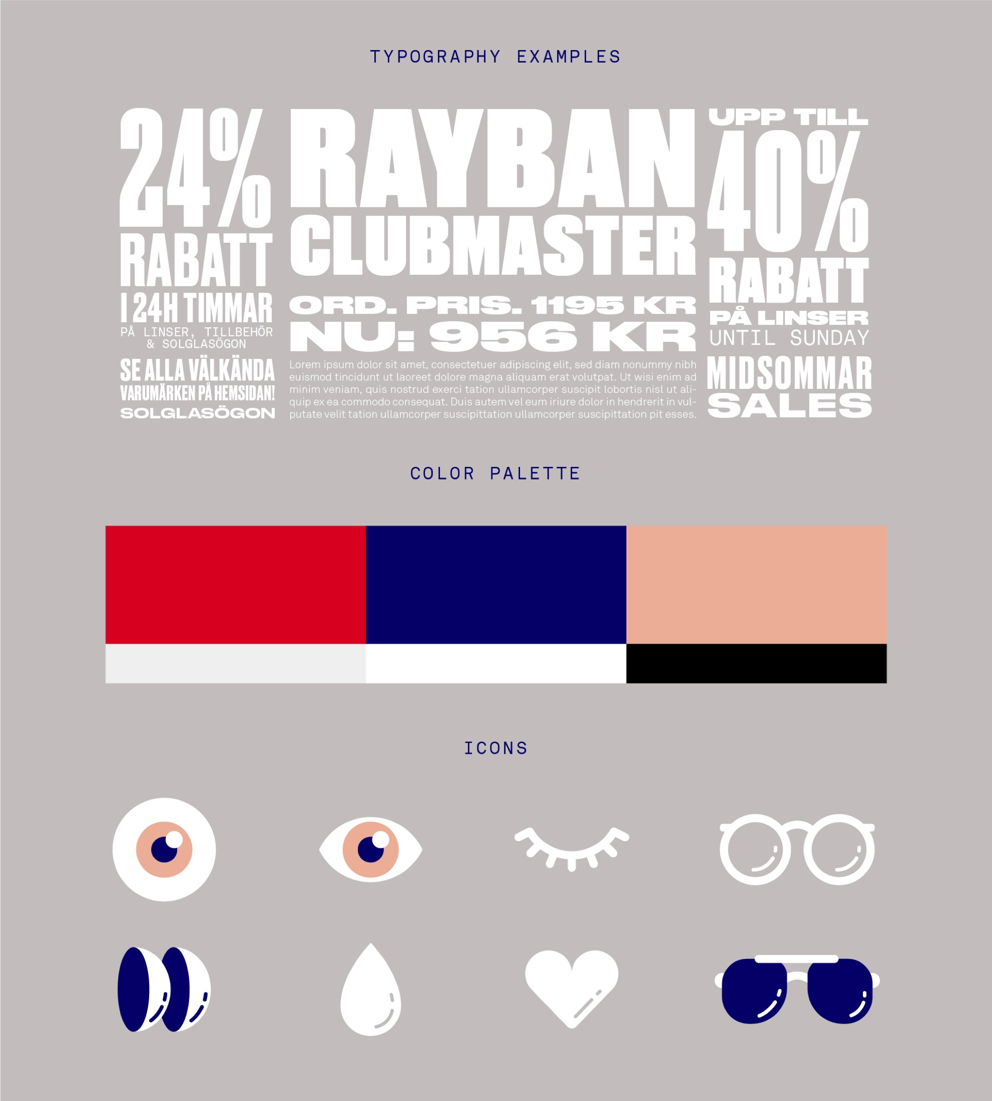
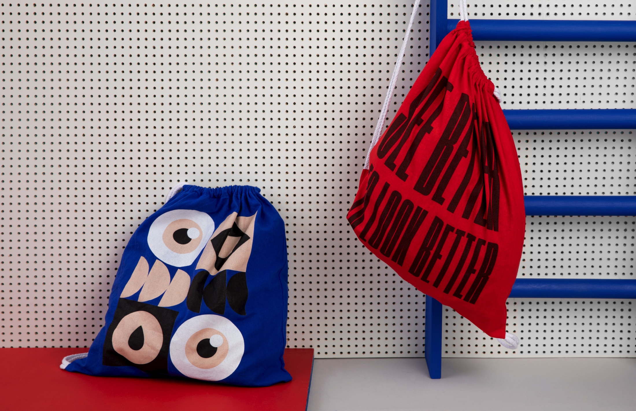
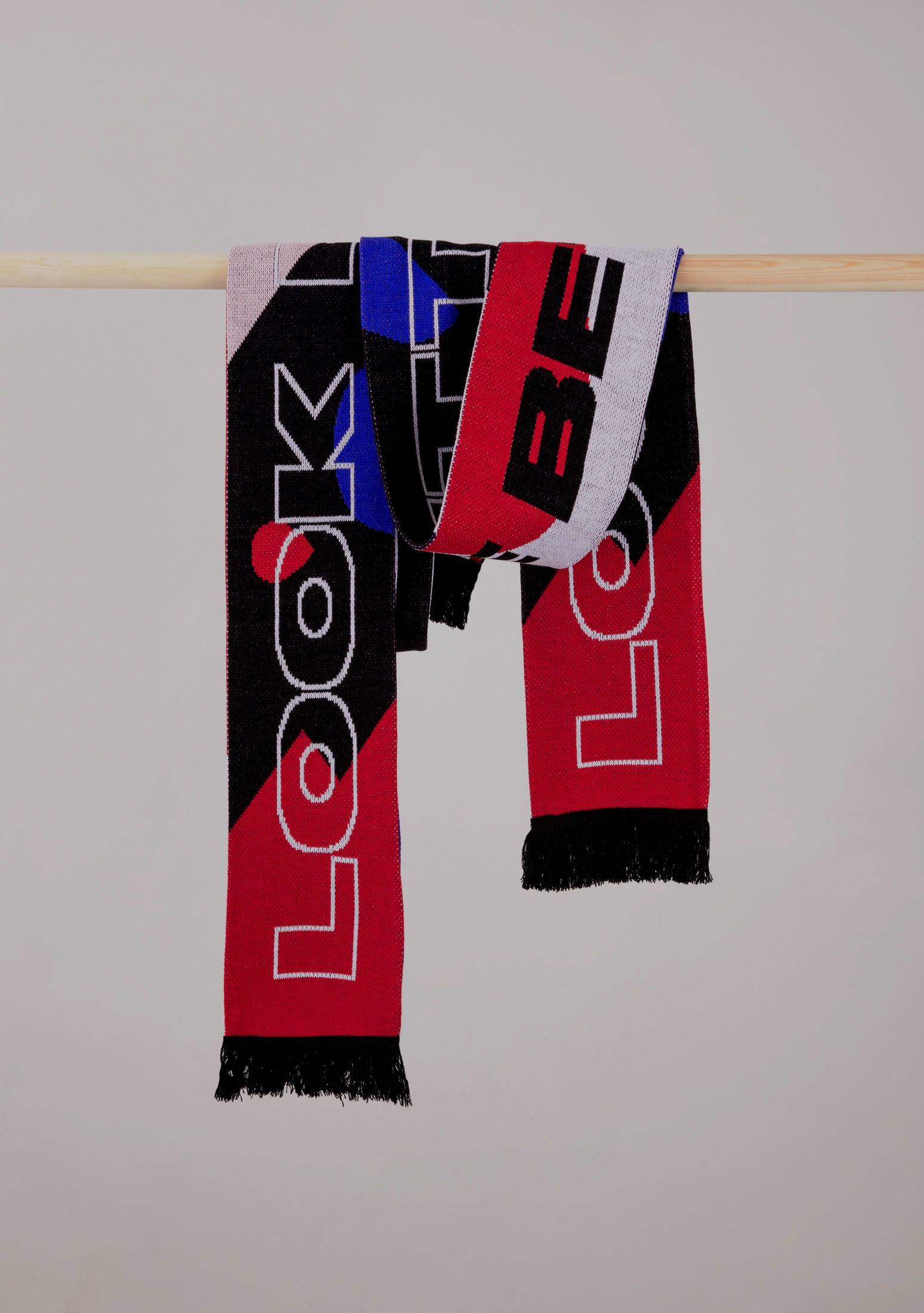
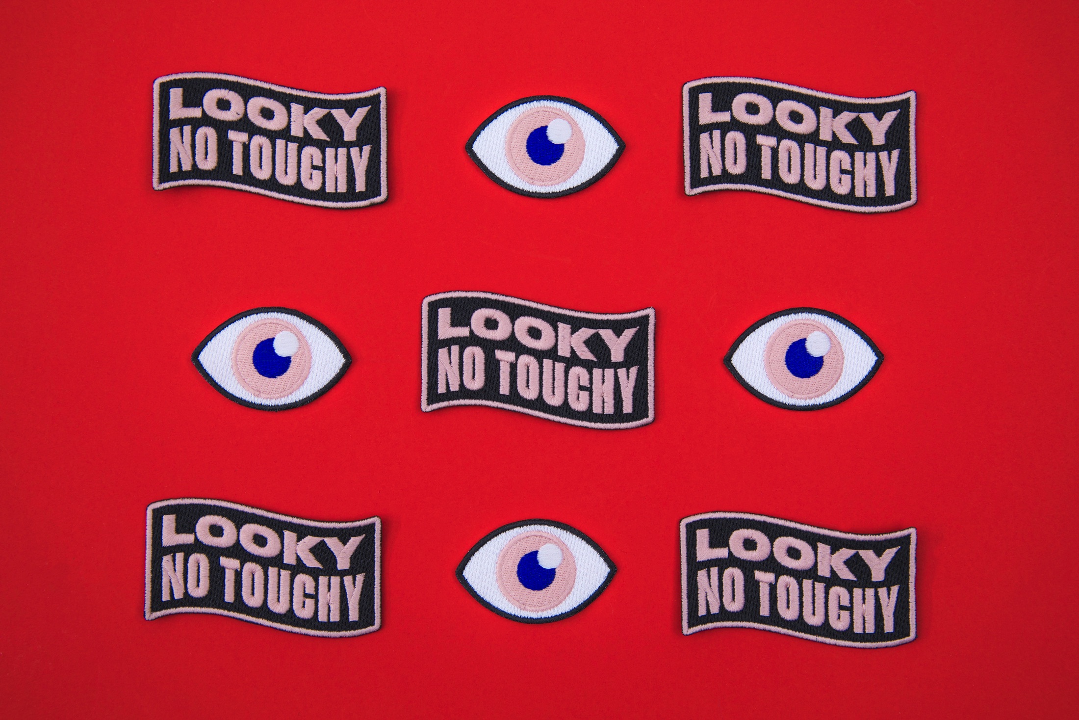
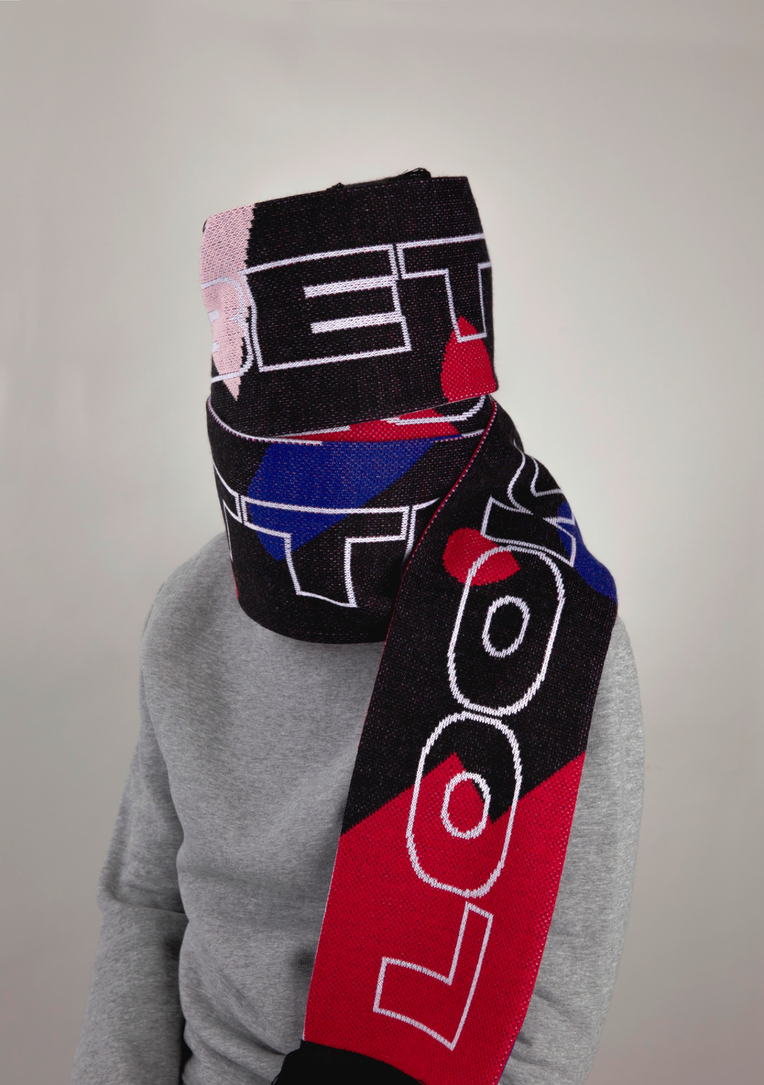
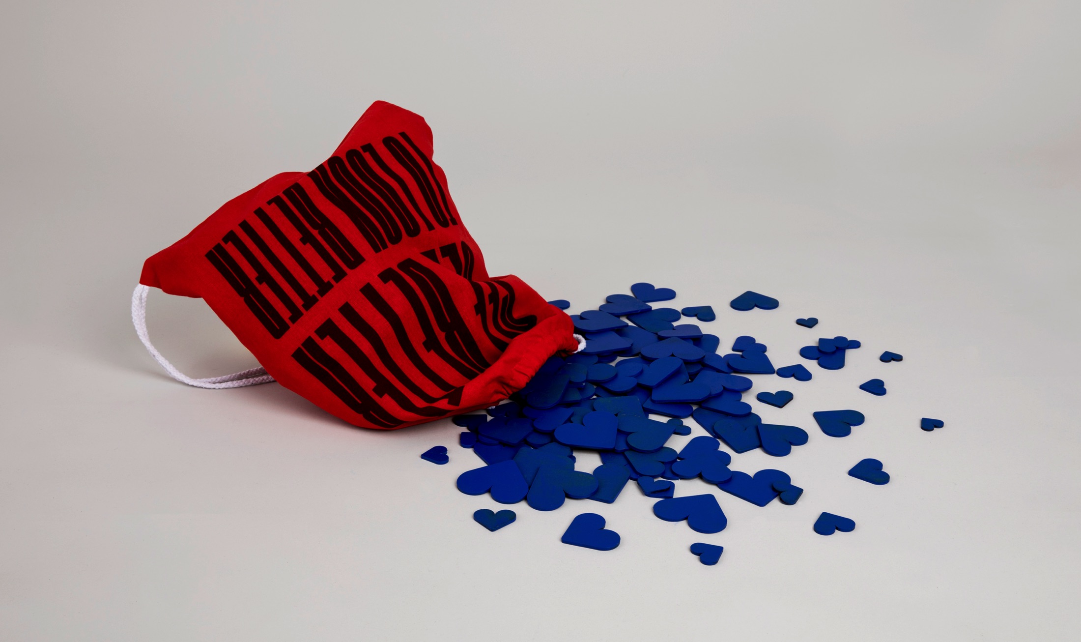
“We knew that the brand was in big need of a visual remake. Everything except the logo was up for grabs and we focused a lot around eyes in iconography and patterns and chose a typography that was versatile, playful and unique yet easy to read. We decided to intensify the brands red color and also add an equally strong blue together with a lighter peach pink. Along the identity we also created a lot of photos and films for SoMe, other online media as well as TV.”