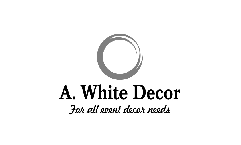
Here’s my latest attempt at logo design. Definitely has M.C. Escher influence . The owner’s name is A. White - what do you think?
2 Likes
I like the logo a lot, but I’m unsure I see the Escher influence. The typography, I don’t like so much. It looks less than contemporary (which might be appropriate for the client, I don’t know). It’s also just a bit too blunt and could use a bit more finesse. I don’t care for the script face at all. It throws a whole different look into the mix that I don’t think complements anything.
Really, when it comes right down to it, the entire look needs to match the style of the client’s work, which we know nothing about.
Sorry, but I think you need to go back to the drawing board on this one. The symbol is nice looking, but it’s terribly generic. It looks like something that you could download from Shutterstock or iStock with “your company name here” underneath it. What is the meaning behind the symbol? How does it represent the client? How will it appeal to the target market? I’m not fond of the type, either. Without knowing more about the client, their style, the target audience, etc., I suppose I should reserve judgement. As it stands right now, the type doesn’t mesh well with the symbol.
Hi thanks for the comments, I agree, but fonts and design were dictated, I just had to put this together for her. I actually had and submitted a different idea, but that was shot down. Here’s the original circle that was given to me. I thought it looked messy, so I cleaned it up. The M.C Escher comment was tongue in cheek - the inside of the circle travels to the outside.

So there we go, just heard back and she loves it. At the end of the day, can’t eat a fish story eh…
Steve’s right, the mark itself is sort of generic, but I do like it. It’s such a simple shape, though, that I’d be surprised if others haven’t used something very similar.
He’s also right about the disconnect between the mark and the type, which, really, was my concern as well. The mark is clean, contemporary, minimal and suggests modernism. The typography suggests traditional. I doubt this mismatch reflects the nature of the company. Even if the company does more traditional work, they’re not going to benefit from clunky traditional type. If they want traditional typography, there are ways to handle it that look right.
I don’t know if you’ve explained all this to your client. Maybe you have. Sometimes, after doing one’s best, obstinate clients have their minds made up and just want what they want with no discussion. When that happens, you take the money and move on.
1 Like
That’s not the measure of a successful logo.
. . . seems to contradict:
You did a good job on the symbol, but the others are right about the typography. Even if the font choices were dictated, they were not good choices, and the wide space between the A. and the W leaves the A. “on an island”. There are other kerning areas I’d have handled differently too, but it’s subjective, and a product (read: ‘symptom’) of the font choice.
Of course she does; she made all the decisions, and your polish only further validated them in her mind. All clients love that, but where effective branding is the objective, it’s a terrible approach.
You didn’t supply us with much background information, so if this is a crowdsourcing thing, the normal best practices and safeguards don’t really apply since the whole process is riddled with dysfunctional problems. Even in normal designer-client relationships, however, there are, as I already mentioned, obstinate clients who refuse good advice.
That said, good designers aren’t order takers and good design rarely comes about when the designer is simply trying to please a client by following orders. As the word design implies, we should be problem solvers, strategists, advisers, consultants and the experts at diagnosing client issues and designing solutions for them. One problem we constantly face and repeatedly need to solve is that of successfully communicating to clients what our role is and that we bring valuable insight, experience and expertise into the partnership when they hire us to do a job.
The name of the company and its tagline says they’re involved in some sort of event setting design. This could mean anything from children’s birthday parties to trade shows, but their ability to make appropriate design decisions should be reflected in their logo — typography and all.
Unfortunately, the composition they apparently loved will not serve them well regardless of how well it matched what they had in mind. It sends the wrong signal to their potential customers — especially those savvy clients who pick up on the composition being a bit generic, clunky, and lacking in finesse and stylistic consistency. In other words, it sets the stage for a first impression that says, “If this is the look they chose for themselves, I can hardly expect them to do any better when designing the decor for my event.”
1 Like
“If this is the look they chose for themselves, I can hardly expect them to do any better when designing the decor for my event.”
Quoted for Truth.
1 Like
I guess then, judge, jury and executioner says, I’m not a good designer.
Well actually no one said that, and no one here has enough information to make such a judgement. In fact, was I to wax philosophical about it, I’d go so far as to suggest there may be no such thing as “a good designer.” The same person that produced effective design for one client may, for any of a million reasons, produce ineffective design for the next. We as individual practitioners simply don’t have enough control to produce a good result every time just because we’re capable of it. You’re simply wading through part of that minefield where your talent gets chipped away in the transaction. We’ve all been there, and probably will be again; that’s why we have so much to say about it.
1 Like
Let me just ask you: did you post your design here to get compliments or to get real valuable feedback? Because honestly, if it’s the first, you’d better go to some place else. I don’t understand why you’re being so defensive about these people’s comments. They spend time reviewing your work, nobody said anything about you not being a good designer; that’s you telling yourself you are. They’re trying to help you gain experience by saying that you should advise your client, not bluntly take orders from them. Because clients make terrible decisions sometimes, that’s why they hire you. (and if they don’t, then you should think about whether you want these clients) We all come here to learn or to get input from those who already have experience in design. It’s a give and take. Part of being a good designer starts with coachability my friend. If you make a mistake and somebody points it out, you should think about it, evaluate if it makes sense and if it doesn’t, ask more questions until you know why something should or shouldn’t be done. I hope you’ll think about this and stop taking offense to what people say while they’re taking the effort to teach you something. It’s very immature/insecure behavior of someone who will not excel at their job but will always get the clients from hell, and then complain about why they get them. You’ll keep running in circles. Be a sponge to new information. You have to separate your self-esteem from what you do, because it sounds like you feel people call you a bad designer while they’re talking about the actions you took. Two different things. To improve, that’s the whole point of learning isn’t it?
1 Like
Hey, time out eh…
“good designers aren’t order takers and good design rarely comes about when the designer is simply trying to please a client by following orders”
My work in this was the circle icon, and most agree this was good work. I’m certainly not attached to the rest, and my feeling is not hurt - trust me, I only have one and that’s for my wife. It is original, or as original as in “nothing under the sun is new” but then again. I promise not to copyright it (lol) so if anyone sees value in the “toilet bowl” go ahead and use it, you have my permission. I thought that name was appropriate, as to me it actually looks like a flush, though if you’re Australian we need to flip it. Thanks everyone for the valuable input.
btw - she wants to silver foil it on her business cards, go figger eh. chaching! It just keeps getting better…
1 Like
No one is saying that at all. You didn’t really supply us with enough information to really dig into a critique of your logo beyond some superficial observations and your mention of the client sort of dictating what you put together. I think the comments veered off into a general discussion about these kinds of less-than-ideal client situations that all of us have dealt with and learned a few lessons from.
Great attempt but you can add more creativity in it.
It is not bad but I personally want to share some things you should remember while designing a logo. Make a logo meaningful like when anybody sees your company’s logo they can guess what is the purpose of the logo. So always remember the purpose of designing the logo. I hope you will remember this. Keep doing you will be a good designer.
Make a logo meaningful like when anybody sees your company’s logo they can guess what is the purpose of the logo.
So following that line of thought, is your logo a computer with a lightbulb over it? You know, computer/design/ideas? Or does your logo become associated to your brand thru reputation whether or not it is a direct, literal representation of the product?
If you looked at the Nike logo totally divorced from any brand association, what does it “say” to you? If you’d never heard of the product, is it a type of hockey stick? Or the name of a band? Would you ever guess “sneaker?”
2 Likes
I’m not really sure what you mean when you refer to someone guessing the purpose of the logo.
If you’re saying a logo needs to have a personality appropriate for the organization to which it belongs, I agree. A logo (and the associated visual branding) for a high-tech computer company would best serve the company by having a clean, modern look. A business composed of craftsmen who hand-build traditional furniture, would need something with a very different personality.
If you’re saying the logo must be a visual representation of what the organization does or the products it makes, I disagree. There typically needs to be a certain level abstraction in the logo to give it depth and make it interesting.