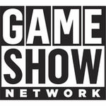
The GNS brand and new logo came to the air in 2015, in an effort to shorten the title and expand the programming on the cable channel. Game Show Network changed its name to GSN back in 2004 to expand it’s programming beyond game shows. It is officially, Game Show Network again with the release of it’s newest logo (right), which was released October 1, 2018.
Probably a step in the right direction considering their previous logo.
But this is a great example of why you shouldn’t design a logo with accent colors that touch each other. That one color version is not really the same logo
‘Show’ and ‘Network’ now seem to be have a special relation by their color. Was that on purpose? I would say a connection between ‘Game’ and ‘Show’ would make more sense (so use some red-tints in ‘show’ as well), but I might be wrong? Overal I think the logo already is an improvement!