Hi there,
which one do you like more?
Or, don’t you like it at all? I kindly ask for your thoughts and ideas concerning it.
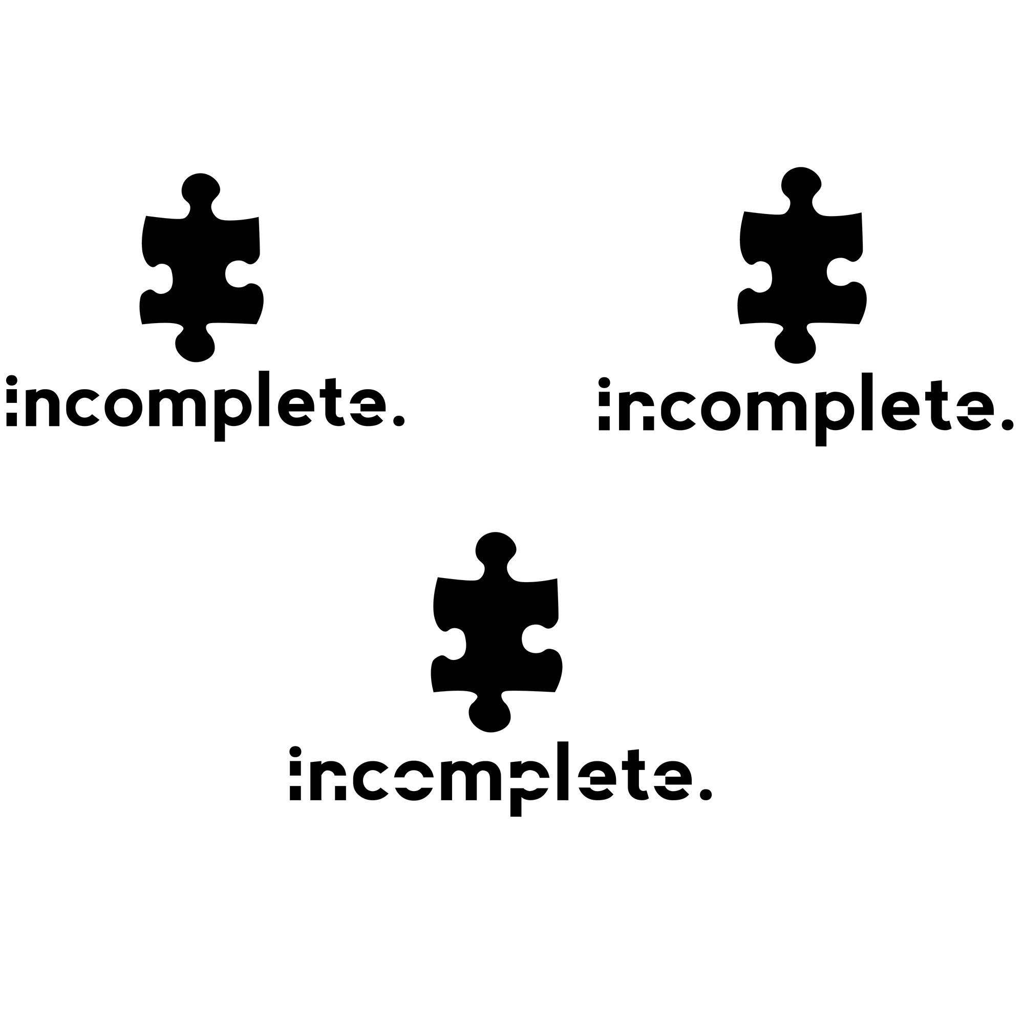
Thanks
Hi there,
which one do you like more?
Or, don’t you like it at all? I kindly ask for your thoughts and ideas concerning it.
Thanks
It looks like an unfortunate reference to the Autism Awareness logo.
I might reconsider the concept if I were you.
Skip the puzzle piece.
Oh okay thanks for the clearance. I didn’t know about that.
It’s almost as though your logo refers to your incomplete description of what this logo is for. There’s no way to judge your logo beyond its aesthetic value without knowing what it’s for, who the target audience is, what is being communicated and why you think this is an appropriate solution to the problem.
I like here third one because of design and name of the icon has relevancy, and other two i don’t like its not like that, other two also nice but i like most 3rd one.
Notice the user name? “IncompleteClothing” ![]()
What he says.
Nevermind we threw the concept away and started with a new logo anyways because of the obvious reference we had no clue about.
The logo is cool, but i dint think the puzzle piece needs to be it, sorry man ^^‘’
you could also have two puzzles that dont fit but looked forced, as if a child playing with it that did not want to accept that it does not fit. or just have the visual be something thats incomplete like; a car with 3 wheels, or something thats about to break or fall into pieces because its still missing one part and that part representing you(the business)
Thanks for having a look dudes & dudines.
We threw away the puzzle piece and sticked with the font.