How do you like it?
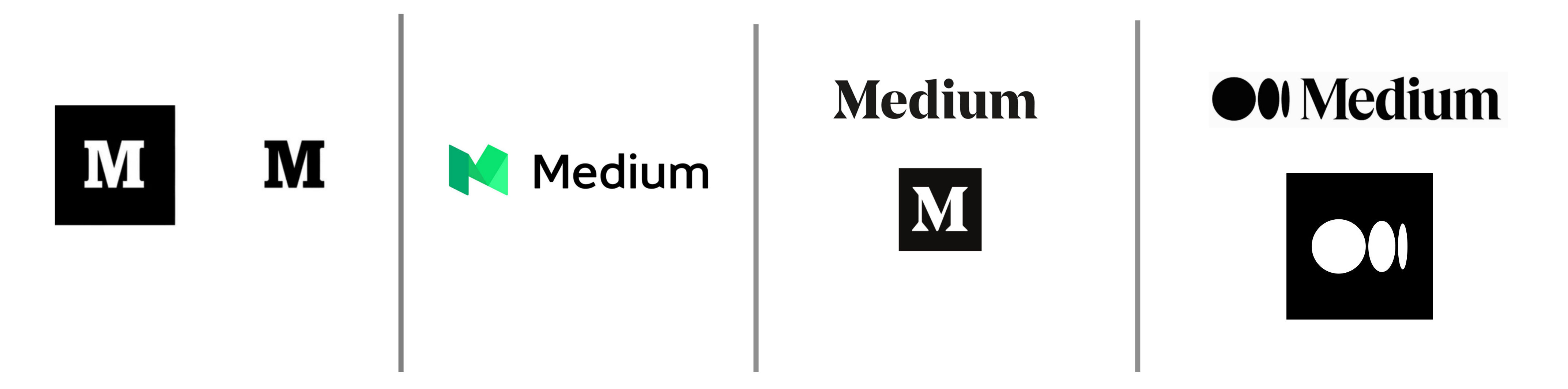
Evolution
what is it?
Guesses:
Not knowing anything about Medium, it’s a bit tough to form an educated opinion, but my initial gut response could best be described as “meh.”
That skinny leg and diagonal on the M bothers the crap outta me. It almost vanishes at the size displayed on my monitor here. It would have to go really large before I could cut that thing out of acrylic with a laser, and even bigger to cut it with our CNC router. Then I’d have to cut 3 or 4 of them to just get them through finishing as at least one will break.
Don’t ask for any kind of lit lettering unless those strokes are at least 5/8" wide (3/8" for the LED tape and 1/8" each side for the material the letter is made out of. a little bit of slop would be nice too.)
Hello Iraszl,
Great. The New logo of Medium is superb and lovely.
The M also bothers me, but I do dig the dots - especially when animated:

Looks like a flat tire when animated.
Did you find that on their website? What do they do? (Couldn’t be bothered.)
Iraszi, is this something you are working on?
The dots look like they’re supposed to have some kind of meaning or significance, but I don’t know what it could be.
My curiosity got the better of me, and I had to see what Medium is. It appears to be a blogging platform – maybe a cross between wordpress.com and Twitter. You can sign up for an account, write articles, people follow you, like, and comment.
I had no idea either. Coincidentally, I’ve just come across this.
Well, that’s interesting. I’m surprised Collins came up with it given their reputation. Then again, it’s not so different from some of their other work. I’d be willing to wager than Medium paid a small fortune for it. Honestly, I don’t like it.
According to Medium’s launch blog post, “The symbol, like our illustration style, is inspired by language and typography. It is born from the ellipses: a punctuation mark that represents an unfinished or impending thought, an idea to come, what’s next. This is, again, what happens on Medium — there’s always a new idea, always more to the story.”
https://blog.medium.com/a-more-expressive-medium-starting-with-medium-63b562206d8f
Elipses come after if representing “what’s next.”
Before, means something left unsaid. Pretty much.
Good point, @PrintDriver!