New Pantone, missing in Adobe?

No, branding will simply shift to defining colours in CMYK and RGB (this is already happening)

Pantone lookup tables become irrelevant when colours are defined in CMYK.

We are already used to differences in colour matching and how to compensate. Pantone as a standard is used less often in part because of the difficulty in reproducing Pantone colours using CMYK and RGB. We have to acknowledge that Pantone is a system of spot colours, and when spot colours are used less often, the Pantone system becomes less relevant. Why sweat about your digital press using look up tables to (in)accurately reproduce a Pantone colour when you can better define that colour in CMYK?

I agree, but, of course this means that we end all up with a much narrower colour gamut in any printed materials.

That said, although for every branding job I do, I have always started with the Pantone and worked back from that to specify CMYK, etc, I can’t remember the last time I actually had anything printed with an actual Pantone colour.

I suspect it may end up used only for golds, silvers and fluorescents.

Shame, but digital print has opened up colour printing for small run jobs in a way that was never feasible / economical previously.

I can hit about 75 to 80 % of pantone colors either spot on or within a couple delta-E using those Pantone lookup tables. If you want them tweeked to ‘spot on’ for the misses, that costs money for a hand match but we can usually hit them (except for the usual suspects in the hot orange and red-blue categories.)

CMYK inks are not standardized. I can hit those colors because the wide format inks have a wider gamut when used in their specific digital presses. The machines don’t all use the same inkset from the same manufacturer, and some of the machines out there add OGV inks as well as the light cyan and light magenta.

I can print your CMYK mixes straight up on 4 different machines that are profiled for Pantone and get 4 very different shades of color, possibly none of them matching each other or the Pantone formula you typed in. And it may not look anything like the CMYK (or rather the representative RGB) on your monitor. And don’t get me started on the LAB representations of Pantones on RGB monitors that Adobe helped you all with. But give me a Pantone number and all 4 prints will match across all 4 inksets.

If you’re good with just CMYK, have at it. I charge for proofs. I’d pay me if I were you.

But you both should know all this. You been doing this a while.

What isn’t happening is LAB. It might define color better, but unless a designer can see in that color space, they aren’t going to use it and until there is a need for it, printers aren’t going to bother much with it, except for possible internal use for custom profiling for matching across devices.

I don’t particularly care any more. But just saying you can use CMYK values to get teh color you want is plain wrong, unless maybe you use the same colors and the same print vendors. I’m always very happy when a brand manager asks, “how did you manage to get our colors right on all your large prints when these guys over here couldn’t handle it on our collateral?” Makes me smile that we can still do good work when others don’t bother.

Yes, and that brings us back to Pantone’s original core business of supplying standardized inks and formulae to mix them. I don’t see that going away since there’s still a need for colors outside the CMYK gamut and for solid colors that don’t depend on mixing screen tints of the process colors.

I can’t quote your entire post, but my response is to the premise of more accurately matching Pantone-specified colors on digital machines because of Pantone-supplied color lookup tables for those machines.

I don’t disagree with anything you wrote, and even if I did, I’d defer to your opinions on anything to do with digital printing since you work with it every day.

However…

Pantone has been very aggressive in tweaking its business model to keep its color matching system relevant.

Digital printing didn’t exist a few years ago. Even now, it’s in a constant state of flux as the technology is refined in various ways by different manufacturers. Pantone astutely saw an opportunity in the chaos to make their system a standard for color accuracy in digital printing by constantly developing and refining lookup tables for different digital presses.

In essence, Pantone became a software company that exploited the niche market by figuring out ways to get digital presses to print close CMYK+ approximations of specific colors. And, of course, since this was Pantone, those specific colors were Pantone colors.

In other words, Pantone has kept a somewhat antiquated ink color matching system thriving by developing ways to awkwardly squeeze it into a growing digital printing market deficiency that no one else has done.

With that in mind…

There are already two other universal standards with hard mathematical values that everyone already uses: CMYK and RGB (or perhaps hexadecimal RGB since web design has made it ubiquitous).

For example (assuming there’s a standard for each process color), 20% cyan is just that, 20% cyan. The same holds true with every percentage of each process color. The same applies to RGB and hex values (even though they’re additive colors that can’t be printed).

Of course, as things stand right now, there are no standardized CMYK/RGB lookup tables (or their equivalent) to calibrate all the various digital printing presses, technologies, and inks in use. In addition, converting RGB or CMYK to CMYK+ hasn’t been standardized either since it’s not a simple 1:1 conversion. Instead, it’s more like an apples-to-oranges conversion.

Still, as I mentioned, CMYK percentages are fixed values, and the printed equivalents of those values can be measured and the press adjusted to match those values. A printed 42% K screen tint should read 42% when measured with a densitometer. If it reads anything else, adjustments to the press are in order. And those adjustments could be minimized by using currently non-existent or inadequate, standardized lookup tables that reference hard CMYK/RGB values instead of Pantone colors.

I’m no expert on this, so maybe there’s some critical piece of the puzzle I’m missing. If so, please tell me.

In summing this up, Pantone is important for accuracy in digital printing, but that’s because Pantone developed a calibration method that uses their fixed colors as the base reference. Doing the same for fixed CMYK values, at least to me, seems entirely doable, which brings me to my main point.

If Pantone disappears from the Adobe apps and becomes some kind of subscription for designers to access, I suspect that will reduce Pantone to a niche product in graphic design. It could easily slide right off the radar screen for most designers — especially for the inadequately trained and inexperienced newbies who are confused by the whole subject anyway.

Adobe could fill this gap with its own standardized and consistent color matching system built around CMYK and RGB, and they could fully integrate that system into all their apps in ways that are completely transparent to the users of those apps. They could also do as Pantone has done and develop lookup tables for digital printing that reference their standardized color system. I don’t know whether Adobe would want to tackle this, but if Pantone disappears from their apps, it opens an already open door even wider.

I’m sorry for the long treatise, but it’s a complex subject.

1 Like

There’s a great article here

The comments are fascinating too

2 Likes

The whole idea behind most digital wide format is to get the best image possible using the widest gamut possible. I’ve gotten into arguments with proponents of GRACOL as to why I should dumb down my capabilities in order to match conventional CMYK printing.

Pantone did step up and filled a gap. My industry, for better or worse, embraced it and the machines do what they do. If you don’t want to use the machines to their capability, again, I don’t particularly care. Perhaps I’m clinging to the Old Ways a little too tenaciously and we should all just dump our extended gamut machines and not worry about getting the best, most vibrant image quality possible.

If you want junk, I can provide that.
At least for a few more years.
:wink:

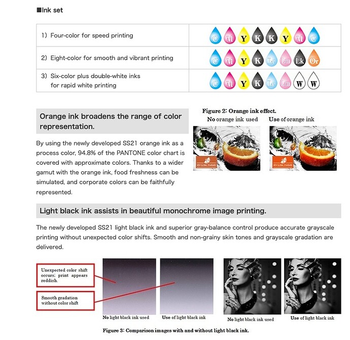
Here’s a screenshot from one of Mimaki’s extended gamut printer cut sheets.
I’m sure the printer will be happy to drop out the orange ink for you if you think it is too garish.
The top inkset is what we call a “fast four” and is used by the high-speed-print-run industry. The middle is extended gamut and the bottom is 6 color plus white (which is handy for under or overspotting on clear or other-than-white materials.)

We’ve been saying Shit in - Shit Out for as long as I am in the industry, not as long as you, but 25 years or so.

Similar to Garbage in Garbage Out - or GIGO as we learned in college.
Yes, even in college at 3rd level education it was mentioned.

Will Pantone live or die - who knows.
Probably every design/print house in the world will continue to use them.

Then you’re left with the dredge who are bottom feeding crowdsourcing platforms who wouldn’t have used Pantone anyway - left to race to the bottom.

At the end of the day, it cleans up the industry somewhat.
But lands hobbyists and small businesses in some issues when it comes to producing original artwork in Pantone.

Albeit, it won’t affect existing artwork.
So I’m pretty sure that getting a logo or a document in Pantone would be transferred into the program without any need to have the Pantone Connect.

Creating original artwork using Pantone might be problematic.

And for the cost of a streaming service for movies for a year - it doesn’t seem that expensive.

It costs less per month than a grande mocha double whiz-bang whatever.
It’s like $10.
You are gonna spend more than that on a proof (not that you should skip the proof, but it might save you from having to do two.)

That’s what I always say:

If you don’t have time to do it right, how do you have time to do it twice?

Or more to the point, if you don’t have the budget to do it once, how do you have the budget to do it twice?

I’m not aware of anyone arguing that the wider gamut possibilities of digital printing be dumbed down to CMYK. At least I’m not arguing for that. For that matter, I’m not arguing for anything; I’m just making some semi-related observations.

Spot colors (especially Pantone) were ubiquitous in offset and letterpress printing throughout the '70s and '80s until the cost of CMYK offset decreased simultaneously with its quality increasing. The development of digital printing pushed spot color inks even further into the background for most designers.

Adobe has never fully integrated Pantone colors into its applications. Instead, the Pantone libraries have been buried three or four layers deep in their menus, along with Focoltone, Toyo, Trumatch, and others.

The result of this is that Pantone has drifted off the radar for most designers who don’t typically run into offset print jobs that involve spot colors. The whole subject is glossed over in most design programs. The new self-educated logo designer crowd tosses in Pantone specs because they’ve read that they should. Most don’t seem clear on why or understand the basics of their use. I doubt that many have purchased a physical Pantone swatch book — relying instead on the tiny swatches squirreled away in the depths of Adobe’s color menus.

With Adobe and Pantone apparently parting ways in their never-vibrant partnership, this pretty much takes Pantone off the radar for most designers. Some designers, of course, use spot colors regularly. Still, for most, spot colors were already something of a mystery. Soon they’ll be a mystery that lies outside the tools they use unless they’re using Quark or Affinity (another related issue).

Again, I’m not arguing for anything here. I’m just observing how Pantone colors have become less and less important for most designers for several decades. Their removal from the Adobe apps is just another significant step in that direction.

In addition…

A separate but related subject is how Pantone has fought to keep itself relevant through excellent marketing and product diversification. It’s been a long time since their business model was primarily focused on selling printers ink.

One of Pantone’s many products (if you could call it that) is calibration tables for digital printing that reference Pantone’s own printing ink colors.

There’s nothing magical about Pantone colors; Pantone saw a niche opening and stepped up to the plate to fill it in a way that helped preserve the relevance of a color matching system based on their traditional printing press inks.

Other companies, such as Adobe, Apple, or Microsoft, could have done the same thing using a different standard to reference. However, they didn’t since, I suspect, unlike Pantone, doing so wasn’t critical to the success of their other products.

My main point…

The whole process of using device-specific digital lookup tables built around referencing 1,800+ Pantone ink colors is awkward for most designers — especially for those baffled by the subject anyway. Some knowledgeable designers do it and send their work to higher-end, quality-conscious digital print shops, but most don’t.

Most designers prepare their work as though offset and digital are the same things. They flatten all their files to CMYK, leave them in RGB, or a little of both. They don’t understand the color profiles in Adobe software. They save to the default PDF settings and just hope for the best when they send it to their clients, who, in turn, take the files to whatever printshop they happen to use without knowing anything about any of it.

Spot color inks are becoming as niche as engraving, embossing, pad printing, foil stamping, or spot varnishes. Ensuring color accuracy by sticking with 1800-plus Pantone colors that aren’t even included in Adobe’s software becomes nearly untenable for all but the savviest and quality-conscious designers, clients, and printers that depend upon spot-on color accuracy.

My thoughts are…

Developing lookup tables (in the absence of more basic standards the print device manufacturers could have developed) was ingenious. Pantone deserves credit for doing it, no matter how cumbersome it might be to reference their decades-old color matching system designed for traditional printing.

I’m not holding my breath, but I think some companies could develop lookup tables that reference the fixed values in CMYK and RGB hexadecimal notation. For example, a9e42b or any other of the 16-million, six-digit hexadecimal numbers are fixed numerical values that correspond to specific percentages in the RGB color gamut. A lookup table referencing 16 million hex values and tying them to specific CMYK+ digital printers might be impractical. However, a representative subset of those values — say 4 or 5 thousand — is probably doable, with the intermediate values interpolated.

Interpolation wouldn’t be as accurate as a table referencing a specific Pantone color, but it would likely be ≈95% there. In addition, it could apply to every print job run through the machine since it would apply to any RGB file. And for those high-end jobs demanding absolute accuracy for picky clients using Pantone spot colors, Pantone lookup tables could still be an option.

I might be missing something important in all of this, but from my limited knowledge, it’s seems doable. However, it would take a company with the industry clout of Adobe to create the standard and the tables. As I said earlier, I’m not holding my breath.

1 Like

The way it’s going is LAB values.

If you think designers (and printers) can’t figure out Pantone, LAB is beyond their comprehension.

The whole object with Pantone, as inaccurate as it often is due to their updates, is that there was always a physical chip to hold up and say, “yup, close enough.” Once you get into 15,000 printers creating their own charting systems based on some representation of RGB you may as well just say, “print it and make it look pretty.”
Which I have been doing more and more lately.
Because if no one cares, I care even less.

To what optical standard do we standardize our RGB or CMYK systems? A spectrometer? I don’t know many designers with one of those in their back pocket. How are they to visualize a color and communicate it to me?

The whole situation with Adobe and Pantone started well over a decade ago. When Adobe, or maybe it was Pantone, couldn’t accept that Spot colors can be transparent and write software that can accommodate that fact, the writing was on the wall back then that they hated each other.

I hadn’t realized that Pantone is a total no go in Photoshop on an M1. I’ve actually run into the “gray image” thing at home and didn’t know what it was. Will have to run some tests on the new work station, as that could be a critical error.

I keep trying to keep my posts short, but this is a complicated subject. I wish we were having the conversation over lunch. :wink:

As you’ve mentioned before, you’re in a specialized industry segment: large format. From what I’ve inferred, you might be in a specialized area of that specialized segment: a good-sized shop with high-quality standards and with customers who expect attention to detail.

Most of us are in specialized situations of one sort or another, and we tend to look at things through those lenses.

Holding up a Pantone chip next to printed digital output under various lighting conditions, then making fine-tuned adjustments that go beyond any lookup tables that might already be in place, is a hard-to-duplicate method for ensuring color accuracy in digital printing. And in those instances where near-perfect matches need to be made, physical Pantone chips make that possible.

For me, however, this is a nearly non-existent use of the Pantone system.

During the first part of my career, Pantone was the standard for choosing printed colors. During the last ten years, I’ve only occasionally used Pantone colors. My use of Pantone has been confined to picking colors or using existing brand colors. Exact matching of digital output to a Pantone chip to get an exact match hasn’t ever come up.

Instead, I’ll use Pantone inks to achieve colors that are not doable with 4-color process. If a book cover I design has large areas of a solid color, I’ll choose a Pantone color to get a solid pure color rather than one made from 4-color halftone rosettes. I’ll, of course, choose Pantone for screen printing or other specialty printing. I’ll specify Pantone colors when designing logos (whether or not the client asks for it).

However, I’ve never needed to match digital printing to an exact Pantone color. We’ve always used offset for anything requiring a close-as-possible match, which allows us to use the actual Pantone inks. Of course, with large-format work, this isn’t practical.

I’ve always assumed there’s a certain amount of inaccuracy inherent to printing. Even with Pantone inks in offset printing, where exact matches are more easily possible, they’re never precise. Minor differences in white compared to slightly off-white stock will change the color. The same Pantone color on coated vs. uncoated stock differs dramatically. Increase that by an order of magnitude for newsprint. Cover the printing with an aqueous flood coating, and the color changes again. Use varnish, and it changes even more. Take two pieces outside that look the same indoors, and they no longer look identical.

We’ve gone off on a tangent about how Pantone is the best solution for digital printing when precision color matches are important. I agree that it is the best current solution in those situations.

However, for more run-of-the-mill digital printing, 95% of the time, getting 95% of the way there is all that’s needed. Although they don’t currently exist, CLUT standards built around hex notations or LAB colors could work and increase consistency from one printer to the next and from one printing device to the next on every job without the need for Pantone. It wouldn’t be as accurate as comparing Pantone chips to printed output, but for most jobs, most of the time, it could help improve color accuracy and consistency.

I wonder if somehow this will get resolved. Apparently it’s still available on other design platforms so with such a defective product but such a narrow market, it’s a wonder how Pantone will survive if they’re hedging their bets on a subscription model. They’re the defacto print standard but if people start moving more towards digital printing anyway, will the PMS color logo matter that much anymore? I don’t know. definitely something to watch though.

Spot colours aren’t going anywhere.

It’s a huge part of printing.

It’s far more cost effective to do 2/3/4 branding colors on large print runs than on digital presses.

Companies will always care about their brand colors.

Some even seek to protect their color like Cadbury tried with their purple color.

1 Like

This topic was automatically closed 365 days after the last reply. New replies are no longer allowed.