Hi there. It’s been a while so not even sure this has been discussed, but I ran into this on a project this week. At first I thought it was a shade of green. To my surprise it’s blue.
I have no reference in any of my color books, digital or otherwise. Looks like another Pantone cash grab to me…go figger eh. Has anyone else run into this?
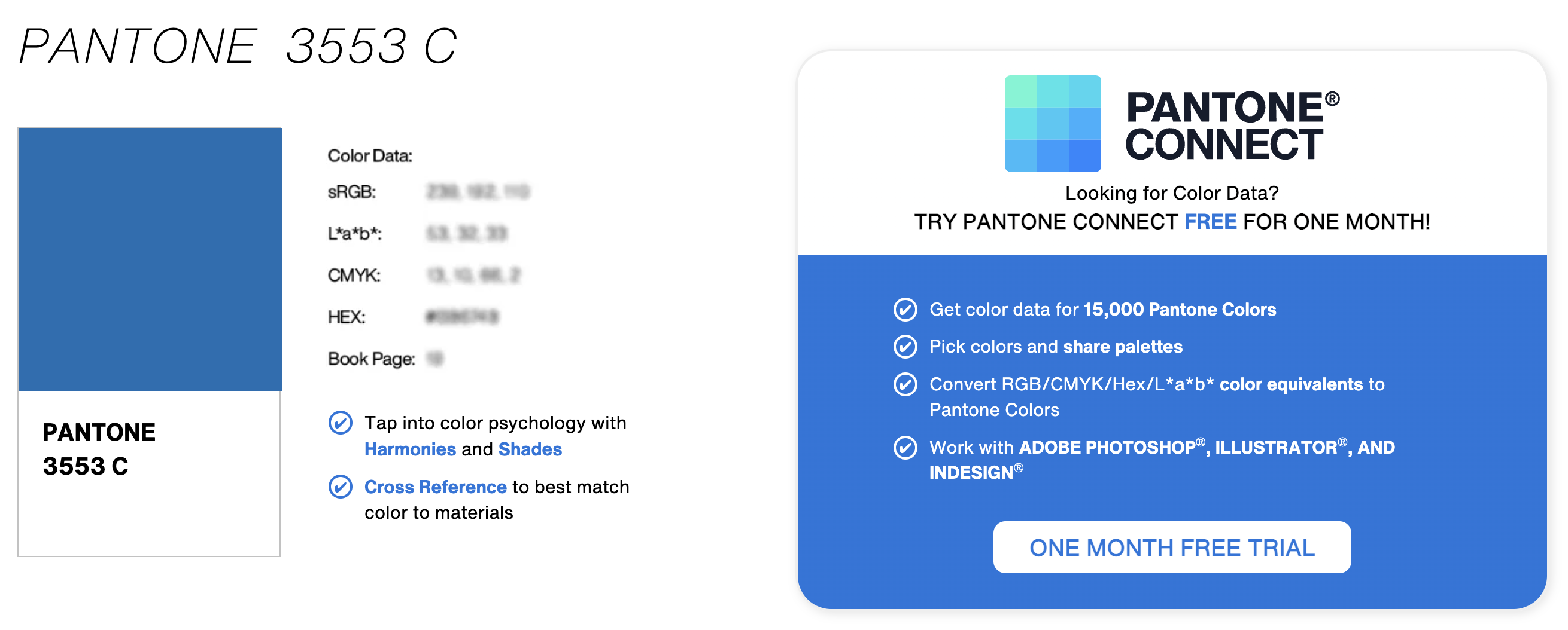
FYI - We settled on PMS 3005C - why reinvent the wheel?
It’s a little cleaner, but I doubt anyone will notice.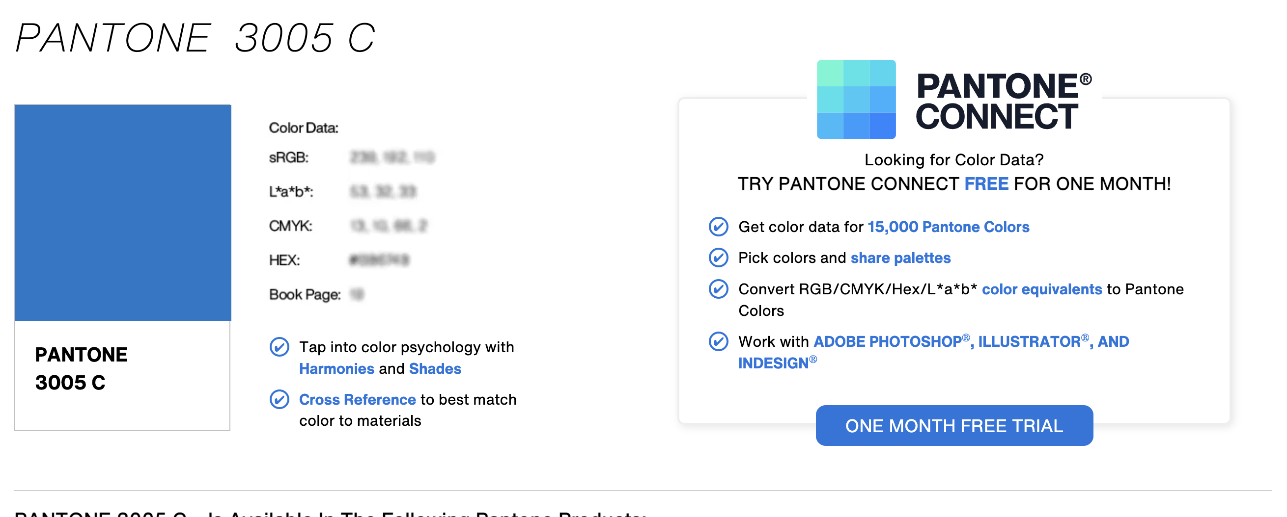
When you buy the Pantone Book from a shop - you’ll get a download link from the inside covers where you can download the most up to date swatches.
However, if it’s just the Pantone swatch you need - you can name your pantone swatch whatever you like - so just rename it to the colour you want it to be.
It’s then up to the print shop to use that Pantone Colour when printing, as it’s an actual ink - so you don’t need to have the actual swatch available in the Pantone set in the software.
You should of course download the correct pallets for your software so you can do accurate CMYK conversions.
But simply stating that the blue should match Pantone XXX to the printers will help.
If you’re not using a printers you don’t need to worry about the Pantone colour.
Or best yet - speak to your print provider and ask for their advice.
Pantone is moving to a paywall on downloads. It’s called PantoneConnect. And is about as awful as their website has always been as far as User Interface (read horribly unintuitive.) The previous, free Pantone Color Manager is dead. There is talk that Adobe is phasing out color swatches where the only way to apply them will be Pantone Connect. Not sure yet how true that is, but wouldn’t surprise me in the least. I’m all for making things difficult (not.)
Bear in mind that not all printers who require Pantone colors for color matching are using Pantone inks. The entire Wide Format print industry relies on Pantone lookup tables in order for the CMYK inkjets to match via profiling.
DO NOT RENAME PANTONE SWATCHES IN THE SWATCH PALETTE. In wide format, the profile lookup tables are based on the way Adobe has the swatches named. A renamed color will just print as CMYK values (or RGB values on a Lambda/Lightjet.)
If you can’t figure out how to apply the color, ask the printer what you should do to make it happen.
1 Like
I’m just glad that I retired in time before the whole industry was hijacked, Pantone among the culprits.
Of course - I had to go and forget the entire wide format printing section of print.
Yes - I do agree and as stated at the end of my post - ask your print provider for advice.
Each will have a different workaround and method to assist the OP.
Thanks for the heads-up PD.
hmmm… we could be headed back to the old days, my grey hair is showing.
Anyone remember fire red, chrome yellow & cobalt blue inks? Color matchers were magicians back then. Once my brother who is a sign painter tells a story of a client who walked in with a color chip of a hard to match corporate beige. It was close, but not close enough. He said leave the chip, come back tomorrow and it will be fixed. After he left he painted the chip with his color. Guy came back the next day, held his chip up to the sign and said “Perfect!”…
4 Likes
Oh gawd, that made me laugh! Needed that after a long week.
I don’t know why, but this move by Pantone really pisses me off.
This is good to know. Thanks for sharing.
Not if it directs you to Color Manager. That’s dead.
1 Like
When I started out in this business Pantone was one single thing, an essential color matching system during a time when spot color was a whole lot more common than 4-color process.
As that’s changed and as spot inks became the exception rather than the rule, Pantone has seemed to try everything possible to keep itself relevant. Unfortunately, with the state that graphic design is in, I think most people calling themselves designers would just as soon not bother with spot colors. On the design Facebook groups I’ve belonged to, most people don’t seem to have a good grasp on what a spot color is.
Whether Adobe’s fault, Pantone’s fault, or a combination of both, I’m wondering if Pantone is on its way to becoming just another Toyo for graphic design — a bit player in a small niche.
1 Like
I agree and I think a large part of the reason is the move to digital presses. There has been a big change in the last few years.
Short runs are ideal for digital and to stay profitable the litho shops have taken the big runs on big machines. The middle run litho sector is disappearing. The big shops now do middle runs as gang printing and to make this pay they mostly run shifts, many running round the clock.
There is little room in any of this for spot colour printing, so this has become specialised. It is now more expensive to run a job in (say) spot colour Reflex Blue than it is to do it in CMYK. who is going to pay extra for that?
I think Spot colour printing is now mostly limited to packaging, and specialist jobs where the colours are important.
Do you believe that consistant corporate branding colors are going to become a thing of the past?
And with digital presses that rely on Pantone lookup tables to give a reasonable facsimile of spot color, that that will go away as well?
I’m gonna hazard a guess I’ll be long dead before that happens. I will admit to seeing a slow shift away from “color matters” in much smaller projects. It’s very rare these days for prints to be bounced for a delta-e under 3 or 4. There are still Fortune 500s that really do care though and still have brand police that have done take-downs at shows for a shift that only they would notice.
Oh please no!
When I started Pantone had almost no presence in the market. Pantone guides were free for the asking. Then in the 70’s (I think), there were several product lines developed by Letraset including markers, papers, films ect.. We all saw how Letraset was replaced by digital, and most of the products suffered the same fate. I remember paying $5 for a color guide and thinking back then it was a rip off, then the price went to $15 and spiraled up as Pantone took control and became the standard making the color guide essential.
I’m not sure who you were asking, but I’ll answer from my viewpoint.
You’re in a corner of the industry that still relies heavily on accurate color matching. I don’t run into it that often. Most clients I encounter either don’t have color standards or, if they do, they’re almost always given to me in CMYK or hex values. I recently had a client — another government agency whose corporate color was brown. When I wrote to them to ask them to be more specific, they wrote back saying “dark brown.”
When I develop logos or branding standards for various organizations, I’ll always include Pantone numbers, but I doubt most of my clients use them. When I receive files from clients, I almost always receive them in RGB — even their logos. Sending files to printers in RGB and relying on the printer’s RIP to perform the color conversion is becoming increasingly common — photos, logos, graphics, everything.
Precise color matching for me has almost become a non-thing — not because I don’t think it’s important, but because spot-on color accuracy doesn’t seem to be that important to my clients. Their corporate blue in their brochure might not look exactly like the corporate blue on their business card, but they don’t notice unless they’re seen side-by-side and I point it out to them.
The only time I typically find a need to specify Pantone colors for printing is when a client needs something screen printed — t-shirts, for example.
Thirty years ago, we would almost always line up printers and follow the jobs through with press checks. Today, most clients just want the files and line up their printers. Even when I line up the printer, I rarely do press checks any longer. Printing technology has gradually improved over the past 30 years to the point where I don’t worry too much about getting back orange instead of red or turquoise instead of blue.
For mid/large-sized corporations with brand managers or fussy creative directors, yes, precision with color matching is often still essential. But the instances where this precision is needed are almost niche situations. For most cases where spot colors were once essential, they’re just drifting off the scene and being replaced by CMYK, RGB, and hex values.
I’m not saying this is a good thing. I’m just saying this seems to be the way it’s headed. If Pantone colors are removed from the Adobe apps, and it becomes harder and more expensive to specify them, I’m afraid they’re just going to drop off the face of the Earth as far as many (even most) designers are concerned.
Are you heading back all the way to the '60s? I started in the business in the late '70s, and Pantone was the standard for picking ink colors. Before Pantone, I don’t know how it was done; I had never really thought about it. Perhaps every printer had their own ink mixes or bought pre-mixed inks in various colors from their suppliers? Do you know?
That was sort of directed at both you and StudioMonkey.
There are colors, even CMYK and RGB mixes that don’t print as displayed on the screen. I recently had a job that used a Pantone callout that was a really dark, almost black, blue color. On screen it rendered as a nice medium-to-dark blue. The print results were not at all what the designer expected. Not even close.
I’ve found that experience matters. A lot of the more savvy designers, they know what works, know what colors to avoid, and have some general expectations based on previous work. And even then, they proof cuz things can and do go wrong (Adobe transparency has been a monkey wrench in print production since its inception.) For a complete tyro though, expecting the printer to ‘match the monitor’ is going to cost money, either theirs or their client’s.
I think the Letraset/Pantone partnership was early 70s. That’s when Pantone seemed to really take off with designers. I’m second generation (born in the 50s) and learned from my dad. Before Pantone, there were standard pigments - ink colors and like I said, good color matchers were magicians. The industry embraced the Pantone standard. It really made it easier to be consistent across mediums. It was kind of like the wild west before that. The whole system was pretty established by the late 70s. I have an old Letraset catalogue (1983) where the last 40 pages are dedicated to various Pantone products.
1 Like