awkward but not that awkward


To me, it’s the white negative space that looks awkward on both the Pepsi and Korean Air logos. The curves just don’t seem to flow naturally.
yes. Pepsi is less bad in my opinion
I’m not feeling the new logo. I guess it’s suppose to appeal to the 80s babies but the black letting just looks wrong. And the overall execution looks like a WIP as opposed to something that’s final.
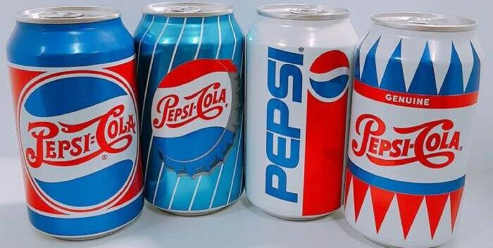
These four cans look the greatest, and embrace the Americana color scheme while being its own thing.
The 3rd can came out in 1991 I believe, but to me it looks like it should have came out in 1985, as it has a very 80s design to it.
The 2003 design with the faux-embossed lettering looked tacky and cheap. The Obama “O” design was trying too hard to be minimalistic. Maybe for some water or health drink, but for soda?
For the longest time I wondered why Pepsi didn’t embrace their roots like Coke and rebrand as “Pepsi Cola”?
Do a Google image search for “Pepsi Cola Soda Shop” for image. THAT would get me to buy their drink products. The can looks nostalgic, yet also looks like a new high-quality, local brand.
2 Likes
I’ve never understood why companies invest so much in building brand allegiance in 18-34 year olds, then once that groups ages out of the demographic the company blows up that identity in favor of something that alienates that group but appeals to the next generation. Maybe we are seeing a change in that if you can go into a store and choose Pepsi packaging from your era.
Doritos is another one that comes to mind. Five years ago they brought back the 1970s packaging for taco flavored, as a limited thing. But it’s still around, so they must have figured out there was a market for that identity.
“Come alive! You’re in the Pepsi generation.”
The grammar of “Come alive!” always confused me. I suppose it meant getting a life by drinking Pepsi. In any case, the Pepsi generation is what, in their 70s and 80s now?
It’s only my opinion, but Pepsi has always missed the mark with its dorky advertising campaigns. The campaigns were (and still are) driven by people who don’t understand their target audiences, which they’ve always assumed are easily manipulated teens and 20-somethings.

To “Come Alive” means to wake up. As in wake up to the world around you. The marketers shoulda drunk some of their own product, if that’s what they were thinking.

I remember when this Pepsi commercial first came out. I still couldn’t believe the lack of self-awareness by all those involved in green-lighting it and creating it. It came across as incredibly out-of-touch.
Here’s the can design I was talking about:
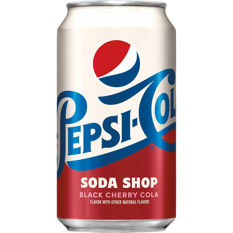
Sorry for the size, but it’s the smallest one I could find. The design is great and I personally would be tempted to give Pepsi a try over my preference of Coca-Cola with these cans. It’s just fun looking.
I get WHY the higher-ups at PepsiCo don’t want to go this route for the entire brand. They probably feel that Coca-Cola has already carved out that “classic” look for itself, so they want to distinguish themselves by doing the opposite and looking ultra-contemporary. That’s a valid approach that I’ve seen done successfully with other brands/products. Unfortunately, it doesn’t seem to work for Pepsi.
The 1973 design is probably the most distinctive and now iconic of them all. However, it kind of reminds me of branding for a gas station or oil company. To return to that is a misplaced appeal to nostalgia.
The 2008 “O” redesign comes across as awkward. I still don’t get the significance of the different shaped swashes. The font is fine, and I like how the “e” reflects the original Pepsi circle logo swash. Yet, it doesn’t match the actual circle swashes on the can. Odd.
1 Like
Yeah, that has to be one of the most tone-deaf commercials of all time. The simple act of giving the opposition a Pepsi will end the world’s ills and bring the world together in perfect harmony.
Well, wait a minute, it was Coca-Cola that taught the world to sing in perfect harmony.

I like the Pepsi Soda Shop cans, though.
1 Like
Ah, the Don Draper classic.
Not as egregious as the Pepsi one thanks to being far more vague. But personally I still find it a little too manipulative for my tastes, as it seems clear to me that it’s trying to appropriate the peace movement and probably any other activist/counter-culture movements going on at the time.
What the world wants today is the real thing (a Coke)
I mean…wasn’t the Vietnam war still going on at this point? Maybe putting an end to that would be high on the world-priority list. But yeah, I guess making sure to avoid off-brand soda-pop was important too.
It’s crazy that the jingle was so popular it resulted in two big radio hits minus the Coke references.
1 Like
Yes, I agree. Although very dated, the Coke commercial contained the right message for the time — a catchy melody, human diversity, harmony, peace, and simple human niceties, such as buying someone a soft drink.
On the other hand, the Pepsi commercial trivialized the world’s problems by suggesting that Pepsi could magically end racism and bigotry and whatever other evil people were protesting about.
Coke pulled it off. Forty-some years later, Pepsi tries to copy the same formula — catchy musical score, diverse people coming together — and totally screws it up.
The comparison is a good example of why Pepsi has always been the runner-up in the cola wars.
1 Like
Not having mainstream TV, I never saw this before. Lucky for me lol ![]()
The fact that they have a Kardashian/Jenner having anything to do with people who are struggling as though she is too and has to join the fight … mind boggling.
I think she will be ok sitting on her millions.![]()

Pepsi 1992
 (1990)")
Coke 1990
1 Like
How you doin?
![]()
Derailing the conversation, here, but there was a show called Episodes in which Matt LeBlanc played a fictionalized version of himself. I’m not sure what platform it’s on—or if it even is on a platform—but it’s pretty good. Better than this trailer suggests it might be.
 | Official Trailer | Matt LeBlanc SHOWTIME Series | SHOWTIME")
1 Like
Yeah, it’s too bad that Pepsi struggles so much in comparison to Coca-Cola. Watching that commercial again…so bad. They took a lot of heat for that ad. And it’s a shame because Pepsi was actually racially progressive before it was fashionable or acceptable.
Mack realized that Black people were an untapped niche market and that Pepsi stood to gain market share by targeting its advertising directly towards them.[31] To this end, he hired Hennan Smith, an advertising executive “from the Negro newspaper field”[32] to lead an all-black sales team, which had to be cut due to the onset of World War II.

A 1940s advertisement specifically targeting African Americans, an untapped niche market that was largely ignored by white-owned manufacturers in the U.S. A young Ron Brown is the boy reaching for a bottle.
In 1947, Walter Mack resumed his efforts, hiring Edward F. Boyd to lead a twelve-man team. They came up with advertising portraying black Americans in a positive light, such as one with a smiling mother holding a six pack of Pepsi while her son (a young Ron Brown, who grew up to be Secretary of Commerce)[33] reaches up for one. Another ad campaign, titled “Leaders in Their Fields”, profiled twenty prominent African Americans such as Nobel Peace Prize winner Ralph Bunche and photographer Gordon Parks.
When I found out about this history, maybe 5-10 years ago, it made me want to support Pepsi products over Coke, even though I liked Coke better. I would have thought it would have been a far better approach at the time of that Kendall Jenner ad to instead make a big commercial celebrating black American accomplishments, history and culture throughout the decades, in the same vein as those 1940s ads. A slice of Americana, while appealing to people who support protesting police brutality and racism, without exploiting or appropriating the protest or protestors themselves.
And DON’T use a big celebrity or model as the face of the campaign, but regular Americans who belong to groups underrepresented through our history.
@Joe
I’m not a fan of “sex sells” advertising, especially when it involves little kids ogling over an adult supermodel. Tame by today’s standards but still not appropriate, imo*. But the old school song, small town backdrop, combined with Cindy Crawford in an iconic look was at least successful in what it was trying to accomplish. And it features one of the better Pepsi designs.
*I didn’t watch till the end. Haha. “Is that a great new Pepsi can or what?” I didn’t see that one coming. Maybe not quite as inappropriate as I thought.