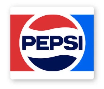
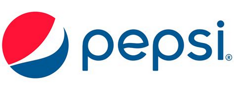
Pepsi is updating its logo again. This time, they’re heading back a few years to bring back something similar to their old logo but with updated typography.

Pepsi is updating its logo again. This time, they’re heading back a few years to bring back something similar to their old logo but with updated typography.
Good … I didn’t care for the latest one … at all ![]()
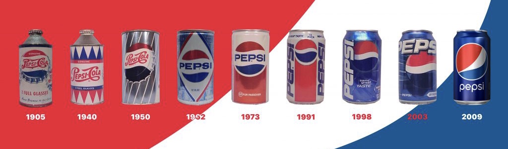
even BBC also changed its logo, and Now pepsi is doing as celebrating 125th anniversary.
Simpler and more readable, or dumbed down with zero design input or interest depending on your perspective.
I hate it - looks like it could have been done by a flat-earther.
They went back to their 70s look.
I guess I automatically realized it was a throwback. I forget that some aren’t as ancient as me and might not have realized this is a vintage Pepsi look ![]() I much prefer it to what we have had for a while now.
I much prefer it to what we have had for a while now.
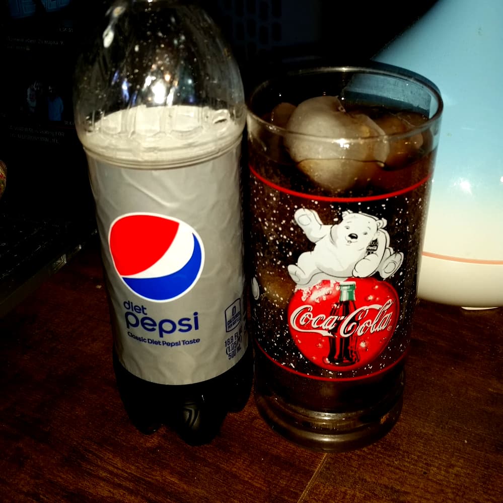
Diet Pepsi is my go to drink when I want something stronger than tea ![]() But, I’m also a rebel … I drink it out of a Coke glass
But, I’m also a rebel … I drink it out of a Coke glass ![]()
from all these
I would go for this in black and white
or the original from 1950 if the blue part looks that blackish
Pepsi has never had an iconic logo like Coca-Cola, but I’ve never liked or understood their logo from the past several years — the circle with the mismatched swooshes. I like this new retro logo much better, even though it’s still not all that great. I’m mostly a Dr. Pepper drinker, anyway.
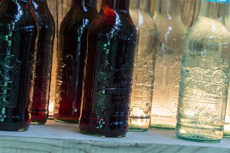
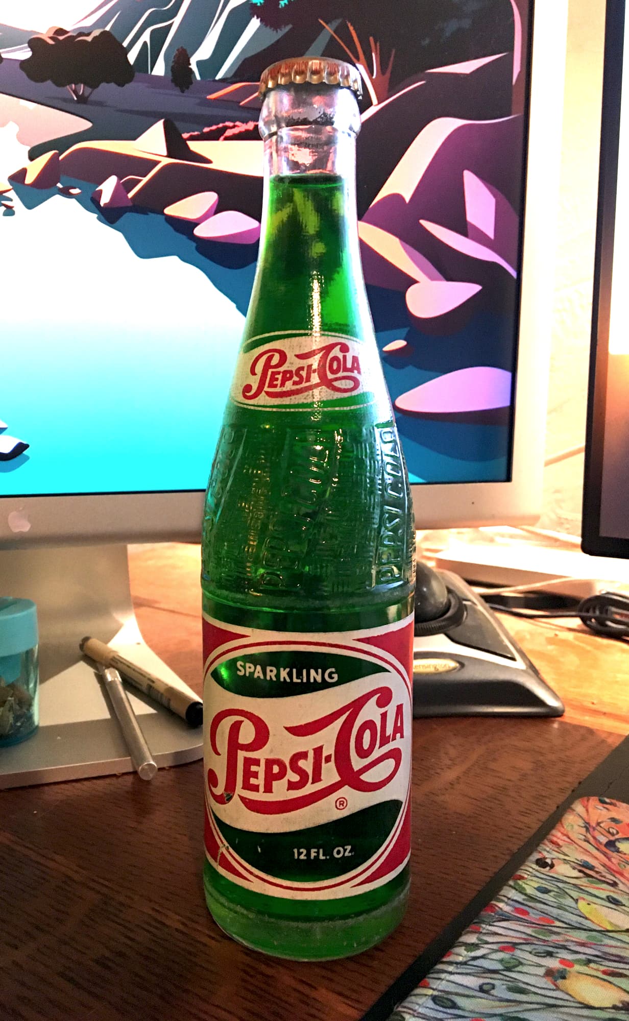
When I was a kid, I found this half-buried bottle of Pepsi in Utah’s west desert while tagging along with my dad. I never did open it, but I kept it because it was already old when I found it. Over the years, the contents have turned green for some weird reason.
That is a pretty neat find! ![]()
Green?
OMG, dude, don’t open it.
It’s probably hazmat by now!
![]()
It’s called strong tea.
I drink mine literally black.
Nope .. can’t do black .. milky and sweet for me ![]()
I used to love black coffee .. but it didn’t like me after a while ![]()
I echo the same sentiment: am not a Pepsi fan either, it tastes like watered down Coca Cola with some suger in it.
The new logo is an improvement.
Not sure WTF they were ever trying to do with the previous logo, how did they even arrive at this choice of typeface and all lowercase too:
![]()
I prefer Pepsi to Coke
There! I said it!
I don’t notice a vast difference in taste - Pepsi is cheaper at the moment, so I buy it. If coke goes cheaper, I’ll buy that.
New logo - don’t care about this.
All I want is a mixer for the rum.
Quite an interesting development)
on a side note, those are some awkward curves on that logo, especially where they join the “circles”.