I think their old logo could have used some tweaks, but it seems their redo threw away what works, kept what didn’t work, then tweaked the typography to make it look as unfriendly, uninviting and as unpet-like as possible.
I will say the guys comments on the right are pretty terrifying. I mean, I know it is most likely “internet bluster”, but threatening to burn their store down because of a logo change is IMO, the sad state that we are in.
Was not familiar with Petco or what they do when I initially saw the logo and my first impression was that maybe they’re a wholesale supplier of pet products and that their clients are other pet-related business, I think that would make sense. It’s all very corporate-like for a business selling direct to consumers.
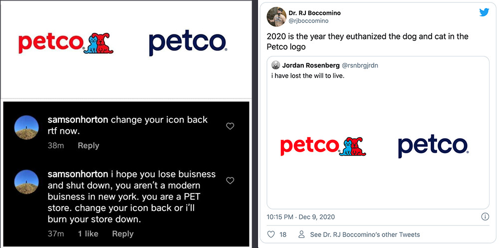
Obviously they are trying to simplify with the rebrand, I just don’t know why they wouldn’t just drop the animals mark and retain the rest.
The name ‘PETCO’ already sounded super corporate. Removing the dog and cat and modifying Century Gothic as your logo just makes it more so. Congrats Petco, you’ve upgraded your image to appeal to everyone.
This new style is cool, however, more creative thinking could’ve been done to consider modernising the cat & dog on the new logo. Such a shame, but still clean and modern in my option.
Oof yea not a fan. I agree with @terzdesign that the name has always been corporate sounding… so I didn’t care for it. Having the dog and cat in the logo was unique and cute which helped to balance out the corporate feel. But now, oh man. Full corporate.
@Smurf2 Thank you for supplying the Fact Sheets link. After quickly clicking through it feels like they are trying to market themselves as Health and Wellness . They literally have it as part of their logo on that page. Plus the color scheme is white and blues everywhere. With this in mind I guess I see why they wanted a logo change and now have some insight to the thought process behind it… but I still feel their final product is inappropriately cold.
I really disagree with clients who suggest that their logos ought to be visual portrayals of what they sell. I could be wrong, but I think the cat and dog logo, when combined with the the name, said pets in general — dogs, cats, fish, hamsters, iguanas, guinea pigs and whatever else they sell supplies for.
This new logo suggests nothing but sterile, lifeless coldness — the exact opposite of what a retail store catering to animal lovers should be.