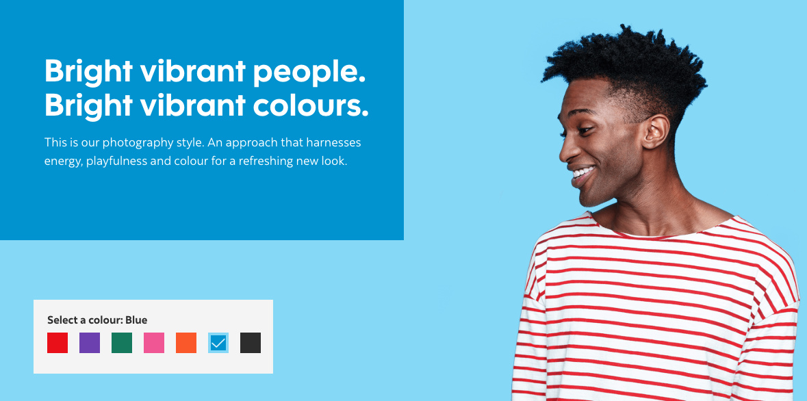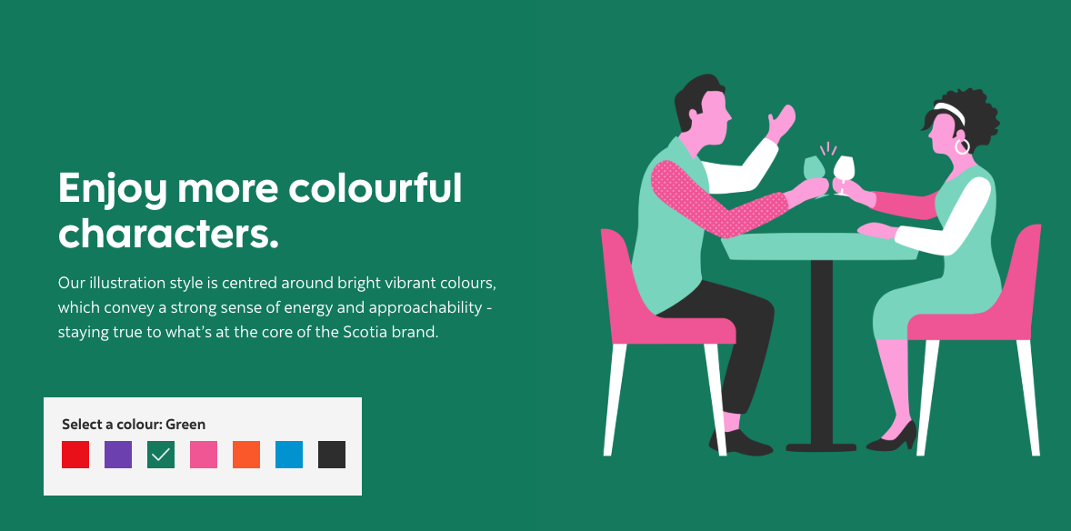
A modernized look for a digital-first world.
We created a colour palette that’s accessible to everyone, a logo that’s always recognizable and working in spaces both large and small, and a style that speaks to our brand as a whole.
A modernized look for a digital-first world.
We created a colour palette that’s accessible to everyone, a logo that’s always recognizable and working in spaces both large and small, and a style that speaks to our brand as a whole.
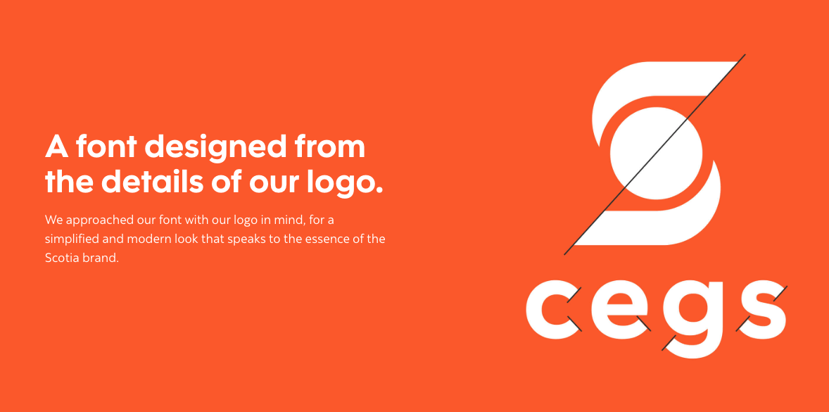
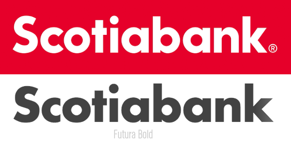
They claim to have designed a company typeface based around “the details of our logo.” Well, OK, some of the logo angles match those in some of the glyphs, but personality-wise, the logo shares little in common with the typeface. What I think really inspired their new company typeface was Futura Bold.
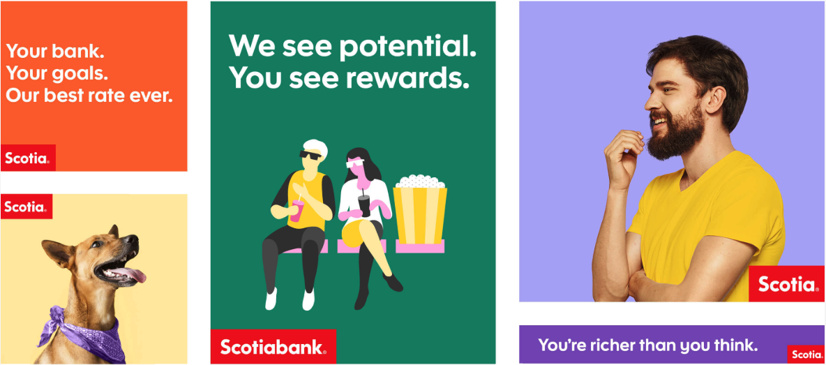
One thing this rebranding demonstrates nicely is that, despite all-too-common assumptions, logos do not make visual brands. They might be their centerpieces, but the real work lies in designing all the details relating to personality, consistency, uses, adaptability and, in general, thinking through, researching, planning and executing the entire visual identity and guidelines associated with all of it.
It’s this bigger, broader-picture that separates a $100 crowdsourced logo from a $100,000-plus visual rebranding. It’s also why I don’t worry too much about the crowdsourcing sites. One-off logo designs aren’t now and never were the road to a successful design career.