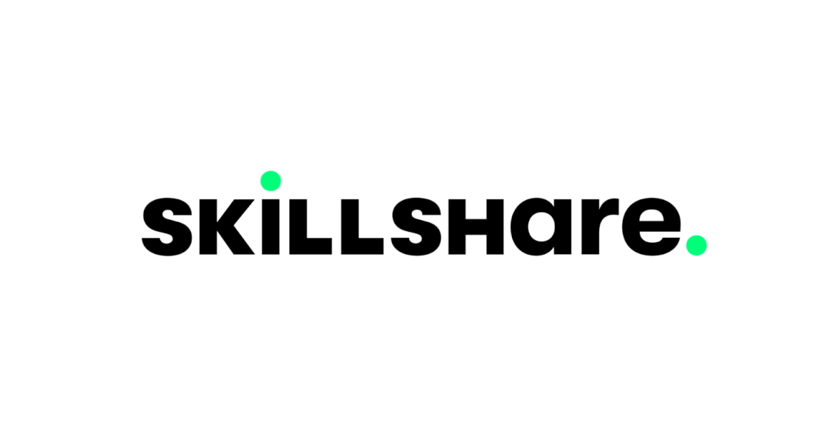
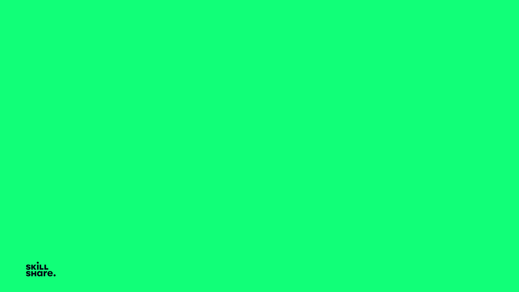
Skillshare is an online learning community. Over the last decade, it has encouraged the kind of creative exploration that furthers expression, learning, and discovery. Now, the company is introducing the next step in Skillshare’s journey: a new visual identity that more clearly illuminates and embodies the mission to inspire discovery through creativity.
Well, I have only been awake 5 minutes, so I hope there is some significance and thinking behind the mixed up uppercase/lowercase. I mean it doesn’t do anything for me visually.
I suppose it does something to make it more memorable, but that’s only if people notice it in the first place and most people won’t.
Mixing the cases was a popular thing to do back in the '70s and '80s.
The accent color is gutsy given that it’s only reproducible in RGB, yet they went with it anyway. Their entire public presence is online, so I suppose it works for them most of the time when it really matters. I wonder if they just use a duller CMYK or Pantone version of it for print.
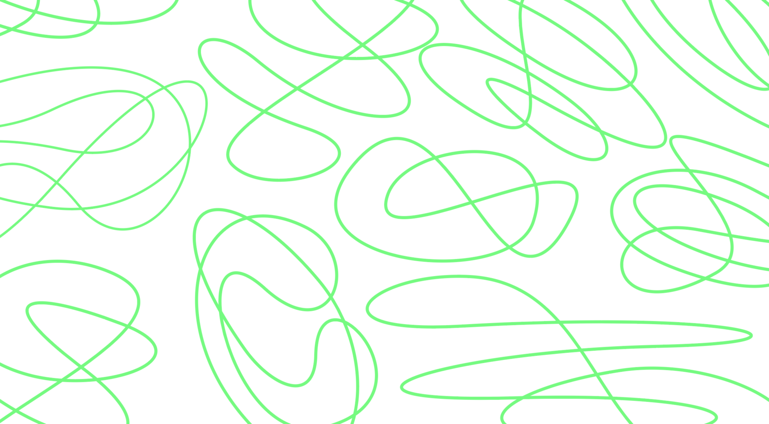
I have mixed feelings about the scribbles over the logo.