Hello everyone, I’m new to this forum but I have been designing for over 20 years (honestly wish I would have had this forum in my early years). I’m also new to the type of work I’ve taken on to help a friend (designing Vehicle Car Wraps) I have mostly only worked in cosmetic package designs and renders. I mostly work in Illustrator for my logos and other designs but my client wanted me to design a logo that looks embossed and metalized and so I made this (LARGE - 60"x20" 300dpi) logo in Photoshop. I saved the logo as PNG and dropped it into Illustrator where I am designing the rest of the background and other vector graphics, but the problem is that I am designing on the template given to me which is 1/20th of the scale it will be (he tells me that he scales up 1000%), so then when he enlarges everything to correct size the PNG of the Photoshop logo I made then becomes pixelated. I want to know if how Im creating the PS logo is the proper way of doing this, or should I be doing something different? thanks in advance for an advice.
I’m not sure where to start since there are several issues.
Higher resolutions (for example, 300ppi — not dpi, as you mentioned) are useful for printed materials meant to be read at arm’s length. The higher resolutions provide enough detail to keep the image sharp. However, when printed materials are meant to be read from a distance, such as a billboard or the side of a van, the resolution can be lower since they only need to be sharp when seen at a distance.
I don’t work in large-format printing, and I’m unsure of the optimum resolution for vehicle wraps, but let’s say it’s 120ppi. Up close, at arm’s length, 120ppi is a little blurry, but from 20 or 30 feet away driving down a road, it will look sharp.
Designing a van wrap or billboard at the actual physical size would be unwieldy and, depending on the software you’re using, might not be possible. The solution is to make the art smaller and have the printer enlarge it when it’s printed.
In this case, when using Photoshop to build the artwork at, for example, half the size, you will need to double its resolution to 240ppi. When the printer subsequently prints the artwork at twice the size, the resolution will decrease back to 120ppi.
In large-format printing, an artist commonly prepares the artwork at one-tenth of its finished output size. However, doing this means increasing the resolution by ten times so that when it’s printed at the final size, the resolution will scale back to the desired resolution of the final printed piece.
You said you’re using a 1/20th-sized template and that your friend says he scales it up by 1000% for output. However, he would need to scale it by 2000% to bring it back to the desired size. You need to clarify this with him. If he scales up 1000%, you need to work at 1/10th the size, not 1/20th.
There are forum members here who work primarily in large format, so they might correct any errors I’ve made and be able to explain things better.
—————
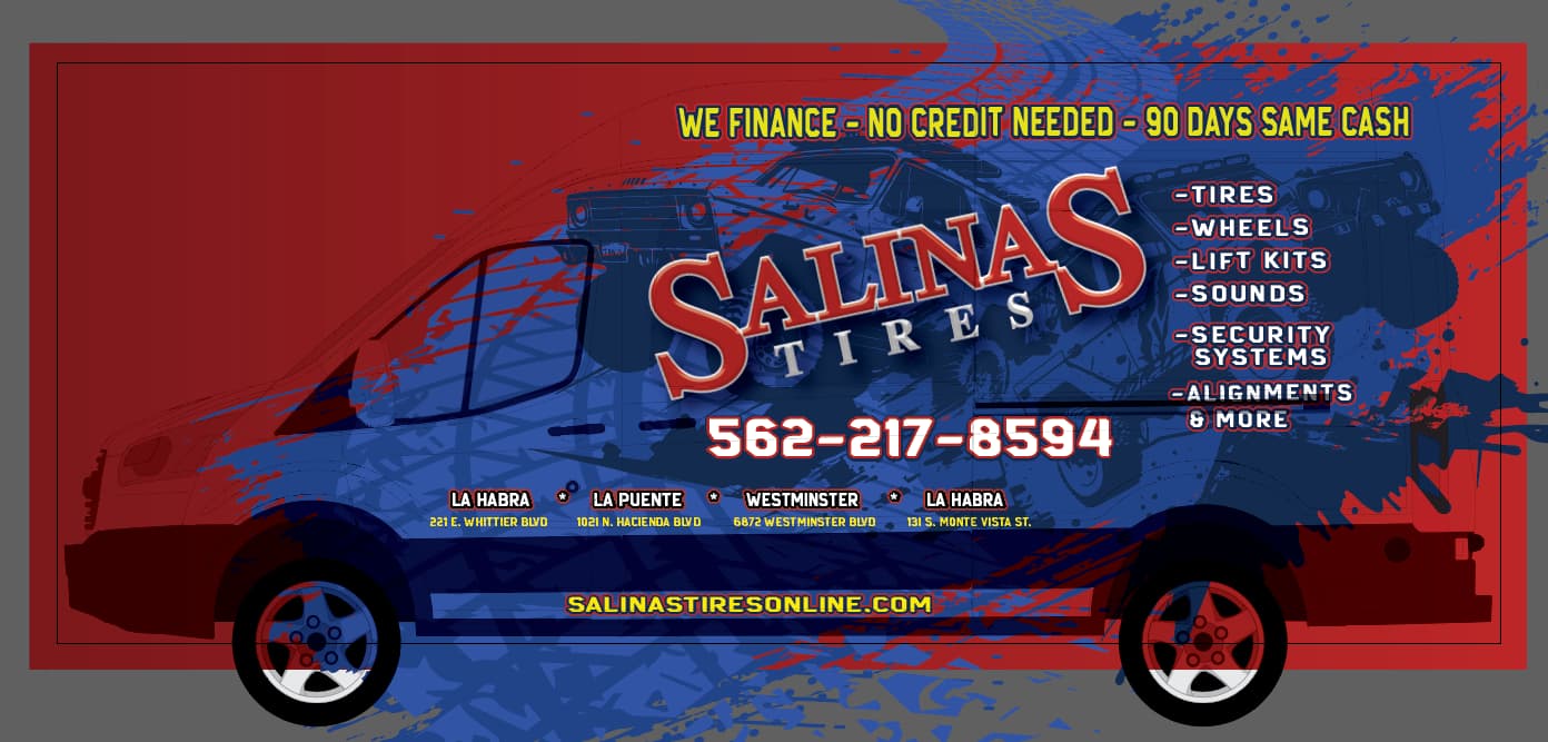
As I mentioned, I don’t design vehicle wraps, so someone please correct me if I’m wrong, but I don’t understand your template. Is the van in the background the non-printing template? If so, why does your artwork — including the name of the business — extend beyond the edge of the van? The name of the business seems to end at the top of the van, but have you considered that the van’s side is rounded at the spot where the side turns into the roof? In other words, the last part of the name will print over the rounded corner, which I suspect you don’t really want.
Is the logo you mentioned the logotype that reads “Salinas Tires?” If so, why are you building the logo as a PNG file instead of a vector file? If, as you wrote, you’re building the background pattern as a vector file, why not build the entire thing as a vector file? Do that, and you won’t need to worry about resolution. Unless there’s something I’m not understanding, there’s no reason whatsoever that the logo, the typography and the background can’t be composed solely of scalable vector elements.
The best way to save from Photoshop to retain the sharpness of the letters is as a Photoshop PDF.
Keep your layers as Text - and apply the filters as smart filters.
Then place the PDF as a link into Illustrator.
Then you can always edit/tweak the photoshop PDF in photoshop afterwards.
Saving as a PNG completely flattens the entire file - plus PNG is a web format (but ok to use for print in some scenarios) - being a web format it’s only RGB - even though it has capability to embed a CMYK profile - it’s not for the feint-hearted for print.
By saving as a Photoshop PDF you can retain your text layers so it prints sharp edges for the text. Only the Effects will be pixelated, and that won’t be very noticeable (hopefully)
As the size of your artwork is scaled up - the resolution goes down
60 inches is about 1.5 meters
- and your design is 300ppi
At other sizes
Small Van / 2 meters
229 PPI
Medium Van / 2.5 meters
183 PPI
Large Van / 3m
152 PPI
Jumbo Van / 3.5m
131 PPI
Jumbo Plus Van / 4m
114 PPI
I’m as confused as @Just-B
What’s the logo?
Is it Salinas Tires?
If it is - then all those effects can be done in Illustrator.
You could create that logo in Ilustrator and place it as a .ai file into the layout.
You just need to increase your document raster effects PPI.
It’s not in English but you can find loads of these videos

I presume the Tires/Wheels text is the back panel and he rear of the van.
You should be careful about type going over door cracks, try to design around them.
There’s a lot of text and the website is in the least noticeable place and likely obscured by traffic/kerb parking etc.
I’d keep the locations as such, why full address?
Move the main address up - ditch the actual physical location just the area
Then make the website large underneath the areas
I’d rethink your approach to 3d effects logo in photoshop - you can do that in Illustrator.
Or save as Photoshop PDF and keep all your text layers.
As B pointed out, there’s a scaling issue. 1000% is 1:10 scale, not 1:20.
For a vehicle wrap,
150ppi is optimal at final size.
100-150 with good art will get you good results.
Below that, for a good look, I wouldn’t recommend it.
When you are working at 1:10 scale (for 1000% output) your raster file ppi should be 1000 to 1500ppi
Logos should be vector.
.png files are not for print, but I bet you are using it for the transparency. You can use a .tif with transparency preserved. 60x20 in photoshop is not “large.”
Commercial vehicle wraps are technically billboards. Don’t crap up the message with a lot of extra crap. Multiple outlines, glows, very busy background art etc don’t help on a commercial vehicle. The idea is to sell the service, not see how many elements you can cram into a design.
Smurf is right about keeping anything useful above the wheel line. Where it looks like this van has a black plastic skirt, I’d be leery of wrapping over that anyway. If it’s any kind of HDPE, the vinyl won’t stick.
And remember, large format graphics is never an exact science. Applying them even less so. If you run text too close to door grooves, handles, trim, heavy (deep) grooves or other elements, there’s a good chance the text will fall into it. You have text running over the door groove ("alignments & more) on this one. Vehicles also don’t have straight lines. New vans these days tend to swoop either up or down. The panels on them are not parallel to the ground. If the grooves of the panels are marked in your template (they usually are) be aware of how off level something may look in comparison.
1 Like
Also this is one of my favorite “Wrap Fails” lists:
If you are just getting into the vehicle wrap sector, there are many helpful videos on Youtube.

There are also ways to “stack” your vinyl components ( raster image for your background, vector vinyl cut for your text components and solid colors).
1 Like
yeah, I’d trust a video where they didn’t proofread their own copy.
Vetearn and owend operated???
![]()
3 Likes
I don’t fix typos on supplied copy.
Never have, never will.
2 Likes
If I see them, I point them out. Cuz I don’t want to have to peel that crap off and redo it.
1 Like
LOL!!!
I didn’t even catch that when I posted the link!
I use it a chance to point out they supplied and approved it that way.
Then I can use it as a chance to build a relationship, yes we can get it fixed but it will cost, and usually get it done for them for a good bit cheaper.
Sometimes we even let them spread the repayments over x amount of jobs in the future if it’s quite pricey.
Most are happy with this.
We do try to make sure it’s right, but sometimes things get through the gaps.
and we’ll do what we can.
But they have to pay more, which is nice for me.
WOW! thanks everyone. I’m sorry it took so long to reply but thank you so much! I learned a lot with just these replies. I feel like a beginner with this knowledge but it’s worth checking out all those things and figuring it out the right way. I was able to finish this project with very few problems, once I built the logo in photoshop (in the correct size and ppi) and dropped it in as a PDF the pixilation was fixed but then once they put it thru their printer it would give them a white very transparent box around the logo frame (am I supposed to flatten the transparency?) Not sure if it matters that their final output is saved as an EPS. Anyway they finalized it as a Illustrator file and it didn’t give them that box.
@Just-B As for your question about building this logo in Illustrator … Im not too sure how to do this. Yes there is lots of videos out there but nothing that would make it look exactly like this. Can you advise as to how you would build it? would it be with filters?
I appreciate all of your replies. The van template obviously doesn’t print but I dont know how to show the template without turning off that layer so I just made it with a multiply filter so I can still see the lines and locked it in place. this is so that I can see where everything lands on the van with door handles/key holes etc) If anyone knows a better way to do this please advise.
Thanks again ya’ll.
-Lo
Perhaps I’ve misunderstood your question, but I wonder if we’re using different definitions of the word logo. To me and most (if not all) designers, a logo is a unique symbol or stylized wordmark used on all the organization’s visual communications as a consistent visual representation of the organization. Think of Apple’s apple logo, Nike’s swish logo, or Starbucks’ mermaid logo.
In your situation, the logo (if one exists) would be the word SALINAS TIRES that you’ve typed out in a serif typeface with an outline and a 3D bevel on the word SALINAS. The background patterns on the vehicle wrap wouldn’t normally be part of a logo.
The SALINAS TIRES logo and the other typographical elements on the wrap could easily be built in Illustrator as vector objects. They could also be left as live vector elements in Photoshop, but that’s another problematic issue. In this case, the huge benefit of vector objects is that they’re scalable without losing resolution and becoming blurry.
I wasn’t suggesting building the background automotive/tire collage in Illustrator; that would be too time-consuming and not worth the effort. Photoshop would be a better tool for that.
@Just-B Yes I think we both understand what a typical logo (like apple) is, in this case Salinas Tires is what they consider their logo, yes its just type with a bevel and outline, but they consider this their logo (and the only thing I built in Photoshop) everything else is vector and has no issues as it is scalable without loss. I was just referring to how would you build this “Salinas Tires” with the 3d bevel in Illustrator? Would that be with filters? I tried using filters in Illustrator and I have a hard time with the controls and just get frustrated. Anywho, thank you again.
Ahhh, I see. Thanks for clarifying. You’re right. Illustrator has some less-than-capable 3D tools, such as Extrude and Bevel (results below), and I’ve never had confidence in them making it through the RIP without being rasterized first. I have very little use for the appearance of bevels and tend to avoid them in all but the rarest of instances, so my experience is sharply limited. There are more complicated ways of producing 3D appearances in Illustrator, such as the one @Smurf2 mentioned earlier in the thread, if you need something that makes it worthwhile.
I am impressed that you built the background in Illustrator.

This topic was automatically closed 365 days after the last reply. New replies are no longer allowed.