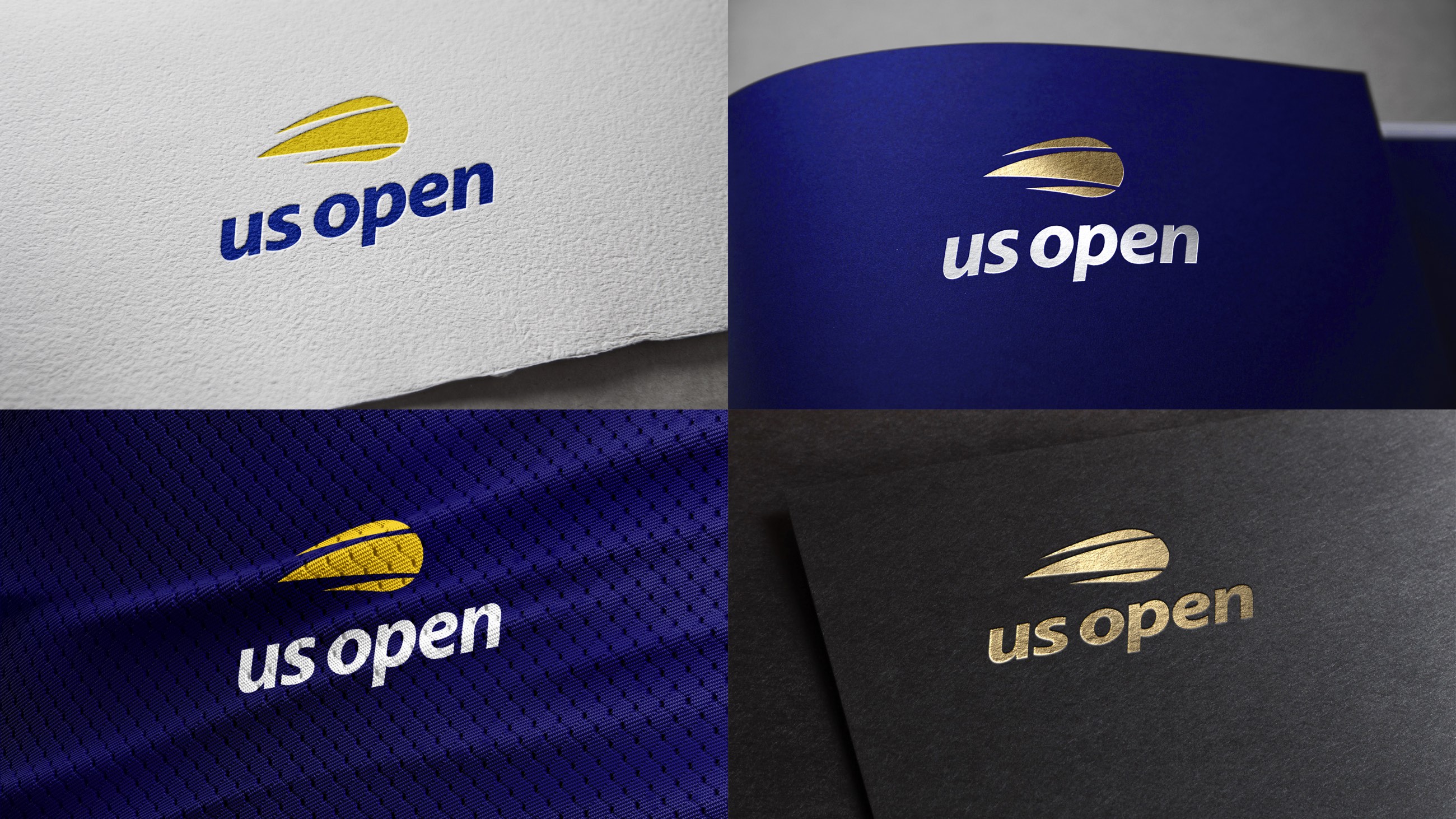
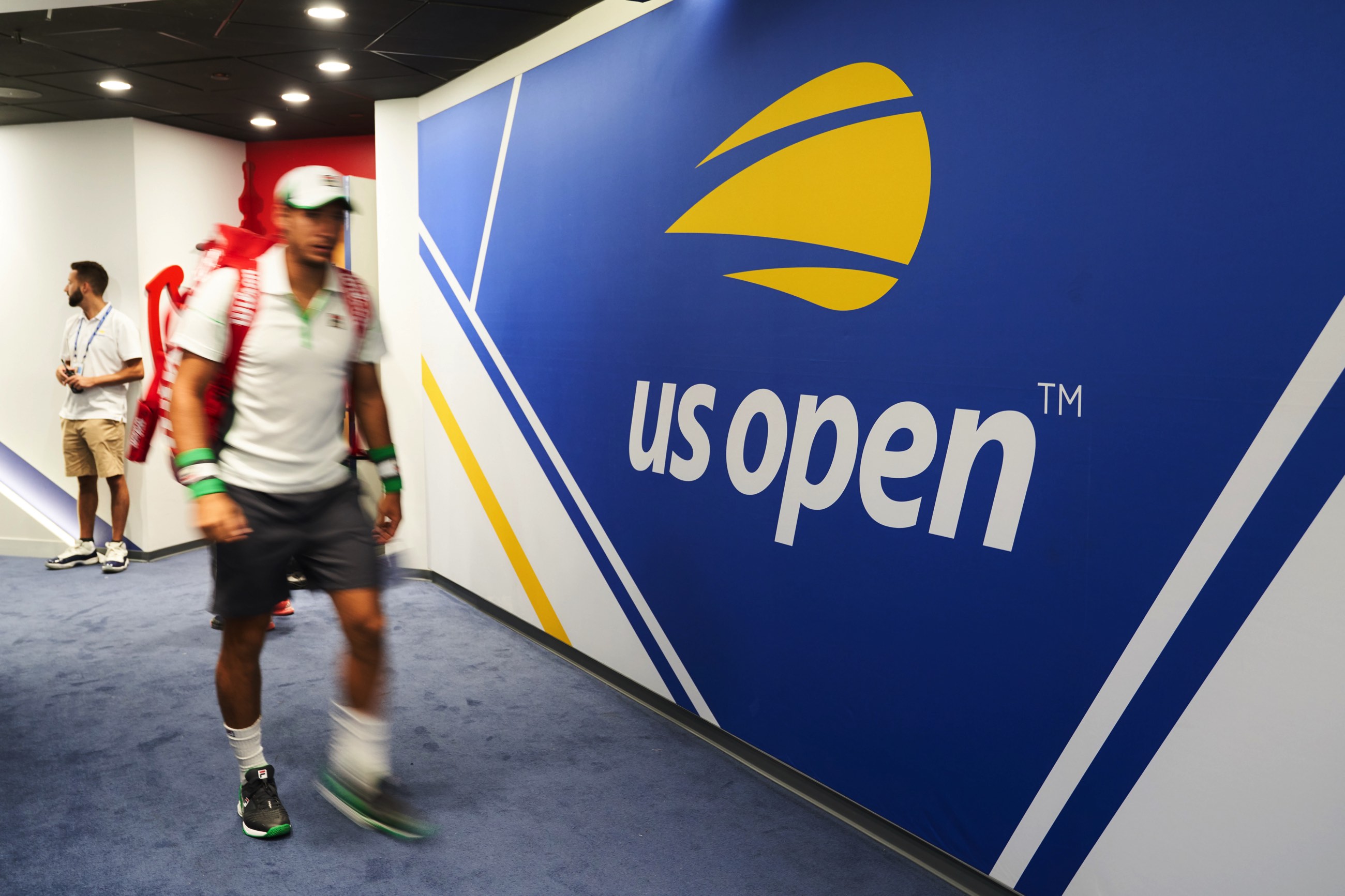
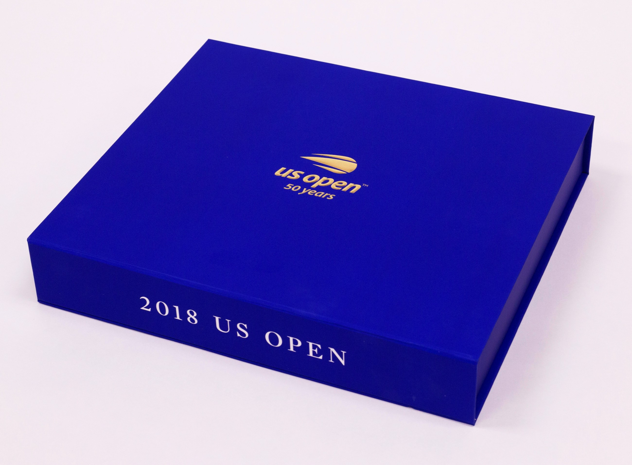
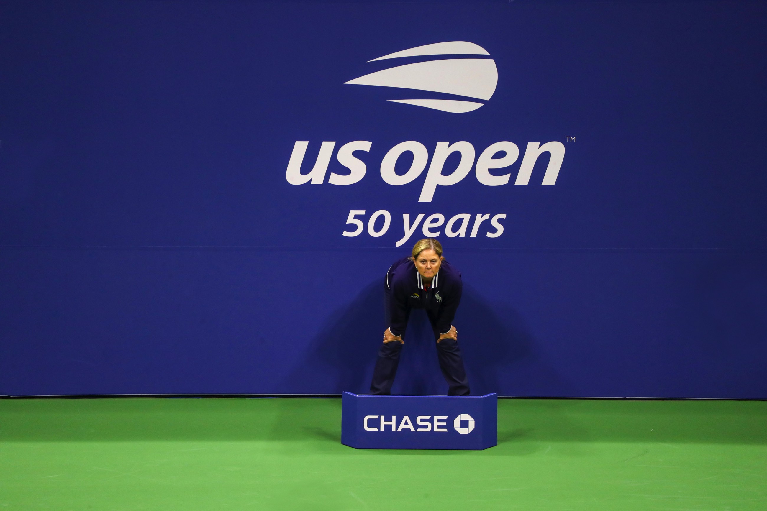
US Open Visual Identity designed by Chermayeff & Geismar & Haviv.
1 Like
Compared to the old logo with the flames this is kinda boring and static. Granted the flames were a bit dated, they still mighta come up with something a little more lively.
1 Like
It’s a tad underwhelming and reminds me of like a car rental company. I dunno, I don’t have much negative or positive to say other than that on first glance.
I guess they went too safe with it.
The logo feels like so harsh , may needs more dynamic elements…