New Visual Identity For Donald Russell

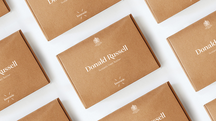
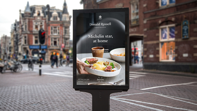
Award-winning Donald Russell appointed Conran Design Group to create its new visual identity. Launching today, Britain’s leading mail-order and online butcher, needed a new visual identity and brand refresh to attract new customers online.

The challenge was to create a brand experience that would appeal to consumers who care passionately about the provenance of their food and are motivated by taste and sourcing. The objective being to retain the loyalty of existing customers, while attracting a wider audience.

The creative solution had to bring the brand’s existing positioning, ‘Scotland’s Finest Butcher’, to life, while reflecting the personality and values of the business with a new logo and visual identity (colour palette, photography style, tone of voice, typeface, visual language).

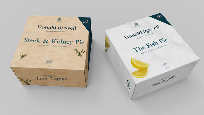
Conran created a visual expression of the positioning that combined appetite appeal and a sense of passion for the art of master butchery. As well as a visual identity toolkit, Conran defined how this would work across all brand communication channels including, website, acquisition materials and packaging, supplying creative assets and brand guidelines to ensure consistency across the roll out. In addition, Conran ran brand training days with the marketing team and its partners, to ensure best practice during implementation.
2 Likes

It’s lovely work, but I’ll pass on the steak and kidney pie.

Nice work, but honestly, if I lived in Scotland, I’d likely end up starving to death.

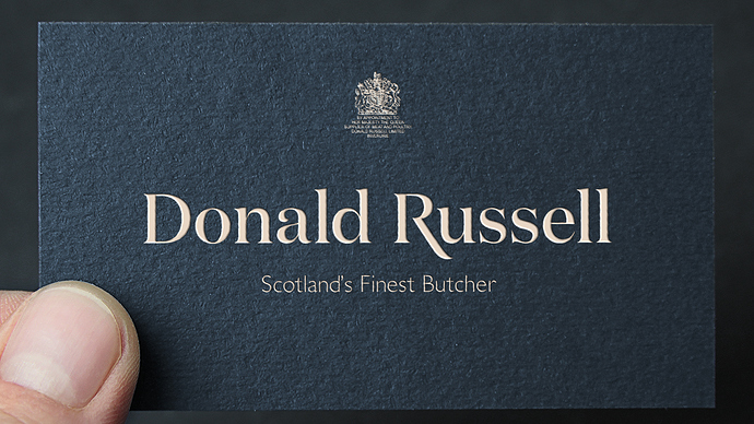
The coat of arms looks like a smudge on an otherwise nice piece of work.

I’ll bet this guy’s steak and kidney pie is prepared correctly and very good. If done right, it doesn’t have that horrible smell some associate with cooking kidneys.

Plenty of oatmeal in Scotland B. I think they use it for everything. Breakfast, mixed with other things for stuffing or as a side dish. You wouldn’t starve. At least not quickly.

All the same, I’m not a big fan of eating organs.

I like oatmeal by itself with a little milk and brown sugar.

I’m much less fond of it when it’s mixed into Scottish haggis with ground sheep heart, lungs, liver and kidney fat before being cooked up with onions as a spicy pudding inside an animal’s stomach and served with a side dish of turnips and tatties. :nauseated_face: :face_vomiting:

My apologies to anyone from Scotland. It’s a beautiful country, but geeech, I’m keeping a good distance between myself and kidney pie and crappit heid.

Far from being a “smudge” considering the demographics. Heraldry is still extremely important to a decent portion of the populous, but it is even more important than that. The fine print says, “By Appointment to Her Majesty the Queen…” Which besides being a pretty significant endorsement means that they are one of the few merchants that hold a Royal Warrant to supply goods to the royal family themselves.

I took grfkdzgn’s comment as referring purely to appearance in the context of its role in the visual composition. I’d agree it’s set too small given its intricacy and significance.

1 Like

Well then …time to rebrand. Hand it over to Megan.

In graphic design terms that royal heraldic smudge is bad form …especially when most everything else within that composition is clean and crisp!

Royal example of why not to scale down an image!

“…time to rebrand.” You’re just being silly right? It is not actually part of the branding per se.

Bad aesthetic form maybe, but Royal Warrants are good function. And you will find that nearly all Royal Warrant holders (at least those who produce goods with packaging) include the mark in an almost identical up top smudgy manner. (Some even hold more than one like Penhaligons ) In fact it serves as a very important part of their brands value recognition. Clientele actually expect it to be there, and acts as a functional design element that greatly increases value perception and authenticity.

I would think you would be hard pressed to find any design agency in the Common Wealth that would not begin to drool all over themselves to be given the opportunity to put that Royal smudge on one of their clients designs.

Royal Warrants are not the coat of arms of the company but rather that of the Royal authority who granted the appointment. Nobody who understands the significance of having the Queen of England’s, Prince of Wales, or Duke of Edinburg’s royal mark on a product would ever call it a smudge or even have the slightest thought of getting rid of it. And it is not just a English thing. You will find the same coveted treatment in some other European countries, and Australia.

Just do a quick image search of such brands like Twinings, Johnnie Walker, Prestat. Also brands well known in the USA carry it on their common wealth packaging. Nestlé, Heinz, Schweppes, or even my favorite sauce Tabasco. (image below)
SY879

No, I’m not kidding. What’s the point of having such weight given to a royal warrant’s mark and then render it illigible? It’s not just poor form, it reflects poorly on those who have granted the royal warrant themselves and the rich histories there of!

Clearly (pun!) Japan’s many many kamon symbols, some of which are just as royal as any Common Wealth or Euro nation etc., are far superior in their design!

Time to rebrand …why not?

Yes, but what’s the point of any of this antiquated royal malarkey, anyway? Crowns, weird costumes, palaces, pompous titles and everything that goes with it seems a bit silly it today’s world, but…

It’s only nonsense to someone who doesn’t appreciate the tradition and the history behind it. Whomever came up with all this heraldry stuff and continues to perpetuate its complexity and ornate detail obviously didn’t take their cues from modern designers who value function over form.

But really, that’s sort of the point of it all. It’s a tie-in to a long history of what makes the British, well, British. People like it, and whether or not it’s a bit anachronistic in a 21st Century world is, in some ways, all the more reason for it to exist.

And if people like something, and if it means something to them, that illegible royal smudge actually has a practical business purpose since it confers legitimacy, prestige and an acknowledged place in British society.

As Americans, we’re not even immune to this stuff. Our ancestors fought a war to rid ourselves of it, yet our very own Meghan Markle, who has now been given the silly and ostentatious royal title of “Duchess of Sussex,” has been headlines in the U.S. press for months.

On one level, yeah, a silly, illegible royal smudge is an awfully poor bit of design to put on a business card. On another level, though, even I — someone three generations removed from my English ancestors — wants it to stay just like it is.

1 Like

Really? What exactly makes them “far superior?” This is not to say I don’t appreciate them. Many are quite aesthetically pleasing, but the history behind them is much more appealing to me. But “far superior in their design?” Just a quick look at the page you linked to reveals that many Kamon symbols suffer from the same issues, also having fine details that are lost or fill in at small sizes.

On the other hand, Japanese have had a special corner on design for centuries. The design of nearly everything from packaging to furnishings to architecture reflect the generally subtle and unpretentious beauty that flows out of Zen philosophy. Still in nearly everything you can clearly see their homage to tradition, and carefully rendered compositions respecting aesthetic principles honed over generations. In large part it is this respect for tradition and history that makes Japanese design so exceptional. When used in marketing and packaging it also has little to do with “branding” and more to do with cultural relevance.

Similarly this the reason why designers in the UK would choose to use a heraldic mark that might not fit perfectly in some composition. It pays homage to the history and tradition and relevant to the culture of the people they desire to appeal to. That is precisely what makes including the royal warrant of appointment Good Design. Much of the criticism leveled at the re-branding craze is because of a “us too” ideology, young CEOs wanting to be trendy, and dismissing the valuable history and tradition that their brands already carry.

I suppose it’s a language gap here, but you do still seem to have interpreted the word “smudge” differently than I believe it was intended.

Had I said “smudge” about this (the chances are reasonable I would have if I wasn’t beaten to it), there would have been only literal physical meaning—an unintelligible bit of inky, smeared print—strictly an assessment of the printed output. Obviously, it could be misinterpreted, particularly by a European reader I suspect, to mean a “smudge” on the reputation; a negative blot on the brand image, in terms of perception.

So still and again, prestige and other forms of significance aside, I’d say the graphical quality of now also the Tabasco example is just horrible looking, quite worse even than its appearance in the Russel branding. Does not a clean and properly scaled version of the graphic exist? If it’s so important, why is it given such poor treatment?

Well, obviously …no illegible (superfluous) text.

And secondly they far few elements.

And thirdly they use solid composition techniques such as the use of contrast.

That Tabasco royal smudge is hideous! And it’s a shame because there’s a lot of awesome going on with that composition …especially with the link chain and all.

I agree the use on the Tabasco sauce is hideous, looking like it was just thrown on last minute and almost an after thought, which seems strange considering how much attention they generally apply to their product design.

Anyhow I did not mean to ruffle feathers. My main issue was pointing out that true design and/or marketing goes beyond visual aesthetics, and also makes an appeal to culture and tradition. No doubt the royals themselves would be hailed by the design community if they sought to simplify their warrant mark. But then again heraldry contains a lot of symbolism and history in its own right and is not all that easy to simplify. But the “By appointment…” text could likely be condensed to one line or go altogether.

I am generally concerned about the current trends to modernize everything to a point which at times seems to approach the near sacrifice of all that once was good true and beautiful in our American culture. (Unlike it was suspected,I am not a “European reader” :smiley: ). Whether good or bad our history is a great factor in who we are. Knowing where we came from is important to understanding more clearly where we are going or want to go. I see history as sort of an anchor point for society and culture, to cast it all away to the point of forgetting I fear will eventually result in “running upon the rocks” and repeating the same mistakes again. I see no good coming from tearing down old landmarks, changing old names, essentially erasing the past.

Perhaps there are identities that are begging for a re-branding, but I appreciate very much when a re-brand takes place that pays homage to the culture and histories that made it successful in the first place.

1 Like

I totally agree!