Created by Pentagram, it’s the company’s third new logo in 10 years—and hopefully a true fresh start.

https://www.fastcompany.com/90407757/yahoo-has-a-new-logo-again
Created by Pentagram, it’s the company’s third new logo in 10 years—and hopefully a true fresh start.
https://www.fastcompany.com/90407757/yahoo-has-a-new-logo-again
I’ve never met anyone who uses Yahoo. I like the logo but they might be running a bit behind the facts though with their new design.
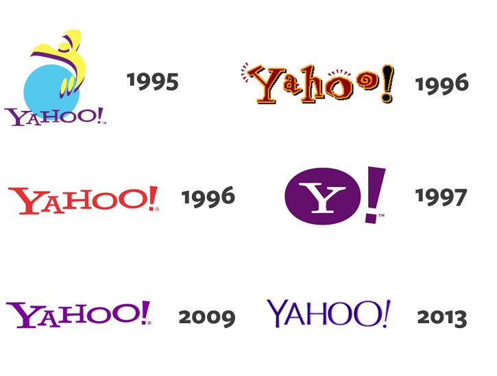
That 1996 one ![]() brings back memories
brings back memories
I had a Yahoo credit card when they first came out. The psychedelic purple one. They had stupid low interest rates for the longest time. I always liked handing that to cashiers. They always laughed.
This new logo doesn’t inspire any kind of laugh.
Now you have lol … I used it for many years before Google took over the internoobs ![]()
I started out on … gasp***** AOL
![]()
Nice to meet you ![]() oh I remember AOL. Never used it though.
oh I remember AOL. Never used it though.
This logo is looking so different than the previous logos. It is going to interesting to see what they are going to do. The logo looks nice and clean.![]()
The 2009’s redesign is so different from 1996’s logo ![]() Everything new is well-forgotten old
Everything new is well-forgotten old ![]()
Verizon emails are now all AOL, never used them before 2019. lol.
I used to use AltaVista as web browser, damn proud.
And I still like the Y in a circle one best.
Yahoo meant a lot to the early days of the web, but today it’s a shell of it’s former self. It blew my mind that Alexa rankings said that Yahoo is still within the top 10 most visited websites online… which I think is largely due to some ISPs making it a default homepage for customers.
The new logo looks great, but it does lack the personality of the classic 1996 logo. The way they kept the slanted explanation point is obviously a nod to the original.
Yahoo still hosts a crap ton of emails too.
This is great news to me because while it’s a pretty standard logo, fairly charming but nothing special, I HATED their 2013 logo. It was very uninspired and seemed like a very weak over-modernization with no personality. But on the other hand, there’s no way they could go back to the classic look in this day and age - it just looks way too dated. So their new logo seems like a preferable option.
New logo looks really nice, I like it the best.