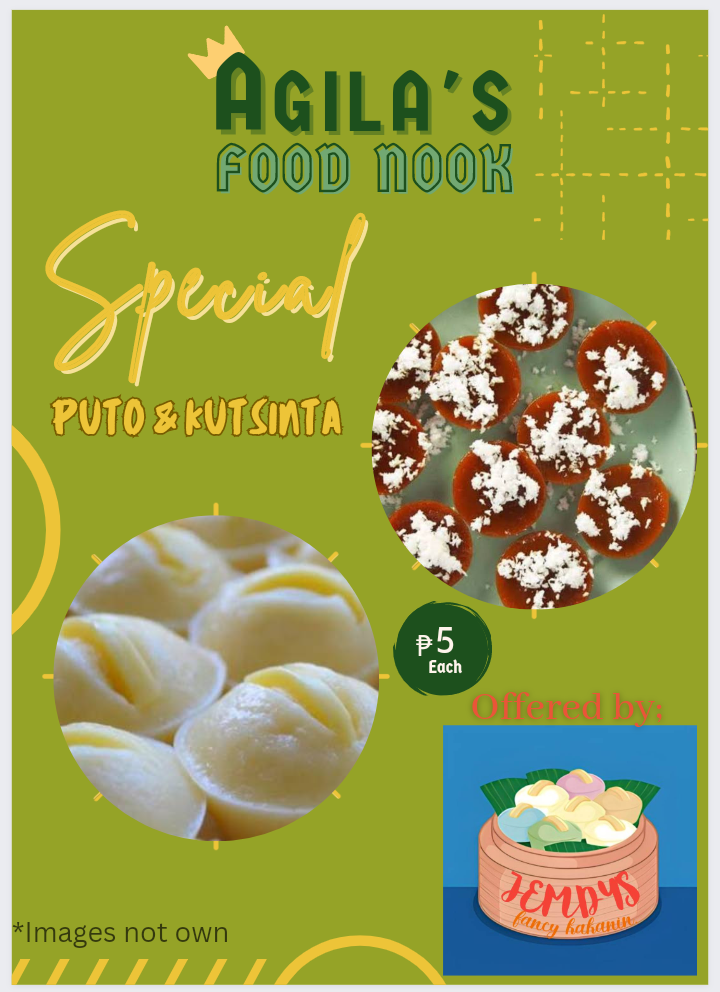
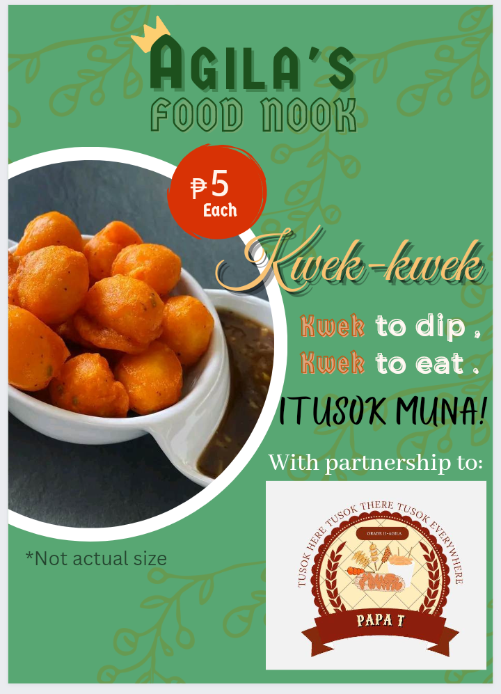
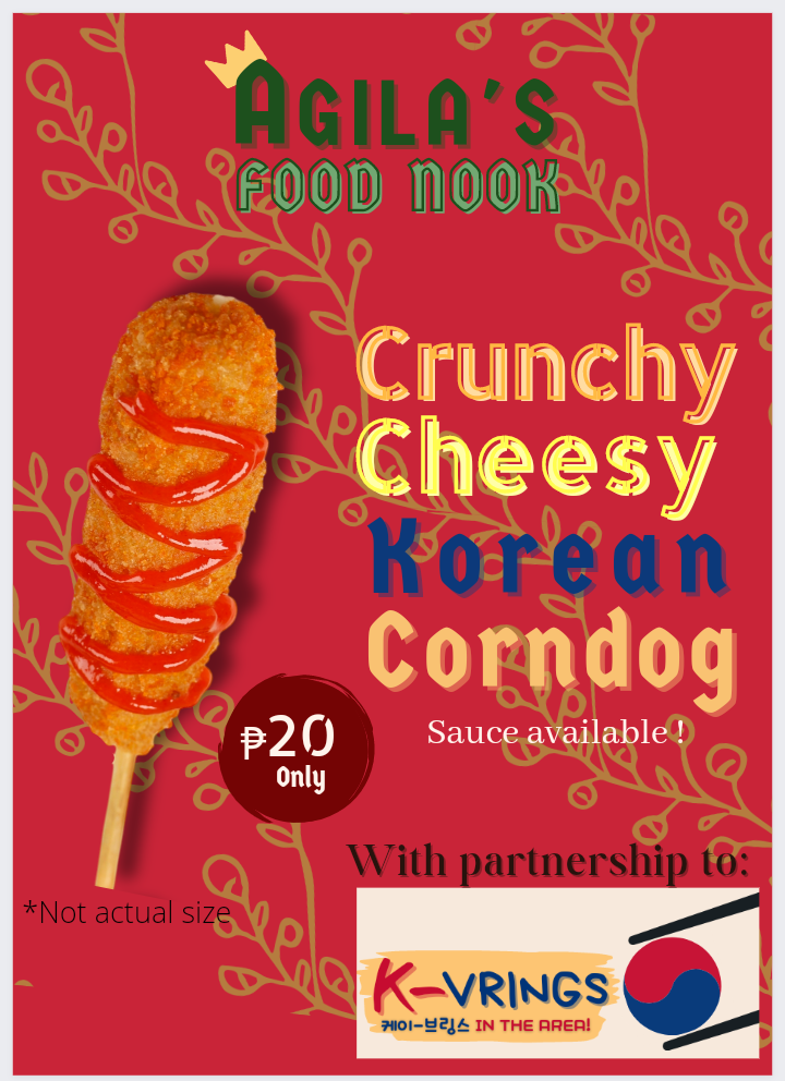
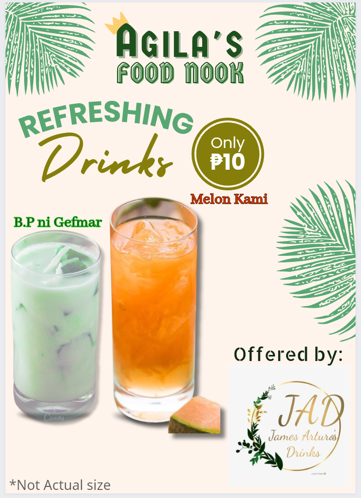
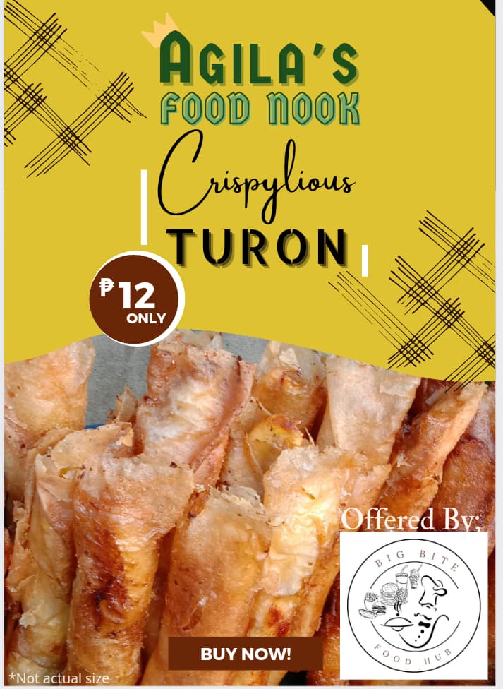
Hello everyone! I’m a high school student, you can below are the food advertisement I made, as part of our school project. While creating this poster, I find it fun to do, which makes me dream to pursue graphic design as a career. That why I post this, looking for feedback and open to any criticism from everyone. Your feedback will greatly help me to improve, thank you in advance. *The poster contains few Filipino words. Some of the logo’s in the left bottom are not design by me.
I was just scrolling though the forum and saw your post. A few things
Firstly, you need to learn a bit about typography. I’m self taught so I don’t know how your course is structured but if you haven’t yet learned the basics of typography, you can check out my post here to get yourself up to speed on the basics. The main problem in the poster is that:
- You’re using a lot of fonts. Stick to 1 or max. 2 fonts
- There’s no proper hierarchy of the text. What is Agila’s Food Nook? Is it the logo or the title? Also the sizing of the text is off, such as when you mention the partnerships, you should make that text small almost like a placeholder because it’s not the main element on your poster
- Contrast. Some of the text blends in with the background which makes it difficult to see. Use contrasting colors such as black text on white background etc. Currently you’re using text that is too similar to the color of the background like yellow on green
Secondly, there are some issues in the layout
- Everything looks congested. Right now, the elements on your poster are too tightly packed together, you should give your design some space to breathe. Make some of the elements smaller and place them apart leaving some white space in between
- Hierarchy. There’s no logical order of the images or text. Look at this poster from the other person’s perspective. What’s the first thing you want them to see? What’s the main focus of the poster? Is it the images of the food, the logos, the partnerships? You can guide the viewer’s eyes by sizing elements differently and making them stand out in various ways
- The images you used are fine but there should be a proper border to separate and “lift” them from the background. Right now they just seem to be awkwardly placed around.
Finally, make the logos smaller. There’s no need for having such huge logos as they just look big and bulky and don’t contribute much to the overall design.
All in all, you’re in high school, you have all the time in the world to learn and experiment, so keep it up! Hope this helps
1 Like
This topic was automatically closed 365 days after the last reply. New replies are no longer allowed.