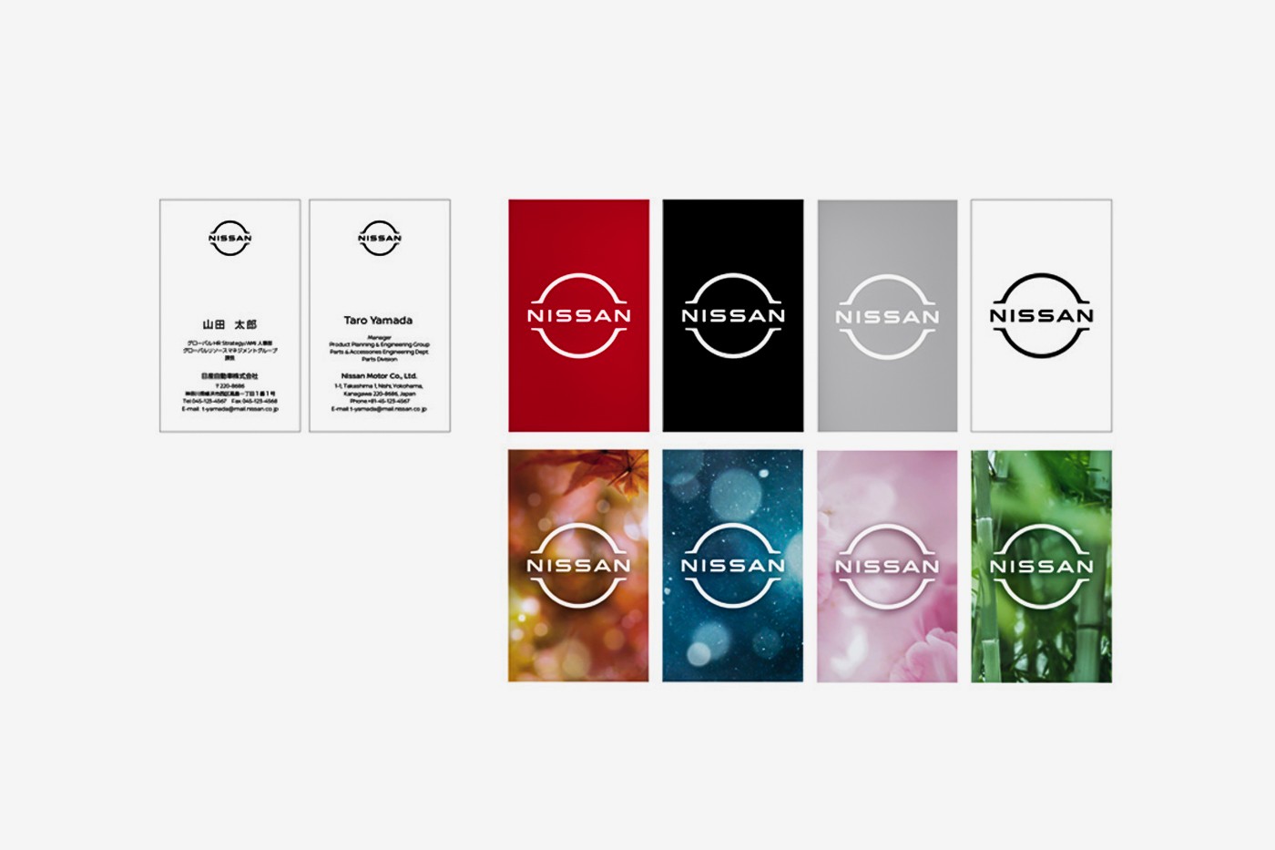
The Nissan badge’s physical identity was adapted for the digital world.
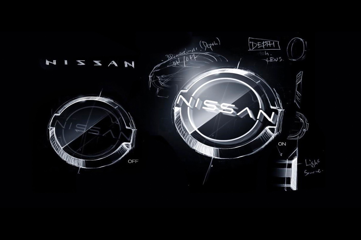
https://d3nuqriibqh3vw.cloudfront.net/a_new_day_for_nissan.mp4?1evZ4XA2KFlpkCl7M8.vUgB.vNZ1wsr6
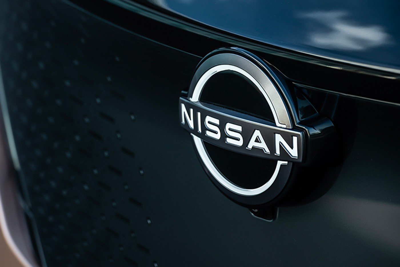
The Nissan badge’s physical identity was adapted for the digital world.
https://d3nuqriibqh3vw.cloudfront.net/a_new_day_for_nissan.mp4?1evZ4XA2KFlpkCl7M8.vUgB.vNZ1wsr6
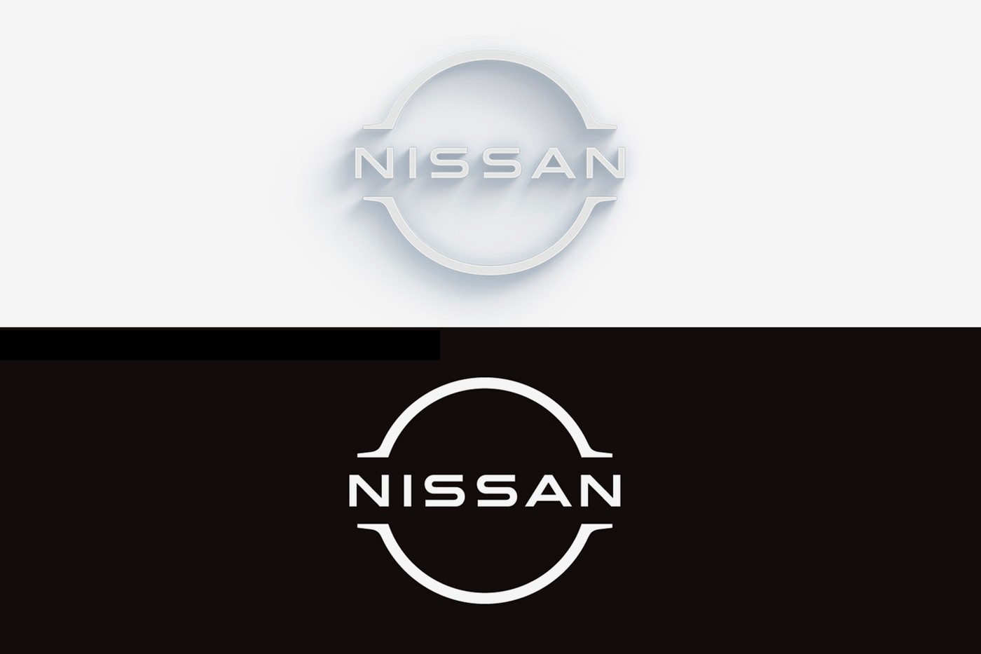
I think it works nicely on the physical badge, and the lighted version will be cool until a month later when everyone is doing it. The relatively flat on-screen/print version leaves me . . . well, flat. But then, I’ve never been a fan of the flat graphics trend. I’d say flattening and simplifying a graphic for the sake of “the digital world” is sort of a backward notion.
Somewhat off topic; I’ve owned several Nissans, including 2 currently, and I would say their heightened attention to “the digital world” might be a good thing, considering the embedded software that runs the subsystems (info-tainment, locks, lighting, etc.), in their vehicles is what I like least about them. I also own a Honda Civic which is rather superior in that regard.
I haven’t owned a Nissan since my Mighty Max truck in the late 80s. A Ford Ranger after that one was a step up. Now they are just too expensive for the quality they are. I’d by another Toyota truck in a heartbeat.
I bought my third Nissan, a new 4WD Nissan Frontier, about four months ago. It was less expensive than any other four-wheel drive pickups I looked at. The Nissan Xterra that I traded in had 140,000 miles on it and was starting to have a few major parts fail, but after that many miles, I think I got my money’s worth.
As for their new logo, it’s fine, I guess. It’s just a modified version of their old logo, which seemed to come in a dozen different versions. This new logo seems to be just another variation that I probably wouldn’t have even noticed.