can you give me a feedback of my nouveau art poster, it was an assignment in my college.
2 Likes
Was the assignment for the “poster” to simply illustrate you understand how to machine-imitate the Art Nouveau style?
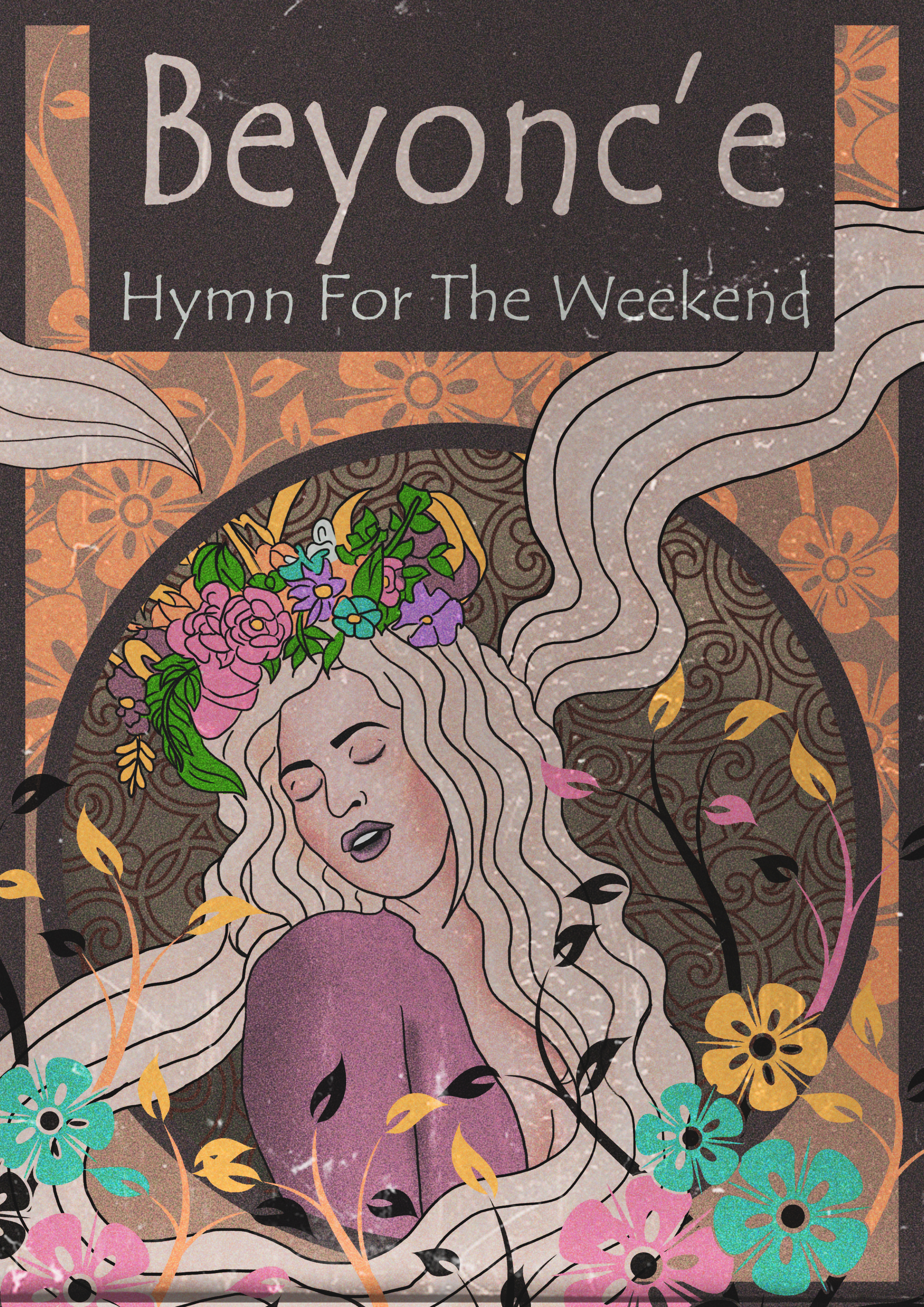
You’ve pretty much done that, sort of with your background motif. The line art on the singer is not quite right. Explore varying your line weights a bit, more in the manner of comic art or an engraving than something done on a machine.
As a graphic design assignment, a poster should have to communicate a message, not just be a pretty picture. What is your poster communicating? Pretend I have no idea who the singer is. What is your call to action?
I agree with PrintDriver’s comments, so I won’t repeat them.
In addition, you’ve placed the diacritic in the wrong spot. That diacritic is called an acute accent (in French, Accent Aigu) and it goes above the e, not before it. In French, it changes the sound of the e to more of a long a sound. (Why someone from Texas would spell her name in French, I have no idea.) Also, there is no space before the é.
Art Nouveau (never Nouveau art as you called it — more borrowed French) was a popular decorative style of the late 19th and early 20th centuries that had its roots in the William Morris Arts and Crafts movement of the mid-19th Century. Imitating this style using modern, digital drawing tools seems a little odd given its historical roots and the philosophical underpinnings of the Arts and Crafts movement.
There’s more to illustration and design than making nice-looking things. I don’t know anything about your college or your assignment, but if the assignment was to imitate a style from the past, I suspect part of the assignment was to research the style itself. By research, I don’t mean just looking at a bunch of visual examples. Instead, I mean doing that and researching the movement itself, what it was, what it meant and how it came to be. You need to understand and appreciate historical styles before you can successfully borrow from or imitate them.
And for this particular assignment, you also needed to do a little bit of research into French spellings and accent marks.
When it comes right down to it, I’m not critiquing the aesthetics of your work — it looks nice. Instead, I’m critiquing something important you seemingly neglected — sufficient research.
1 Like
Shouldn’t this be it Crit Pit?
Anyway, the circle around your figure, the box surrounding your type, and the frame are NOT art nouveu. The whole point of the style is to make it seem like a flattened organic form. It didn’t just get placed there, it “grew” there. These geometric shapes are not coming off as organic to me, and I’d reconsider them.
Thanks for your feedback,
yes the assignment was to imitate art nouveau .
I know that I cannot perfectly achieve exact imitation of the style using a machine, however, your comment about the lines weight (to draw them more like comics) is so right and I was thinking about it myself but I didn’t do it. I will redesign it.
Thanks again.