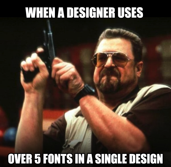
Rookie mistake to use too many fonts in a single design work. It makes the end result look like a mess, even if you use beautifully designed typefaces. In my experience 2 typefaces is sufficient for any work: one for display text and one for body text. There are very few cases where you need to introduce a third one. For example a script for quotes, or monospace for code. Thoughts?
3 Likes
I totally agree.
There are always exceptions, but in the absence of well-defined reasons for doing so, one or two typefaces is usually about right, along with italics of each as needed and some possible weight changes.
I also think it’s usually best to keep the number of weights used within a typeface to a minimum. Again, there are exception. Switching to a condensed face within the design, even if it’s the same typeface used elsewhere in the same design, ends up introducing an entirely new look, which is pretty much the equivalent of adding a new typeface.
1 Like
I sort of take exception to that “rule.”
Mostly because a lot of the stuff I work on is far more broad than a single page focused ad or campaign.
For instance a museum exhibit, even a smallish one may use 3 different display typefaces for various purposes under an over-arching theme. Then there are all the various treatments of text hierarchy under that where the rule does follow not more than 3 typefaces with bold and italics added where needed.
I’ll try to find some photo examples later.
I don’t see it so much as a rule as it is a rule of thumb, which, using my definition, means it’s a good place to start and, in the absence of compelling reasons to do otherwise, is usually the safest bet.
In larger, multi-piece, designs, like a book and its cover or a magazine or some of the things you mentioned, I think the rule of thumb still applies in the sense that the fewer typefaces used, the better and more cohesive everything will be.
For example, the dust cover of a book is different from the guts of the book and requires a different treatment that typically requires using different typefaces. So in this example, even though the cover and the inside of the book might be regarded as one thing, in reality they’re two separate designs with two separate purposes that support one another.
Rules in design are there to be broken, definitely.
I’ve pulled a few examples.
https://thehermitage.com/visit/exhibits/
https://www.peabody.harvard.edu/node/971
https://www.nationalmuseum.af.mil/Visit/Museum-Exhibits/Fact-Sheets/Display/Article/198082/wright-brothers-1901-wind-tunnel/
for packaging, I try to keep it to 3 or less. 2 for the design, 1 for legal copy.
Imo, when you are using 4+ fonts for the design, you are letting the fonts dictate the design - when that happens, if you lose a font, you actually lose part of the design. I think it should be the other way around, determine the design and choose fonts that can be seamlessly integrated or removed/swapped out without impacting the look.
Similar to that, I tend to think in terms of the personality and emotional qualities I want a design to have, then choose typefaces that compliment or can take on those characteristics.
1 Like