Currently im intern at a company in the marketing department. I need some help, with removing an object from a picture. Tried myself serveral times without sucess in PS. It gets too obvious the Logo from the picture has been removed.
I tried with clone tool, and also “Fill” - And even both xD
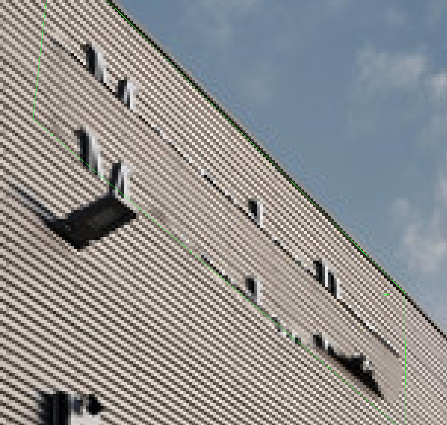
I have uploaded the picture i need help from you guys!
I need to get removed “Mercedes Benz” Logo, from the building!
If anyone can make this work for me i would appreciate it very much.
If you have any inputs on how i get this away perfectly - links to guides or other, it would be lovely!
If this is something you need to hire a designer to do, feel free to post a Classified - Be sure you leave an email where you can be contacted for payment info etc.
If you want to be a high level designer, start learning!
This won’t be the first time you’ll be asked to remove logos from images (which I’m assuming you are doing for trademark reasons of some sort - or reselling/re-leasing the building, LOL)
Out of all the methods mentioned - Vanishing Point in the Filter tools - and using the clone stamp in there - works pretty well and the best of I’ve tested
Watch the video @Smurf2 posted again. It is not just the clone tool. It is using the clone tool within perspective. If you follow the video, it should be a fairly easy edit.
And while it wouldn’t be fun, if you really had to do it to look perfect, since the lines are pretty “geometric”, even though it would be a monotonous beating, you could redo that area by:
filling the area with the logo with the background wall color (giving ample “extra” area around the logo
making selections that match the perspective of the lines and fill with color matching the current lines
Finish up with the marks running vertically
If you go that route, I’d recommend keeping each of those layers separate for easier fine tuning.
Once you do all of the above, you can place all of those adjustment layers into a group, and add a feathered layer mask to the group so that your layers don’t have a harsh edge. By feathering it your redrawn lines would blend more seamlessly.
Not perfect, but with a little more effort, it could be passable.
Twenty minutes of work mostly copying the section beneath the sign, then pasting it over the sign and using Image > Transform > Distort to shift everything into position and correct for the perspective differences. Then using the lasso tool set with 30-pixel feather to blend the edges. Some selective dodging, burning and adjusting the vibrancy. Finally, cloning all the bolts into place, which took longer than anything.