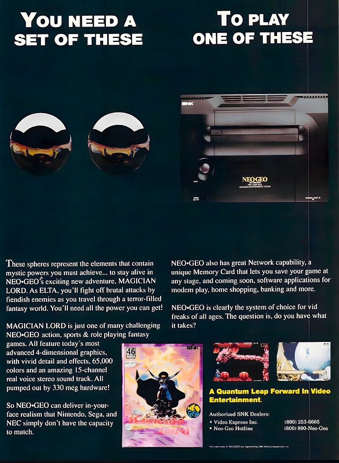
As I am preparing my designs for you, I decided to share an old design from SNK NeoGeo and how they attempted to sell the expensive console to the public. The NeoGeo is one of my favorite all-time game consoles and it is still one of my favorites (even though I don’t own one), but I am curious, and I would like to share a design from them to see what you think about.
Some wonderful graphic design came out of the 90s. This is not an example.
Thanks for your feedback Steve !, I am just curious what do you think about this Design. For me is not “great” or impactful but I would like to see what do you think.
I believe critiquing someone else’s work is against forum rules, so I’ll let the mods delete this if it isn’t copacetic. Since it is for educational purposes and it’s an old piece, maybe this will fly.
The type is terrible. A real small caps font was not used for the headline. The kerning of the headline needs work. The small, reversed, serif font isn’t working.
I don’t think the copy is very strong or well written — headline or body copy.
The black product on a dark background means the product doesn’t stand out. The balls, save for the reflection of the light at the top, blend into the background.
The spacing is off.
Overall, it’s low energy and boring, and I doubt it played well with the target market.
The headline is inacurate.
It says you need a set of these to play one of these.
But the copy says you need them in the game.
So you don’t need the steel balls to play the neo geo.
You need need steel balls to play the game.
You could play the neo geo and other games without them.
Forgive an ageing cave-dweller: Those are balls?
Back to the cave I go.
I agree with the others; the print advertisement isn’t well-designed. The product photo is lifeless and terrible. The balls don’t look like balls, and their sexual reference is obtuse, a bit crass, and uncreative. The typography in the small caps headline is awkward. The text is full of jargon and unengaging to anyone who isn’t already familiar with the product or wants it. It’s the kind of ad that most people would skip and not even remember ever having seen.
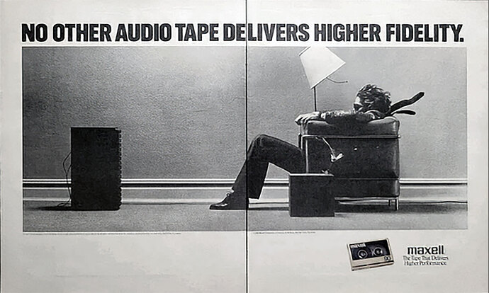
Off the top of my head, I can’t think of many print ads from the '90s, but here are two from earlier decades that I think were pure genius for their time and impossible to ignore.
I really appreciate the design of Volkswagen and the concept behind “Think Small”—it’s amazing! Thank you all for your feedback. My main goal in seeking your input is to learn from each of you and apply your insights to my own designs or when reviewing other designs here.
Know someone who did a similar ad for an old company I worked for. I wondered where she got the idea … now I know!
The indents and runts on the VW ad are killing me. Very 1960s.
Yeah, the body copy typography is pretty awful in this example. Volkswagen ran with this campaign for over a decade, so there are probably better examples, but a quick search turned up this one. On a side note, the Think Small campaign boosted the visibility of Herb Lubalin’s Avant Garde, making it one of the most popular typefaces of the '60s, '70s, and '80s.
The VW logo could be bigger, clients say.
“Think Small.”!


