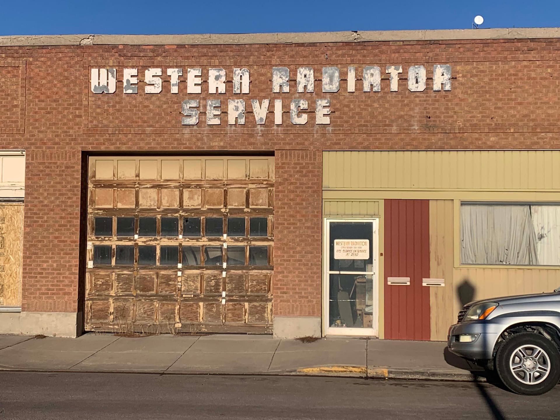
I’m always looking at old, dilapidated signs and wondering what typefaces are on them. A friend sent me this sign from Pocatello, Idaho. I have no idea what typeface it is, but I’ve checked all the automated font ID sites. I even quickly drew better copies of the letters to upload with no luck. The N or n has me stumped because it’s narrower than the others and is lowercase.
4 Likes
I’d wager that’s just handmade lettering by someone who has absolutely no idea about stroke weights and stresses. It’s all over the place. As you say, that n is a bit of an odd one too. Why would you do that?
3 Likes
I got nothin’
![]()
Looks like something out of the 50’s. I couldn’t find anything either. And can I just say how I loathe titles in caps with one lowercase letter. It’s painful for my eyeballs ![]()
3 Likes
I’m going to go with either hand cut on a band saw or made from some other sign lettering that was just laying around someone’s shop. And I say bandsaw cuz someone got lazy about doing all the counters.
“Hey, we got all the letters in caps, except for the N, but we have this lower case N. Should do the trick, right?”
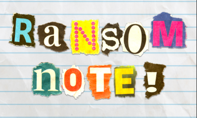
It’s kinda funny we have so many recuts and duplicate letters for signs we build, I have a box of them. I’m sure I’ve contributed to many pained eyeballs when I let the shop guys take what they want for house numbers, or whatever, LOL. Can you say “looks like a ransom note?”
3 Likes
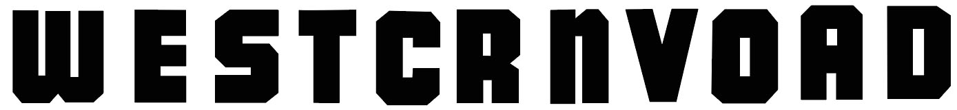
A quick search through my archives turns up a number of similar somewhat condensed heavy weight typefaces and many of them feature the odd lower-case “n”. I wonder if that was done because a normal upper-case “N” would have taken up more room and been visually larger and darker than the rest of the letters (with the exception of the “W”)?
For instance M23 Hydrant Special
4 Likes
When they spell their kids’ names for their bedrooms, I think that’s the look they are aiming for anyway. Never heard any complaints. ![]()
1 Like
I know this isn’t relevant but, what nice brick!
2 Likes
M23 Hydrant is pretty close. It even has the odd lowercase N. I suspect Hydrant is a newer version someone put together as a revival of some obscure old typeface.
I’m sort of intrigued by these old signs. Enough have survived from the '40s and '50s to still catch my eye when I see them. I’m guessing the letters on the radiator shop sign were cut out of metal by the owners of the radiator shop. They’re crude enough to look homemade, but the letters show enough sensitivity to suggest they were based on a real typeface.
2 Likes
It is sort of relevant to why I’m intrigued by these old signs on buildings. There’s so much about them that shows that someone at one time really cared, even though that care and effort has been obscured by subsequent neglect over the years. The garage door, for example, it’s literally falling apart and hasn’t been opened in years.
3 Likes
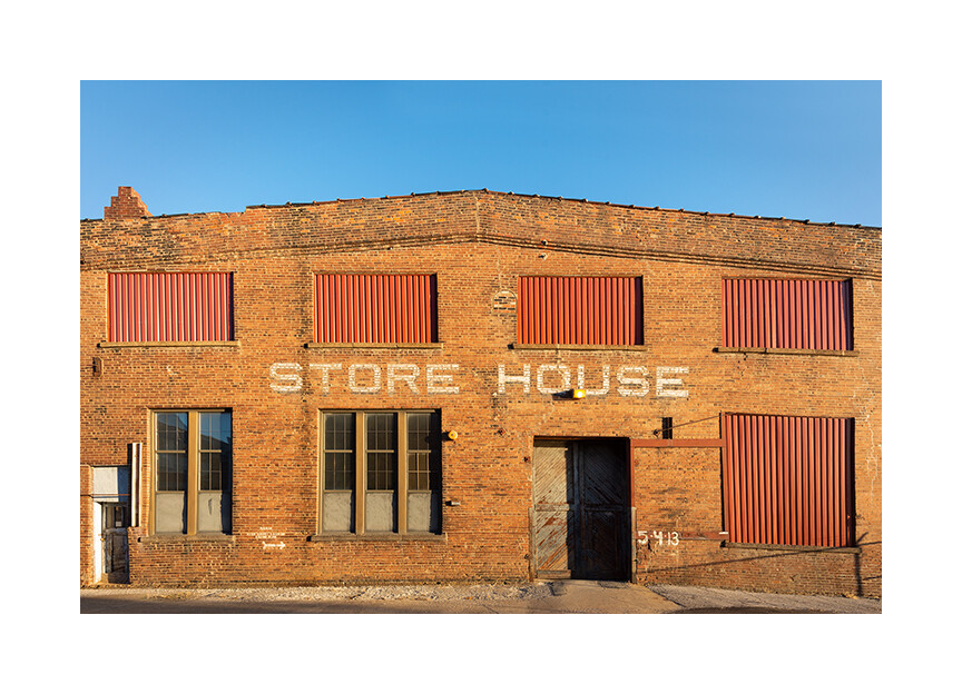
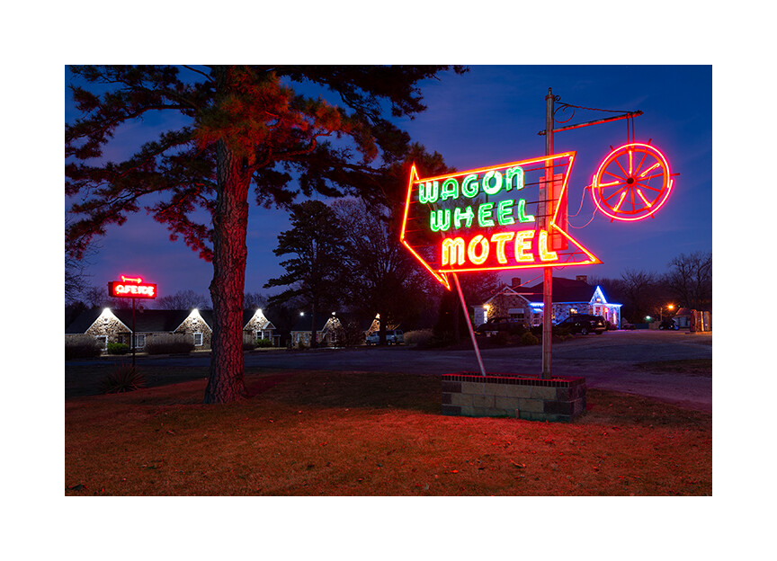
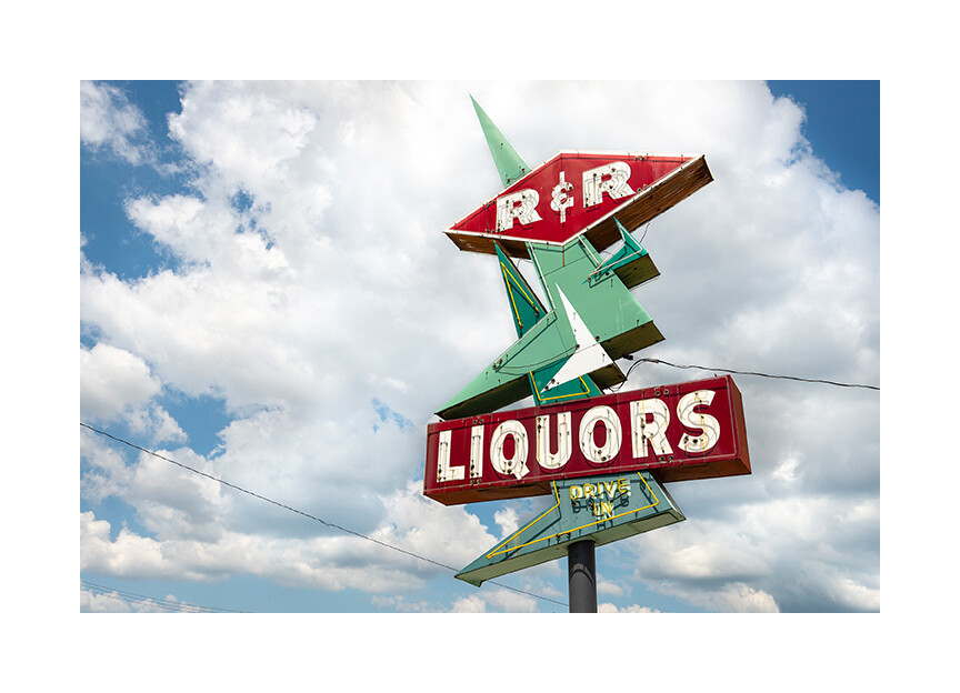
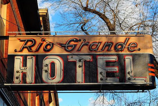
Photographing old type and signs is a hobby of mine. Here are a few samples. I’m sure there are more in the share your photo thread.
When I first saw your post, I thought, “That looks like something I’d take a picture of.”
There is some gorgeous type and design in these old signs.
8 Likes
A had a Twitter account a couple of years ago that I devoted to old and unusual signs here in Utah. I kept it up for a few months until it started turning into work. Here are a few examples.
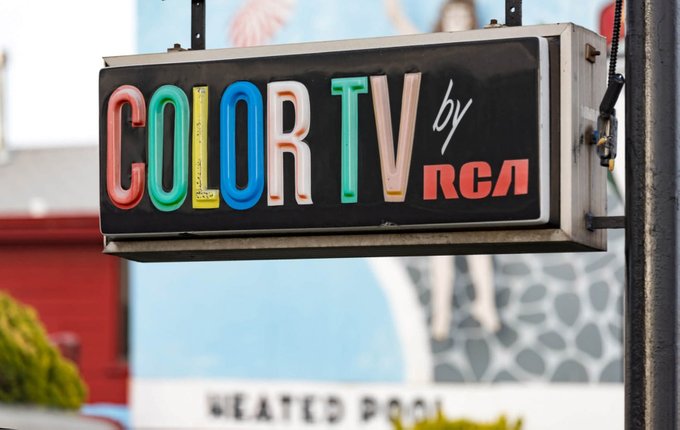
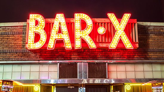
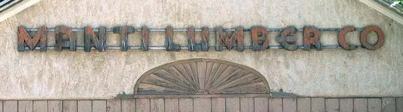
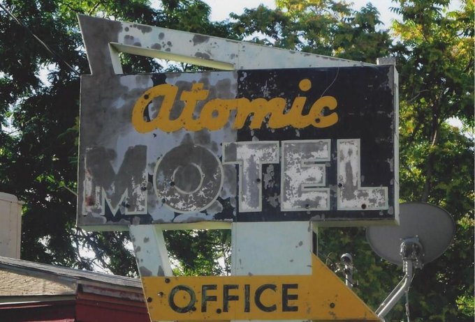
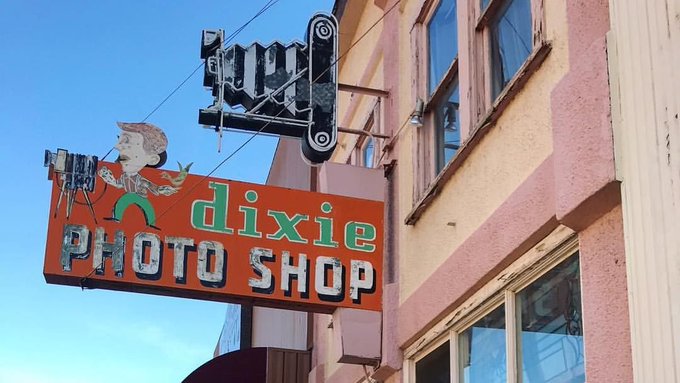
6 Likes
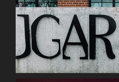
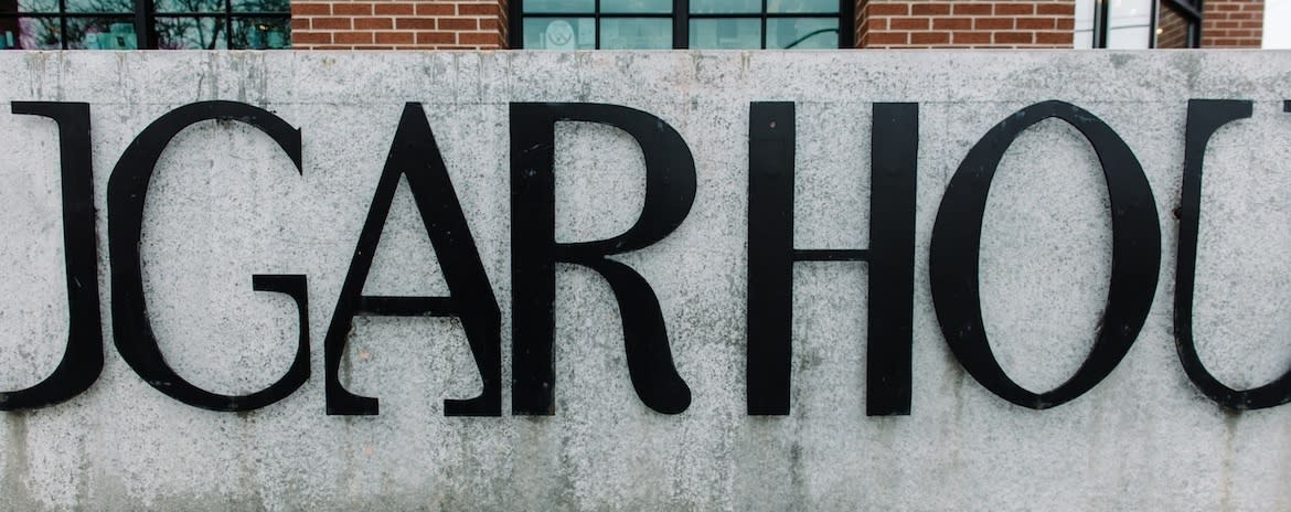
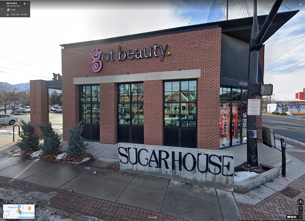
Here’s a Google Streetview shot of the sign in context. It’s a neighborhood down the street from me called Sugar House. The weird typography has baffled me ever since they began erecting these signs several years ago.
2 Likes
I absolutely love these. I look into one and feel like I’m transported to another part of the country or another era.
1 Like
That atomic motel sign really looks like it went through atomic trauma lol
1 Like
Thank you for the kind words. I really appreciate it!
1 Like
Yes, and as creative types, we all particularly thrive on kindness and appreciation — a good thing to remember when giving advice on this forum, don’t you think?
1 Like
Closest I can get
2 Likes
I’m with you. I think when done professionally the edges would have been curved or were at least meant to appear curved from a distance.
That font is vintage and was universally. It’s striking a faint memory of a Western Electric or Western Union sign but I googled it and I don’t see that any of the official logos of either used a font like this one. Probably I’ve seen faded versions of the font on the walls of “Bricktowns” across the midwest. It seems like back in those days, when a sign maker made a sign, the same font was used all the time, logo usage was not strictly enforced like it is today. The corporate heads were not so wrapped up in “branding” one assumes.