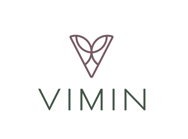
Good Morning, I have been working on my company logo, we have selected the final one, but I would like somebody else’s opinion. We are a company founded in 1984 importing articles for decoration, events, and flowers. We have a good range of items, for many different tastes, in many different styles.
Please check our logo and let me know what you think about it.
What do you mean? From a crowdsourcing site?
What do you think of it?
As far as I know, if you didn’t create it you can’t ask for critique.
It’s one of the forums rules.
1 Like
Dear Smurf2, thank you for your superfast reply! this is not taken from any website, my team and I created it (we also created others, but this is the one we prefer) and we have to decide wether we start using this one or keep on working on other ideas.
I like it, it looks elegant, a bit common maybe.
With the limited information you’ve provided, my overall impression is actually favorable. I’d spend a little more time exploring the size ratio of the mark to the type. Right now, they’re both about equal in terms of visual weight. It may look better if there was more contrast there. I’d also spend a little more time on the color palette.
My depraved mind suggested – oh, never mind.
3 Likes
It looks like…boobs popping out of a shirt. Cleavage. Just me? ![]()
4 Likes
Not bad, not bad![]() i think it can be good for our sales
i think it can be good for our sales![]()
Whether it has the right personality for your company, I don’t know. It looks higher-end and a bit feminine.
I do like it, though. However, I’d move the V just a little closer to the I.
1 Like
We modified it a little bit, separated the letters a little bit and made it thicker. We kept the boobs though, for us the V becomes a container of all the styles we offer, and it also represents our team and how the work of everybody comes together.
We do decoration and we hope to higher our brand, so i really appreciate your point of view, you saw right into our identity. I think it works!
1 Like
Yeh not much to critique - the icon looks like a vagina icon to be honest, I know others said boobs earlier, but when I first saw it I thought it might something else.
It kinda looks like a decorative V - anyway not much else to say.
It’s simple. Clean. Elegant. And definitely looks feminine for all the wrong reasons.
1 Like
Uh-huh …
1 Like
That was my thought before reading the comments. Glad I’m not the only degenerate here.
1 Like
My first two associations are
-
Vermin
-
Praying mantis head
The pure drawing and typography part looks professional to me.
What did the designer think? I hope he or she has told you.
Personally, I like it, with the change Just-B mentioned.
This topic was automatically closed 365 days after the last reply. New replies are no longer allowed.