I’d appreciate your feedback on this design. I’m not quite satisfied with how it looks, but I can’t quite pinpoint what’s off. Could you take a look and share your thoughts?
2 Likes
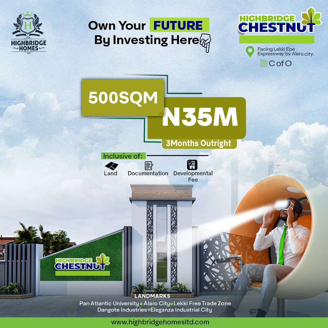
What is it? I have no idea what you are selling.
The reason you can’t pinpoint what’s wrong is you don’t know where to look first.
Why do you have a down finger when saying “Invest Here.” There is no place to invest. Just some random numbers.
You need to address hierarchy…
hmmmmm
Thanks
It appears to be some sort of real estate advertisement. With that in mind, what’s the ball-chair-VR-guy doing in there at all? What does VR have to do with real estate? Is this virtual real estate?
And why is there a beam of light shining from the VR headset?
Yeah, sorry, nothing about this is working. Simplify, simplify, simplify. Figure out a message and aesthetic that will resonate with the target audience and eliminate the non-essentials. Then again, maybe this type of thing works in Nigeria. I don’t know.
I wondered that too, but I think it’s supposed to lead the eye to the logo in the bottom-left, but that logo is already larger in the top-right. So.. I dunno.
It’d work a little better if Mr. Craig V.R. Guy (I’ve unofficially named him Craig) was actually looking that direction. Not that it would make any more sense.
1 Like
What is the briefing?
What kind of advertising material did you design here?
Who is the target audience?
I tried looking up “Craig.” He and others like him seem to belong to a multitude of people, some on royalty driven stock sites, some on Free sites, some on uncredited websites. I wouldn’t touch the image with a 10-foot pole.
Admittedly I am a single Craig, but that guy doesn’t look like a Craig to me. He looks like a Wilson.
The VR headset in this image doesn’t make sense. I assume this is a real estate investing ad? You need to ensure correct brand colour and images that are consistent with a real estate investing opportunity.
I’m glad we’re all on the same page here. Unfortunately, most of us know what’s off. Here is a short list, as told through design principles:
- Balance. It is visually lopsided for no reason. Not in a good asymmetrical way, but just heavy on the side with the seated man.
- Emphasis. All text is fighting for attention.
- Repetition. Three “logos” across the top. Three icons near the middle. None are giving a sense of what’s important.
- Movement. The angular fence and light beam from the man’s goggles provide movement, but move everything to the bottom left corner, where there is nothing to see.
- Proportion. The egg chair the man is sitting in is bigger than the gate pillar. He’s in front of it, yet, the chair is semi-transparent?
- White space. Lots of white space on the left without any balance (see number 1 of this list).
- Contrast. The contrast allows it to be readable but every element is high contrast, which makes it difficult to know where to focus.
- Hierarchy. I can tell what you think is the most important based on your hierarchy, but I can tell your customers likely don’t share the same opinion of your order.
- Rhythm. Just, it seems to be a 3, 2, 3, 2, type of beat, with a drumroll at the end.
- Pattern. I like the patterns created by the gates in your image. The verticals are on the left and the geometric diagonals are on the right. Unfortunately, you’re not mirroring any of that in the design.
- Variety. You put the company logo in two places. No thanks.
- Unity. The only unifying factor is the green color in many of the logos, boxes, and photos. Unfortunately, they’re all different shades.
If this was an assignment, I’d be interested to hear why you think it is only a “bit off” considering it is undeveloped in many ways.
I would review them all to verify that you intentionally made designs based on design logic, rather than attempting to piece together something like this.
Additionally, you need to address some of the other questionable elements:
- Why is the man using a virtual reality headset? Unless this is part of the buying/investing experience, remove it.
- How come you’re showing a gated community when you’re selling homes? Show a home rendering or at least a photo of a possible building someone could purchase/invest in.
- That hand pointing down to “Own your Future by Investing Here” is pointing to nowhere. “Here” literally means nothing.
1 Like
I get that maybe the VR represents some kind of virtual representation of the property, but that’s not how it works in Real Estate. At least not universally.
And “homes” can be Condos in a gated community.
But the whole ad here is just not coherent.
I agree. I was confused as to why the gate was shut. Don’t they want you to see the homes? Or is that only allowed via VR? ![]()
This topic was automatically closed 365 days after the last reply. New replies are no longer allowed.