Is there any way to circumvent the Illustrator/PDF glitch that results from outlining san serif fonts before exporting to a PDF? This happens specifically with the the following letter: l.
I’ve read that it only appears on the digital PDF but does not print that way - I thought so too but if anyone can confirm that would be great.
I also know the way to fix this on my Adobe Acrobat is to uncheck “enhance thin lines” in the preferences panel. I’ve read a circumstantial amount regarding this glitch and understand WHY it happens. I just don’t know how to get rid of it, not only for myself but for all viewers of the file.
My current temporary solution is to not outline the font at all before exporting to PDF although my serif fonts are outlined since I have a different glitch showing up for the other font if it is not outlined. If it’s just a digital file, I guess it doesn’t matter if it is outlined or not? I do also have to send this to the printer so I still need to make sure it’s not a problem there.
Here are some links that are somewhat helpful but don’t have an all around solution for all viewers. Also attached is a screenshots of my issue (client says she can still see it even if it no loner shows up on my end from unchecking “enhance thin lines”)
This isn’t a glitch in Illustrator or Acrobat. It’s the result of rounding errors that become apparent at lower resolutions.
In any quality font, there’s a set of instructions called hints. Hints instruct the application to display the glyphs in the font in ways that override rounding errors. For example, if the vertical strokes for most glyphs in the font are the same width. the hinting instructs the display or printer to ignore any rounding errors in favor of making all the vertical strokes the same width. (I could explain why rounding errors occur, but it’s probably beside the point.)
When you outline the font in Illustrator, InDesign, or another graphics application, the vector data that makes up each glyph is transferred directly into the software application, and the references to the font file and the hinting in the font file are severed. Consequently, the glyphs can appear uneven in both width, and height, and in the uniformity of the various strokes.
At higher resolutions, the rounding errors in outlined glyphs are not obvious since one pixel this or that way doesn’t make any visible difference. For example, the typical resolution of a commercial platesetter, can be a few thousand dots per inch as opposed to the relatively much lower resolutions of a computer display where the rounding errors of small point sizes become apparent.
A one-pixel rounding error on a 12-point letter on a computer display is noticeable. A one-pixel rounding error on a much-higher resolution output device at a print shop isn’t noticeable because it’s microscopic.
There’s no solution to this problem other than to not outline the glyphs. If you embed the font in the PDF so that the hinting tables are retained, the problem goes away.
Some fonts don’t allow embedding, but most do. Even for those that don’t, however, as I said, any rounding error output at the resolution of a printer’s platesetter or high-resolution digital printer won’t be noticed. On the other hand, if you’ll be distributing the PDF to the public from a website, those errors will be noticeable, so it’s a good idea to embed the fonts instead of outlining them.
There are a lot of things that are a bad idea, even if the software enables you to do it. This is one of them. The results are unpredictable at best, and vary from display to print - even varying depending on the print method.
It’s enabled by default, and can produce the unwanted effect you’re seeing on I’s and l’s, even when it’s a live font (which it should be). Turn it off and see whether your problem clears up.
This is one of the Acrobat aberrations I’ve learned to ignore. Sometimes I do have to tell a client viewing a PDF proof to scope in to see that the error disappears at a higher magnifcation (same thing happens with completely missing thin object strokes.) But I do wide format where most text gets outlined before I receive it or convert it anyway. If the PDF if for screen viewing, outlining fonts is just a bad idea.
You’re a lifesaver. Thank you. I didn’t even know embedding fonts was something I could do - going to look into how to do that, now.
As of right now, I was going to outline(or embed) the text for the version going to the printers. For the version being used as a digital flier via email, I will look into embedding the fonts. Currently, I left the sans serif font alone and outlined the serf font (which I had to as some of the letters were creating a weird box around them if left as a font when exporting).
This is new to me. I was always told by printers (as well as reading online from a design perspective) to “outline text”. I’m pretty surprised the general consensus here is to not outline text – Which I completely get but I thought that was a big no no when sending to a printer. I know I can package the fonts and send along with the file if needed. Embedding fonts was mentioned above and I didn’t know that was an option. Learning something new every day…
So, is that information I constantly come across to outline text obsolete or just incorrect coming from printers and other sources?
From now on, I’ll thinking twice before outlining.
Yes, I have this unchecked on my software. But it only solves the problem for me and I need this file in both print and digital formats for others. So really, I am looking for a solution where it does not show up for other viewers digitally. I found a quick fix already. But will follow the advice of others here for future projects.
Yes. I agree. I told the client the same thing and assured her it wouldn’t be visible in print. But since they are also using a the file as a digital flier, I had to find a workaround for that version; they said it looks like a bunch of typos on their end. I came here to educate myself for future projects. But my current quick fix is to just not outline the sans serif fonts. I also have serif fonts in the flier and they had to be outlined as they were creating some weird box around some of the letters. But after exporting, the file looks great that way so I’m just going to leave it for now.
Going to read more about embedding fonts and adopt that method going forward.
When saving to PDF from Illustrator (or InDesign), embedding fonts is turned on by default. Of course, if you outline them they’re not embedded.
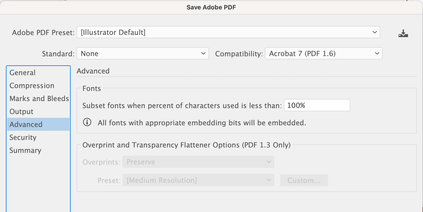
When you save to PDF from Illustrator, you’ll run into the screen capture of the dialogue box I’ve attached (if you click the Advanced tab). By default, the process embeds only the characters from the fonts you’ve actually used (a subset).
A font can contain many hundreds or thousands of characters, so if your document only contains a couple of hundred of those characters, only a subset of those characters are embedded. If for some reason, you want the entire font embedded, you can change the percentage from 100% to 0%, but that’s usually not necessary and just increases the size of the PDF.
You’re not the first designer I’ve encountered who automatically outlines all the glyphs. I supervised a designer a couple of years ago who said she was taught to always do this in school by her instructors.
Every now and again, you might run into a font where the font developers included instructions in the font that prevents it from being embedded. If you run into this problem, go ahead and outline the glyphs in that font. Otherwise, it’s almost always best to embed the fonts instead of outlining them.
It depends on the source of your info regarding outlining fonts.
Technically, I’m not supposed to take packaged files that include fonts purchased by others (ie we don’t have a license.) But we do own licenses to a wide assortment of fonts out there. Not the crazy titling stuff or display fonts. For large projects we buy licenses for those, but for little one-off stuff we just ask it to be outlined. The stuff I print is so big, and the text tends to be limited in scope, outlining is okay to do.
Unless you anticipate edits to the copy. There is nothing more deadline killing than having to wait for a new file to re-rip for a text change after proofing (a pet peeve of mine, printer’s proofs are not one more opportunity to change copy. GRRR.)
Thank you so much. This makes sense as one of the characters of the other font used would not embed. I wound up outlining that font but leaving the sans serif one alone.
It’s always good to get the printer’s perspective. When I was younger, I wanted to get a job in a print shop to better my knowledge of the print process but found getting a job in a print shop as difficult as getting a design job. So, lots of trial and error.
But I’m pretty meticulous about the details of my projects before they hit the printer.