I’m working on some food packaging design and it’s my first time working on this sort of project, so I’m reaching out for a bit of help. It’s going to be a vacuum sealed product and I’ve attached the front and back design for reference. Are there any precautions and considerations when it comes to packaging design? I’ve made sure to include all the pertinent info and where it’s necessary, in bilingual as well. I’ve generated the UPC-A barcodes from the numbers provided by the client by using online generators. What kind of area will suffice for the best before date? Is there anything else that’s missing or that needs to be changed in my design?
Sorry if my questions are a bit vague and scattered–I’m just new to packaging design. I appreciate any help and advice! Thanks.
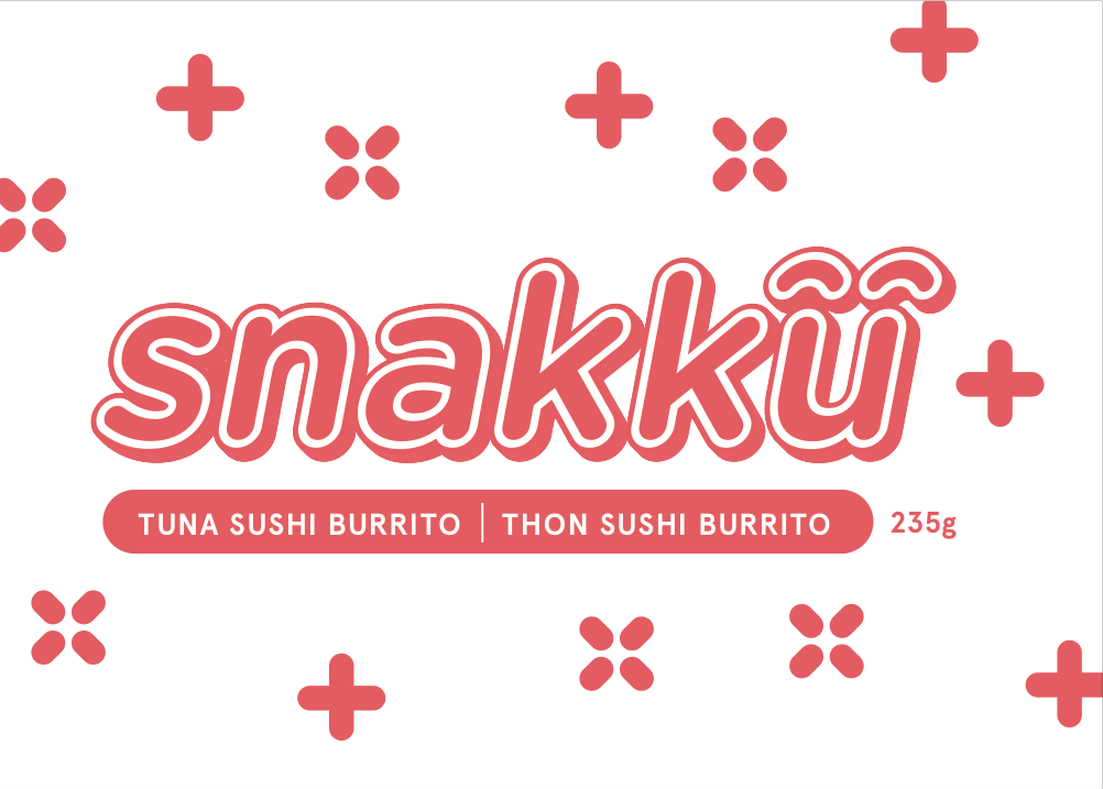
I like the feel overall feel and the fonts used. It’s clean, approachable. Non traditional Japanese but I think works in the healthy snack food market.
Front: Does the white mean clear packaging? If it’s clear, it would be a good idea to see how this looks over product. The pattern is cute but I prefer of the x+x design was more even rather than random and the + at the end of the name means it reads like is snakku+
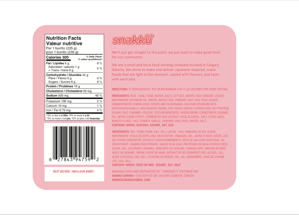
Back: I feel that the pink text on pink background will be quite hard to read.
I agree the pink on pink text is very hard to read.
In the directions sentence “…for good tasting.” This doesn’t read correctly, maybe try “…for the best flavor.”
What size is the package? I always worry about inlined text if it gets too small.
Your printer or vender should be able to tell you where the best by date should go. It depends on who stamps it on and when they stamp it. They might not want to have to turn it over.