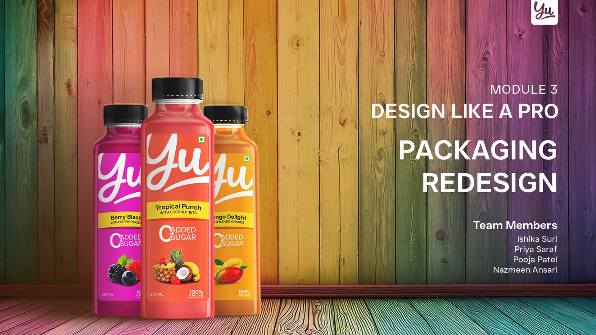
Hii, it is group project of a company named YU and it the project was to redesign the juice packaging, so I and my fellow members made this packaging and presentation, Please give review. I couldn’t upload the pdf file so uploaded the images
The brand and presentation of the brand in the packaging is very good, not much to critique.
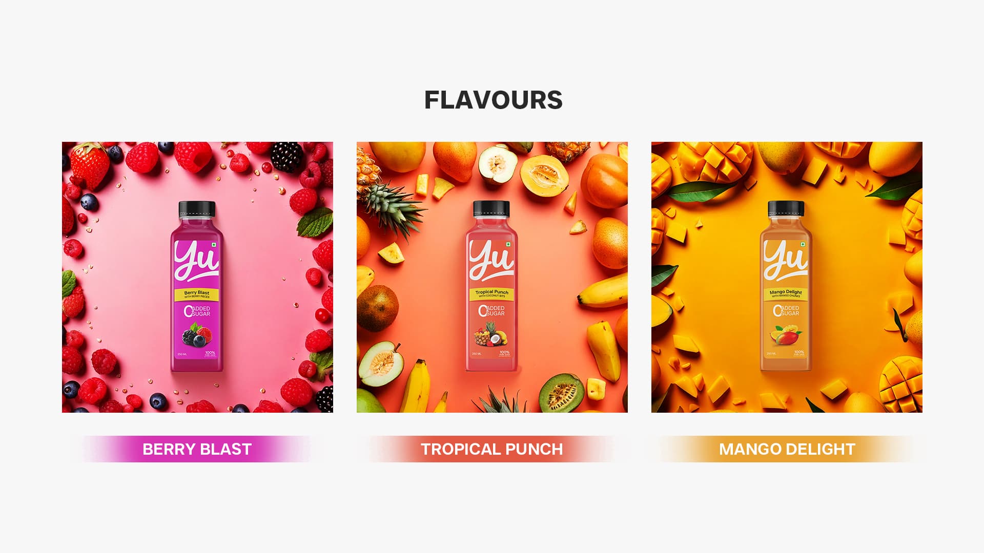
I’m uncertain that ‘Tropical Punch’ is better than ‘TROPICAL PUNCH’ in the band where the flavour is shown.
It looks a bit lost and 2nd to everything else, like it’s unimportant, but it should be important and looks lost in the hierarchy.
I like a lot about it and it’s very clean and professional looking.
What I don’t like, since you posted the entire presentation, the justified text introduces rivers in the text, and you also have a lot of orphans/runts - which makes reading a bit uncomfortable.
Either use hyphens, which I hate, or use left aligned text and don’t allow orphans, it looks so much more professional, in my opinion.
I also get the impression of an unfinished presentation.
There’s no fonts, no colours mentioned, no pantone.
Where this is a nice ‘pitch’ I get it’s not a ‘brand book’.
I would hope you have one that shows fonts, colours, gradient creation, logo use and logo dont’s and all the other things that go with a brand book.
Overall I think it’s excellent, it’s a good job.
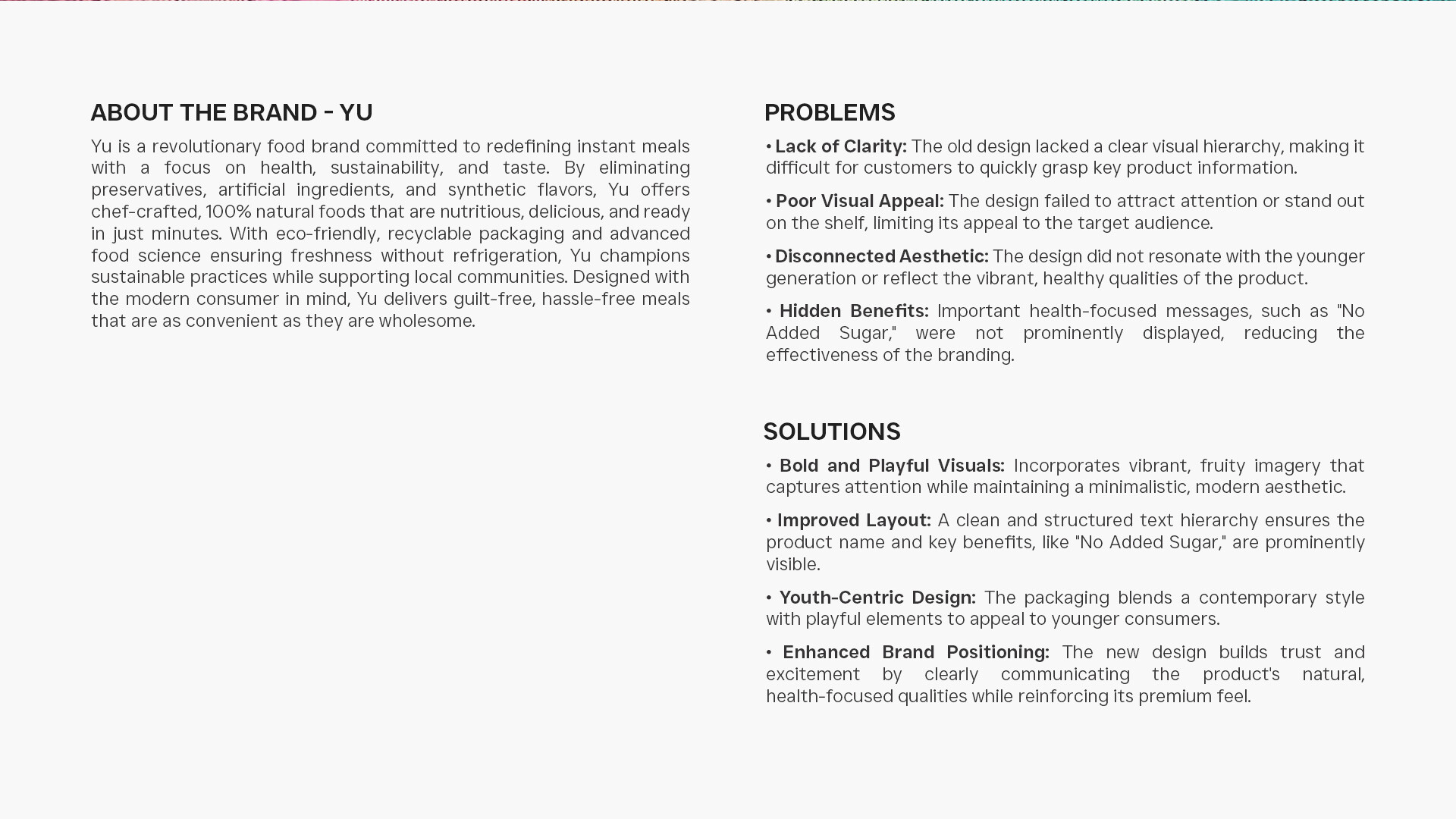
‘ABOUT THE BRAND - YU’
then next line it’s spelled Yu.
If it’s brand name it should be consistent.
‘Ready in just minutes’ - do people have to mix the drink themselves or it is packaged and sold like this?
Align your bullet points
That’s slide 2 - don’t have time to go through the rest.
Maybe later.
1 Like
I like it. It’s very nice but since you asked…
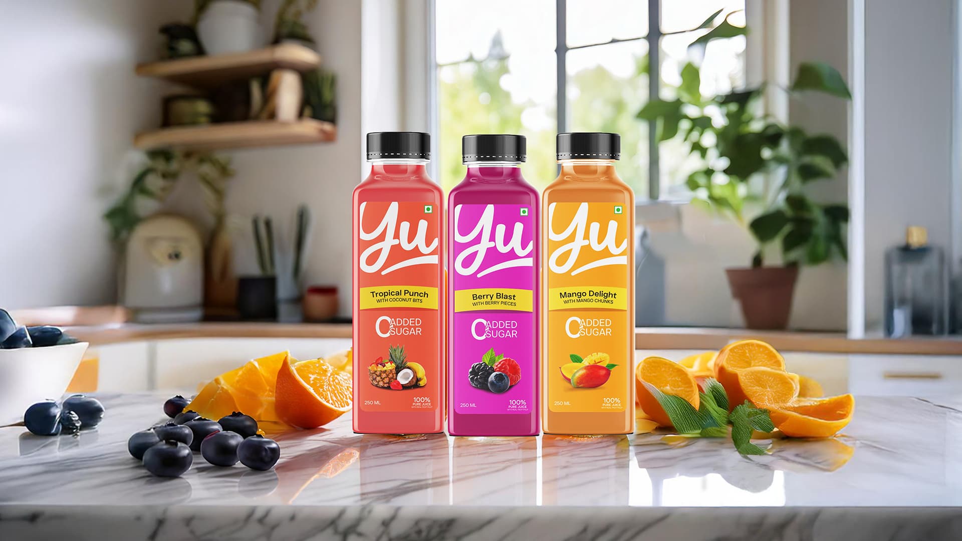
You wrote, “…the project was to redesign the juice packaging.” However, your project seems to emphasize a hypothetical initial presentation to a client (in this case, your instructor) rather than focusing on the packaging. If I were the client, I would want to see more than just frontal views of the bottle. What do the sides and back look like?
The Yu logo is very fluid and would lend itself to the Y flowing around the corner of the bottle, yet the label appears confined to only the front of the bottles. There would be production and cost issues to consider in the real world, but this is a student assignment, so I’m curious why you focused exclusively on the front label rather than the entire bottle.
You state that you’re trying to emphasize freshness and youthfulness (more on that later). Still, despite the casual freshness of the label, your “creative explorations” all use a conservative and squarish bottle that seems at odds with the fluidity of the logo and your stated objectives. Again, real-world budget considerations might impose these limitations upon you, but this is a student assignment. Was maintaining the original squarish bottle and black cap part of the creative brief?
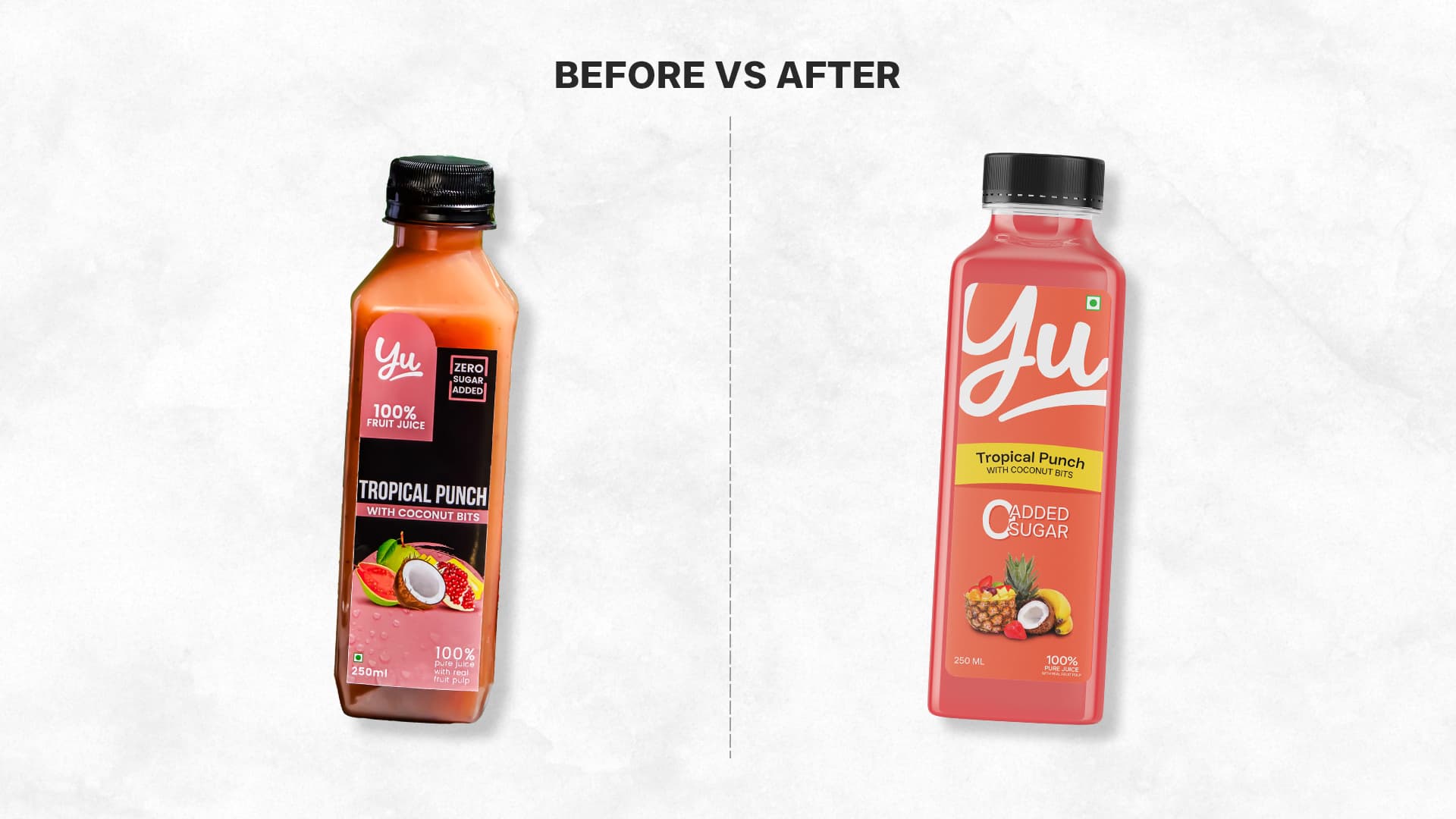
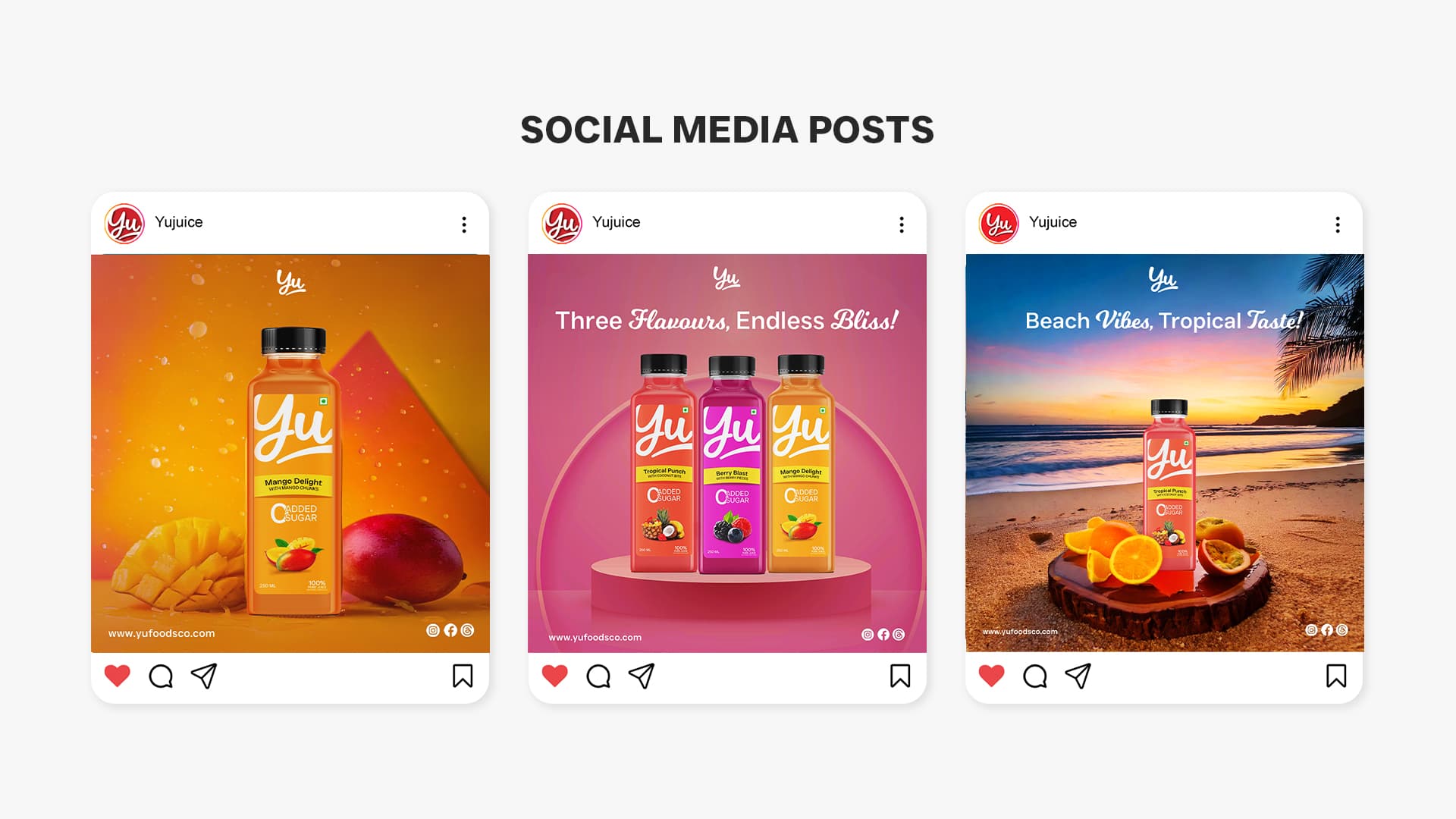
Page 2: What is it about a bottled juice drink that requires “just minutes” to prepare? Wouldn’t someone just unscrew the cap and drink it? The spaces after the bullets are inconsistent. If it were me, I’d hang the bullets outside the left edge rather than include them within the paragraph. The justified text creates uneven word spacing. Using ragged right text usually works better for narrowish columns without hyphenation. What is so “Youth-centric” about the design? It’s a fresher-looking design than the original, but I don’t equate freshness and vibrant colors in a juice drink with only “younger consumers.”
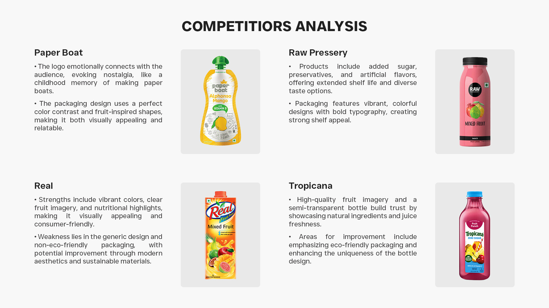
Page 3: The word competitors is misspelled in the headline.
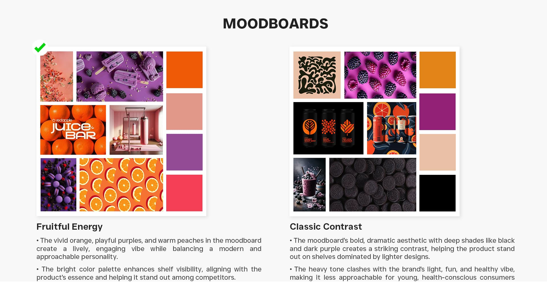
Page 4: I’m unsure what the mood board (two words) is trying to convey. Is it comparing the original’s color scheme to that of the new packaging? If not, I’m unsure what’s so “classic” about the darker colors.
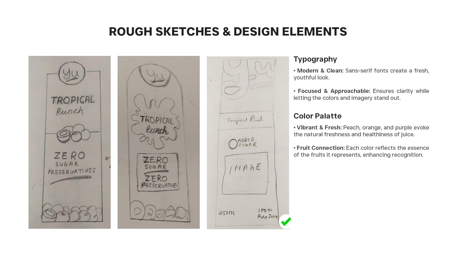
Page 5: Design instructors always like to see rough sketches that show students’ thought processes. However, you rarely want to show quick sketches to clients. They typically don’t have the visual imagination to envision the final work. In addition, rough sketches tend to encourage clients to start tossing in their own bad ideas. I’ve been there, done that, and learned my lessons.
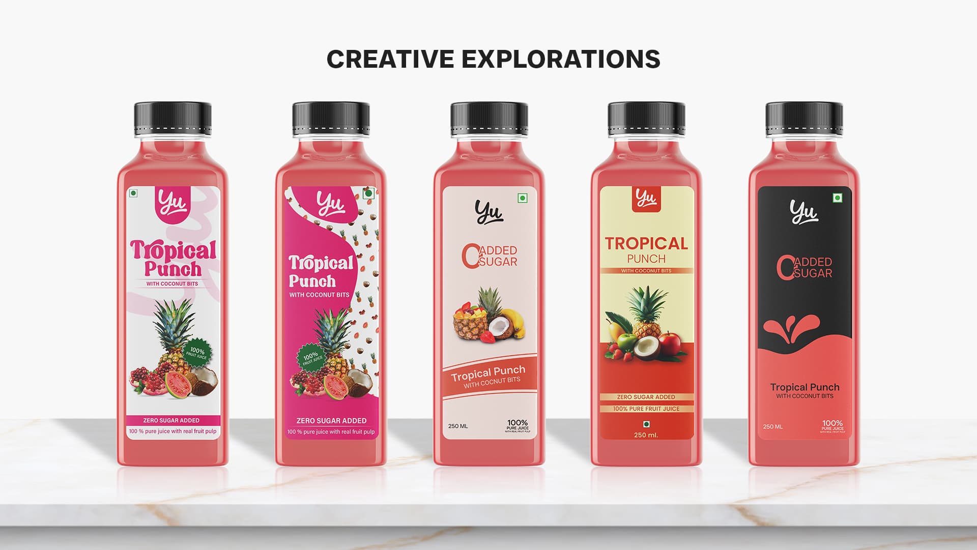
Page 6: Again, these “creative explorations” are useful to a design instructor, but I wouldn’t show a client the ideas that didn’t make the final cut.
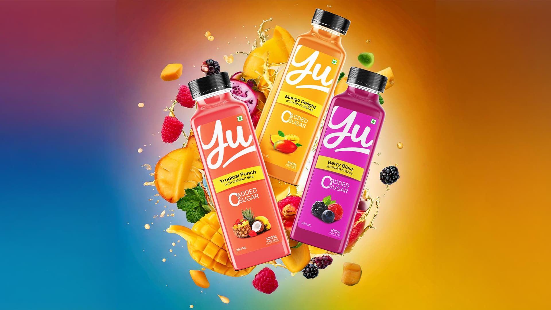
Page 7: I have mixed feelings about the 0 Added Sugar composition. It’s interesting but, perhaps, stands out as an inharmonious oddity.
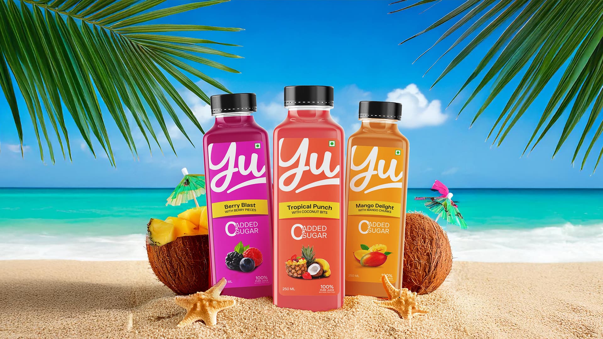
Page 8 through 13: I love these, but as I mentioned earlier, it would be nice to see the bottles from different perspectives and angles instead of only frontal views.
Despite my comments, this is very nice work. I could have mentioned many things that work well, like the colors, the elaborate imagery, the freshness, and the attention to detail.
I like it too. In my experience creating package design, I found that there are often governmental requirements that must be placed on packages.
it is very nice design.
First of all thank you for such detatiled review.
-
As you said why front part is only shown, we also designed the back label but the main brief was to show front part also we forgot to show back label in the presentation
-
Maintaining the squarish bottle and black cap was not specifically part of brief but the original bottle was like this so we haven’t considered the bottle looks.
-
the brief was to make the redesign more urban and youth centric so we added those words and “ready in minutes” is a mistake I realize now thank you for that, the typography and spelling mistakes you mentioned I will correct them.
-
for moodboards do we also need to explain them in brief? We all were new to these kind of projects and also we thought giving a name to a moodboard will give good impression
-
We thought showing rough sketches will show a bit of process of the project and our work from paper to digital clean work, from now I will try to show them in a new and good way.
-
It was a student project so we showed each member’s creative exploration and idea.
Thank you so much ![]() for your time and attention to details which even we overlooked
for your time and attention to details which even we overlooked ![]() , I will share this post with my team members also.
, I will share this post with my team members also.
2 Likes
I will keep it in mind when designing a real project, thank you
1 Like
Thank you for your review,
- We will try to correct the typography problems
- Thanks for mentioning that we haven’t added any guidelines and proper assets documentation, We will keep in mind these things in future.
1 Like
You might never pick the bottle anyway. The bottle is usually chosen or changed and you’ll adapt to what the client supplies.
I did a stint in packaging where I had to come up with solutions for the customer, but it was typically budget driven, lots of calls, lots of test samples, lots of work in selecting packaging that works for them. And a trip to China to boot.
If you’re in the ground floor with a startup then you’ll get those opportunities. If it’s a multi-national you won’t ‘pick’ packaging.
What am I even talking about? I’m not sure, just my experience I guess.
1 Like