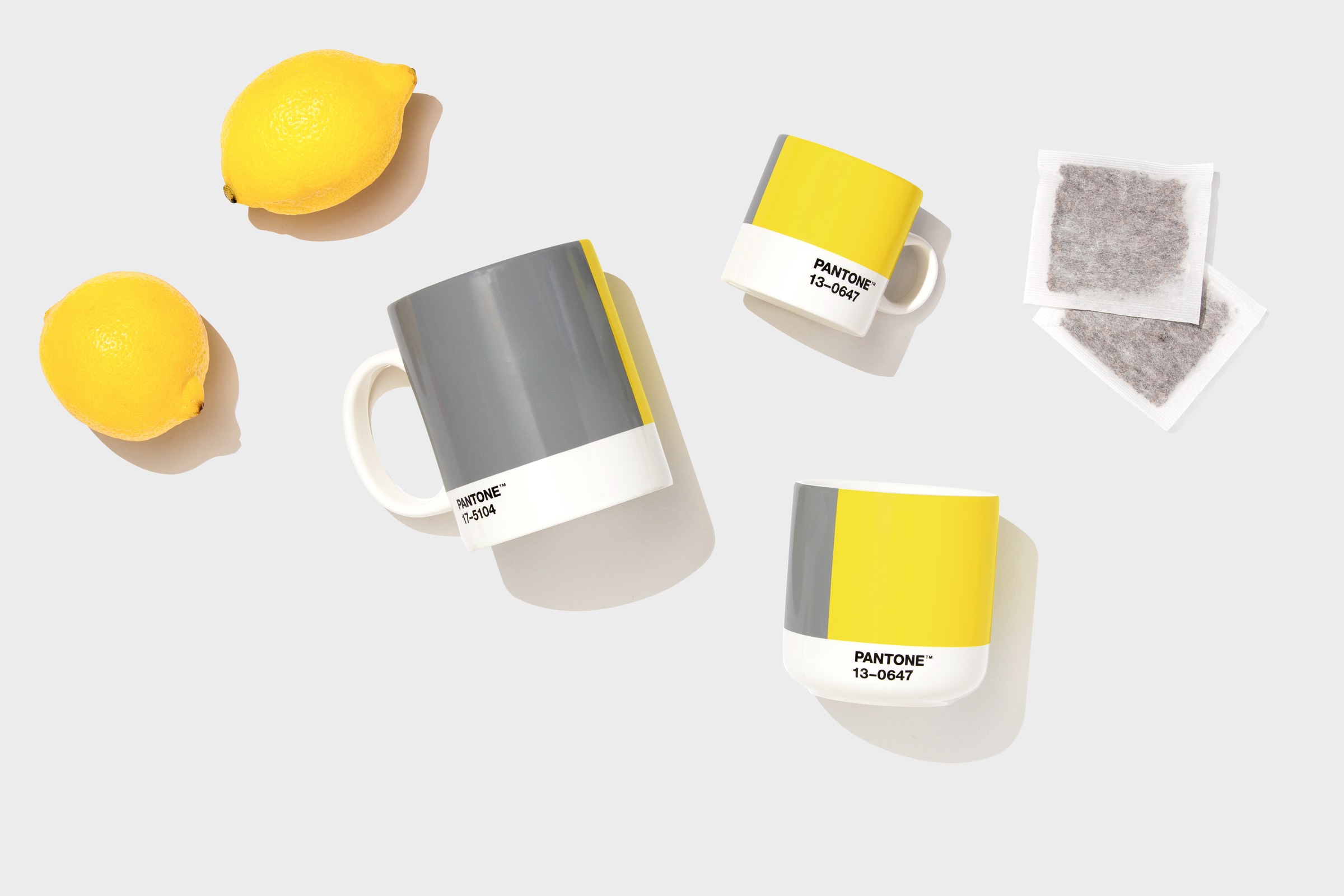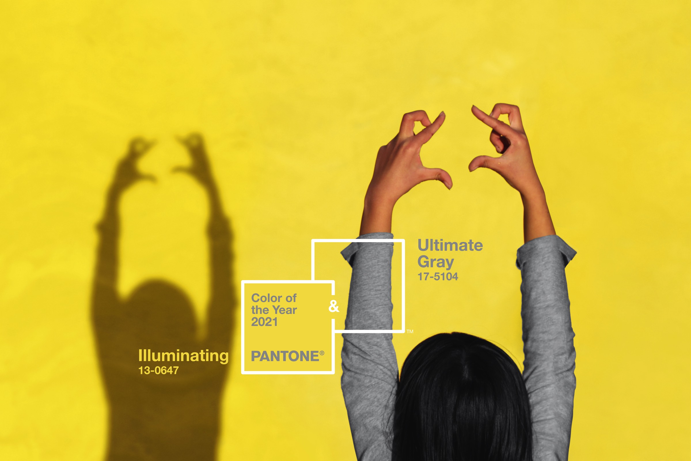
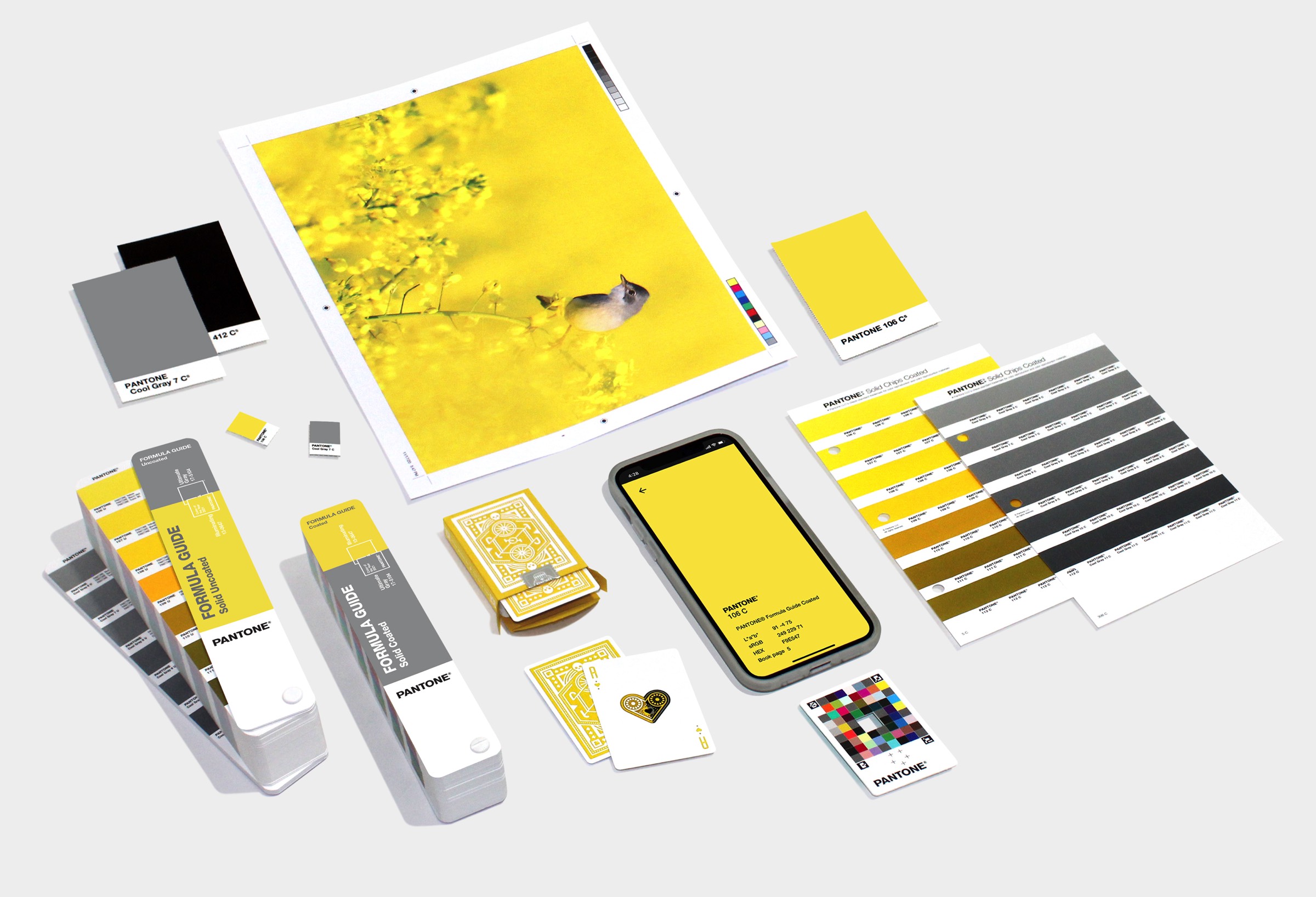
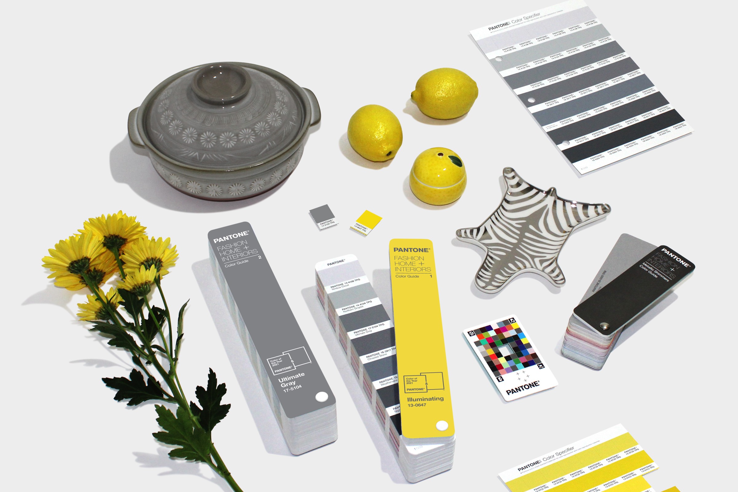
The Pantone Color of the Year 2021 is officially live! This year, Pantone has selected PANTONE 17-5104 Ultimate Gray + PANTONE 13-0647 Illuminating - a marriage of color conveying a message of strength and hopefulness that is both enduring and uplifting.
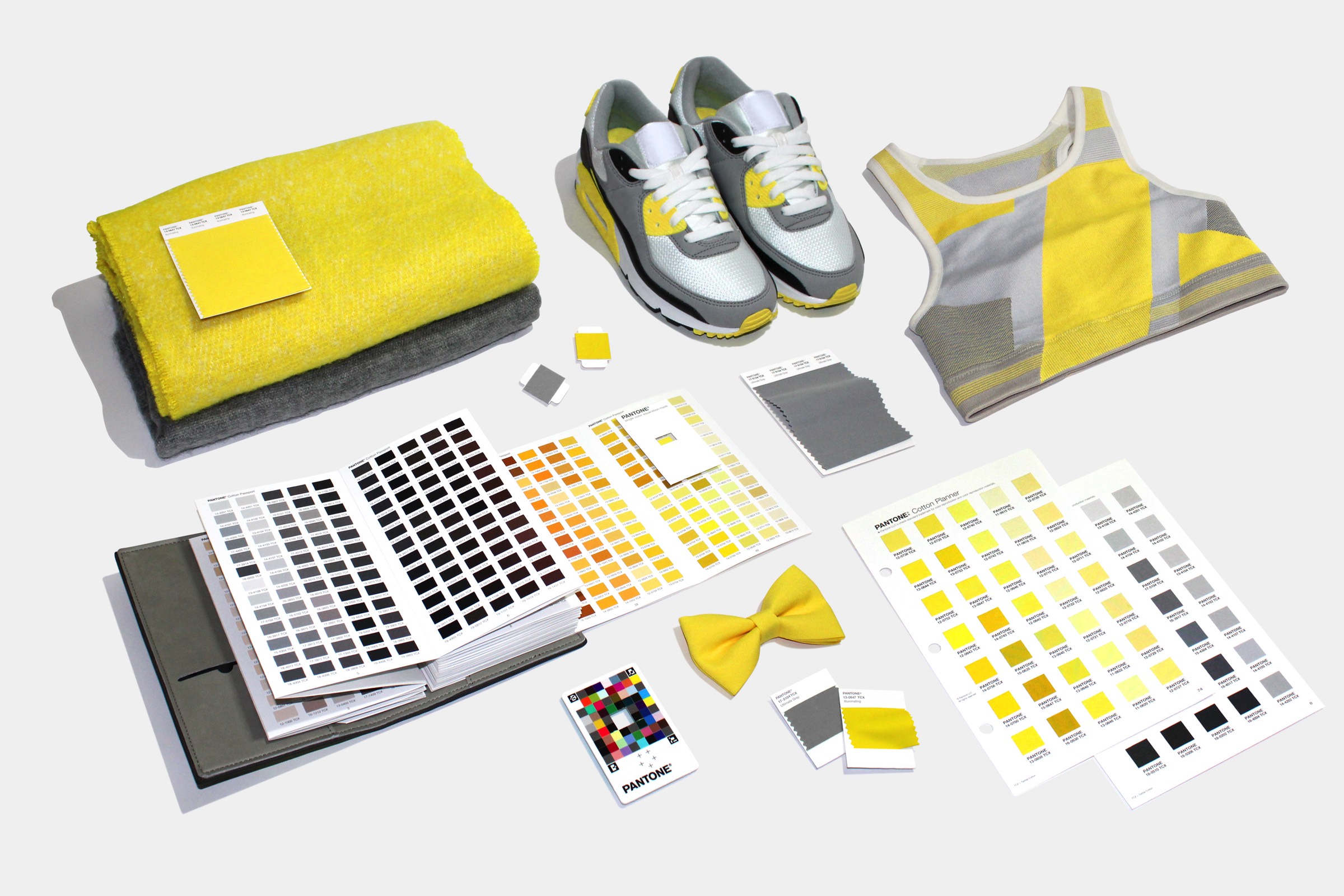
PANTONE 17-5104 Ultimate Gray + PANTONE 13-0647 Illuminating, two independent colors that highlight how different elements come together to support one another, best express the mood for Pantone Color of the Year 2021. Practical and rock solid but at the same time warming and optimistic, the union of PANTONE 17-5104 Ultimate Gray + PANTONE 13-0647 Illuminating is one of strength and positivity. It is a story of color that encapsulates deeper feelings of thoughtfulness with the promise of something sunny and friendly.

A message of happiness supported by fortitude, the combination of PANTONE 17-5104 Ultimate Gray + PANTONE 13-0647 Illuminating is aspirational and gives us hope. We need to feel that everything is going to get brighter – this is essential to the human spirit.
As people look for ways to fortify themselves with energy, clarity, and hope to overcome the continuing uncertainty, spirited and emboldening shades satisfy our quest for vitality. PANTONE 13-0647 Illuminating is a bright and cheerful yellow sparkling with vivacity, a warming yellow shade imbued with solar power. PANTONE 17-5104 Ultimate Gray is emblematic of solid and dependable elements which are everlasting and provide a firm foundation. The colors of pebbles on the beach and natural elements whose weathered appearance highlights an ability to stand the test of time, Ultimate Gray quietly assures, encouraging feelings of composure, steadiness and resilience.
Emboldening the spirit, the pairing of PANTONE 17-5104 Ultimate Gray + PANTONE 13-0647 highlights our innate need to be seen, to be visible, to be recognized, to have our voices heard. A combination of color whose ties to insight, innovation and intuition, and respect for wisdom, experience, and intelligence inspires regeneration, pressing us forward toward new ways of thinking and concepts.