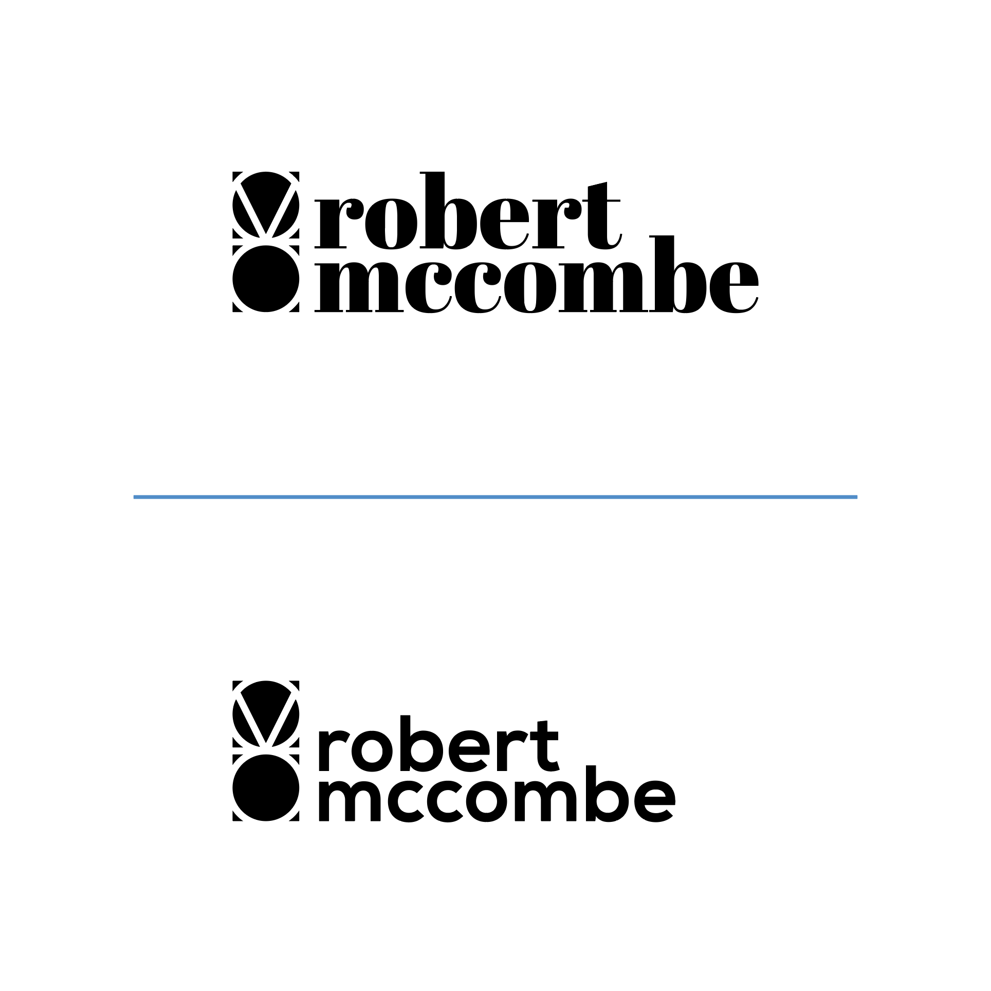
Hi, I am having some issue deciding on a typeface to match my symbol for my personal logo. I have attached 2 options that I think may have potential, but would really like any advice or thoughts anyone may have, on wether you think 1 of these options will do the job, or have any to recommend.
I prefer the first, but that means absolutely nothing until we know what you do, etc, etc.
Also, the font is the least of your worries. Reduce that logo down to business card size and see how much of those tiny corners are left. They will just look like tiny little blemishes.
Thanks, this would just be for my personal brand as a graphic designer.
I have had the logo printed on a business card before, and they seem fine. I get what you mean though that are some sizes they may disappear slightly, but I am not sure how to fix that issue without changing the complete design and wether it is a major is to were I have to.
I wanted to create an abstract mark using simple features from my initials RSM. Such as the 2 circles make up the S as well as the top of the R. The 2 lines in the top circle is the M and the line in the middle is part of the R. If that makes sense. Just because a lot of people use their initial for their logo, so I wanted to use mine, but not make it obvious that they are my initials, so its a bit different.
OK. There’s nothing wrong with using one’s initials to create a logo, but keep in mind that if no one can read the initials, you end up with a meaningless abstract shape that only makes sense to yourself.
Although the logo is yours, it’s really intended for those who will be seeing it and might best be designed with them in mind. And if you go with an abstract shape, there really is no point in forcing your initials into it if they can’t be deciphered. Instead, you might as well just make the best-looking, most functional abstract shape possible.
Ok, thanks ill revisit the drawing board then. I wasn’t trying to force my initial into an abstract shape, the reason for using it was to give the abstract shape meaning through using my initials, rather than it just being a random good looking shape.
I probably could have phrased that better. What I meant was that if your initials can’t be deciphered by average people, the logo becomes little more than an abstract shape with no readily apparent meaning.
I have nothing against abstract shapes used as logos. Sometimes, I think designers go too far in trying to incorporate literal meaning into their logo designs rather than creating a mark that plays into a look that’s just right or with an emotional tone the complements the organization that uses it.
If you want to use your initials, great. But when your initials can’t be read, they’re no longer the initials you wanted to be there. Instead, you’ve created an abstract shape with a hidden meaning known only to yourself. So if you’re OK with an abstract shape that most people will see, might it not be best to just design the best abstract logo possible? When looked at that way, there’s no need to place constraints on the composition by building it from the components of indecipherable letters that create an overcomplicated and, possibly, less-than-ideal abstract shape.
For example, I like the typeface you’ve chosen on your top example, but I’m not sure it complements the geometric nature of the abstract, letter-based mark. They just don’t seem to have the same flavor. If you relaxed your criteria of the mark somehow needing to incorporate (indecipherable) letters you would have a freer hand at creating a mark that better matches the typography.
Just one more thing to consider: when a logo composition looks like it’s supposed to be something, but can’t quite be resolved, people start imaging what it might be and seeing things that aren’t there (Gestalt Psychology). For example, in your logo, I can’t help but see a mouse standing on its back legs and facing the viewer, which is not what you intended.