Hello!
I am working on branding myself and was wondering if I may get some feedback on the logo I have created. I am a new designer and am using my first and middle name for my design.
Thanks!!
Hello!
I am working on branding myself and was wondering if I may get some feedback on the logo I have created. I am a new designer and am using my first and middle name for my design.
Thanks!!
When curves turn into a straight line, an optical illusion occurs. This illusion is especially noticeable in type design where the simple shapes make it more pronounced.
At the point where a straight edge turns into a curve, our brains, for whatever reason, expect both the curved and the straight edges to continue along their paths. We perceive these transition spots as anomalies that draw attention to themselves. The end result is an optical illusion of a sharper and more pronounced bend — a shoulder — than is really there. Your logo has twelve of these shoulders.
The solution is to spread out or taper the bend across a larger area in a way that isn’t mathematically accurate, but is enough to offset the optical illusion.
Another option in this case might be to make the bends deliberately sharp rather than curved, like in calligraphy.
Speaking of optical illusion, it looks like the logotype resides entirely in the southwest part of the circle, leaving the northeast unpopulated.
Still, I see a good logo emerging. I can visualize an “l”, an “n”, and an “m” to boot, but I need the full back story to justify what I think I saw. Is the full stop necessary?
In my opinion, you should go with straight lines and use caps for both the letters which will increase its visibility because when you’ll place your logo into a profile or on a tight frame then it should be easy to identify and recognize.
That would completely destroy the rhythm and calligraphic fluidity at the heart of the design.
Hello,
Nice effort, But you need to work hard to become a professional designer.
Looks like a pretty solid mark. It flows pretty well.
Have to start somewhere.
I’m loving the repetition of the lines and the way the shoulder on the “n” tapers off to imply that it connects with the stem.
However it the visual weight feels a bit imbalaned.
On my first impression I actually read it as a combination of “lm” rather than as “ln”, also the first thing I noticed when I looked at the mark was actually the yellow dot.
I think you should drop the yellow dot because it creates an unecessary point of emphasis. Maybe you could reposition the mark in the circle to be a bit more balanced. Another thing you could try (which I think would be pretty cool, but maybe won’t work) would be to make all the curves at the ends of the lines the same.
Never the less, I think it’s a cool mark and I think you’ve got a lot of potential ![]()
As an aside, I just had a sneaky peek around your site.
By nature I am usually pretty critical and don’t suffer fools gladly, but, equally, I also think that when something is good, you should say so. To that end…
You have some really lovely work. Your layout, use of type and white space is more mature that you usually see from people at your stage of their career (apologies if that comes across as a bit patronising, it’s not intended that way). With my nit-picking, critical head on, there are details that could be addressed that would give it all a real polish – widows, kerning, spacing, etc – but overall, really good job. It’s refreshing to see a good clean body of work, when there’s so much I’ll-considered, talentless, uneducated rubbish flying around these days from wannabes with no idea what they are doing.
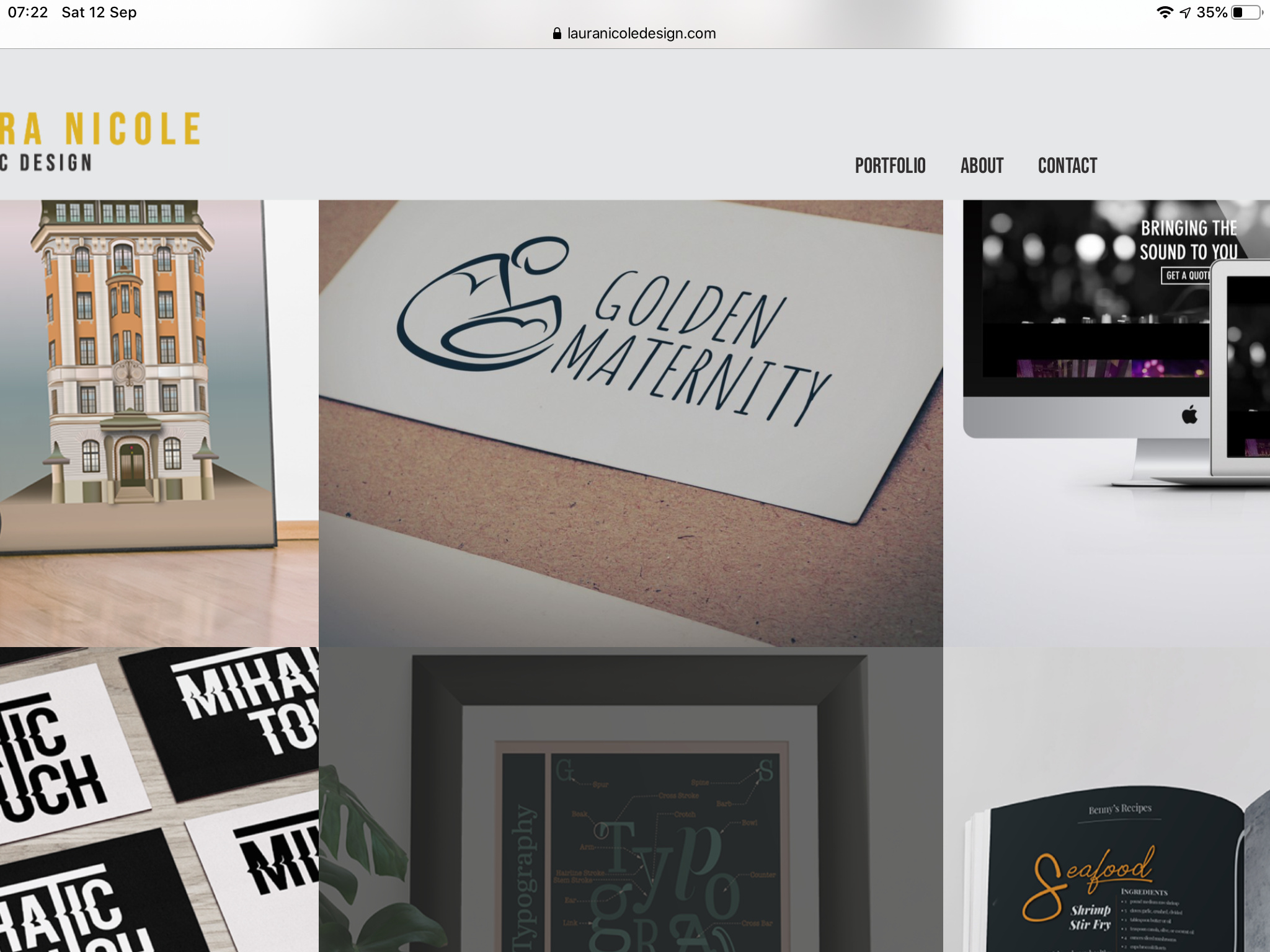
The only thing I’d say is not about your portfolio directly, but the site itself doesn’t sit well on an iPad. It’s a nice clean presentation, but it is too wide for my iPad in either orientation. Some gets cropped off the sides.
Here’s what I see…