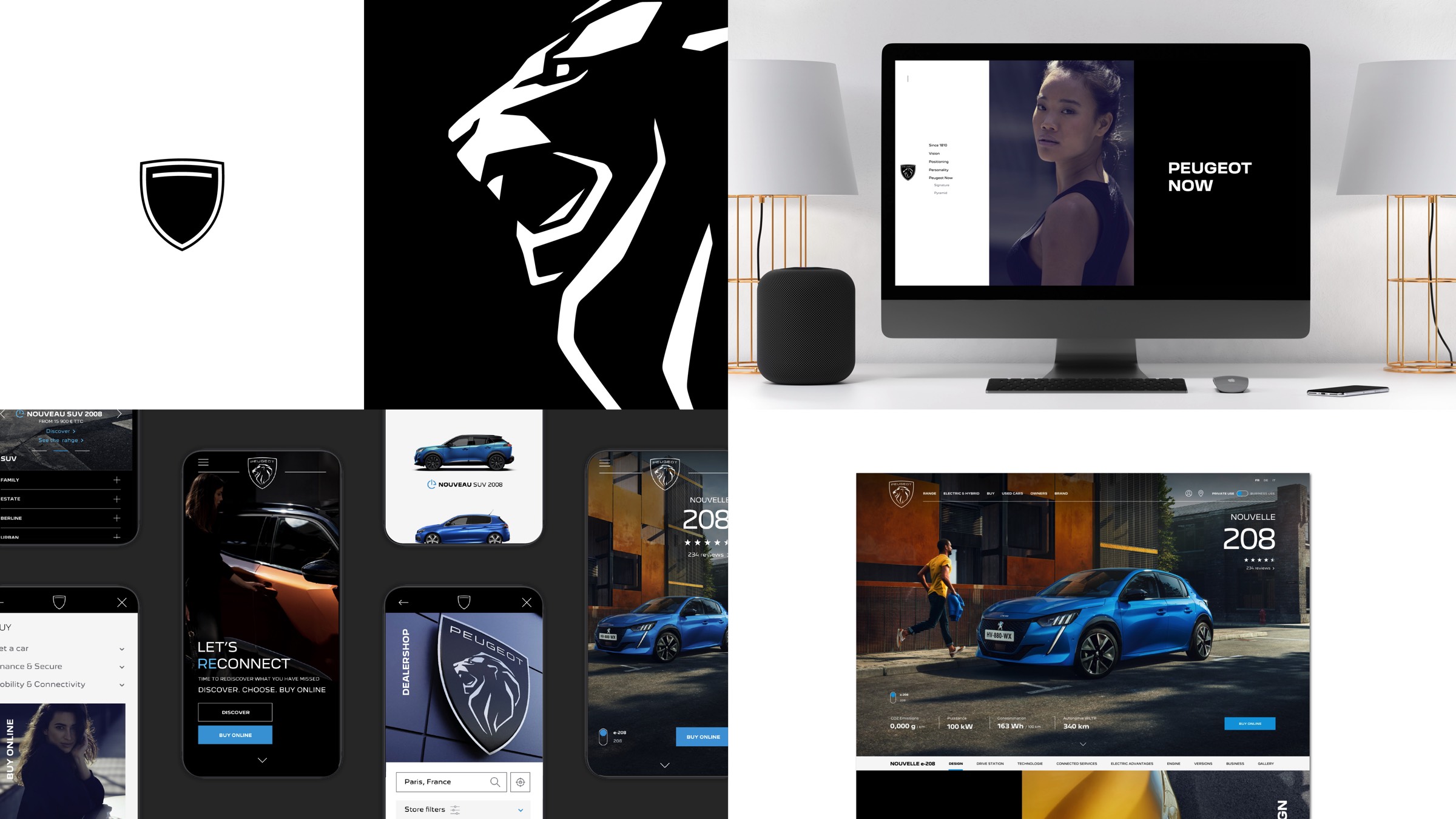
PEUGEOT has brought together a multicultural talent pool to design its new brand identity. This is not just a new logo, but a complete experience for users, from the brand’s website to its retailers. This experience transforms the time spent with PEUGEOT into quality time.
Designers from PEUGEOT and the PEUGEOT Design Lab studio have created the new logo with the iconic Lion. They joined forces with the W agency to design the visual aspect of the new identity. With the PEUGEOT marketing teams, the OPEn agency imagined the worldwide brand campaign LIONS OF OUR TIME . The mantra of all these teams is the move upmarket, the attractiveness and the digitalisation of PEUGEOT. The brand unveiled its new identity on 25 February, 2021.
The origin of PEUGEOT’s new identity
PEUGEOT’s new identity asserts its positioning as an innovative high-end generalist brand. Three words sum up the new PEUGEOT logo: quality, timeless and assertive.
This new identity has been built in the minds of its managers, taking inspiration from the brand’s flagship events.
- The PEUGEOT i-Cockpit® (compact steering wheel, heads-up display, touch screen, ergonomic seats and controls, quality of materials), unveiled on the SR1 concept and also found on the PEUGEOT 208 road car.
- The attractive and sharp design initiated by the QUARTZ and EXALT concepts and embodied in the second generation PEUGEOT 3008 and 508.
- The assertiveness of the Brand with its XXL-size ambassador Lion presented at the 2018 Paris show.
- PEUGEOT’s exciting vision of the future, driven by PEUGEOT e-LEGEND Concept.
“With over two centuries of history, PEUGEOT is a pioneer of mobility and a legendary brand for automobiles and bicycles. This emblem and this new brand identity are a link between our history and our vision for the future. This logo has been conceived, designed and developed in-house with the same stringent requirements that we apply to every detail of our vehicles: the quality of materials, the quality of execution and the quality of the finish.”
Said Matthias HOSSANN, PEUGEOT Design Director.
PEUGEOT Design Lab, instigator of PEUGEOT’s new identity
To create the new logo, PEUGEOT designers from different areas of expertise (exterior style, colours and materials) joined forces with the PEUGEOT Design Lab studio teams. Specialising in Global Brand Design, the studio designs products and services for clients outside the automotive sector.
“PEUGEOT is the only manufacturer to have developed its identity in-house. The studio acts as a laboratory of ideas for PEUGEOT and the other Stellantis group brands in non-automotive territories”
said Arnault GOURNAC, Director of the PEUGEOT Design Lab studio.
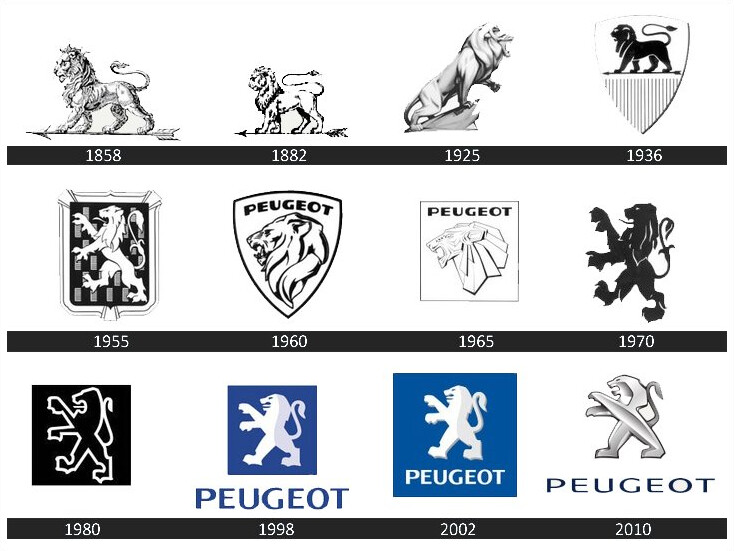
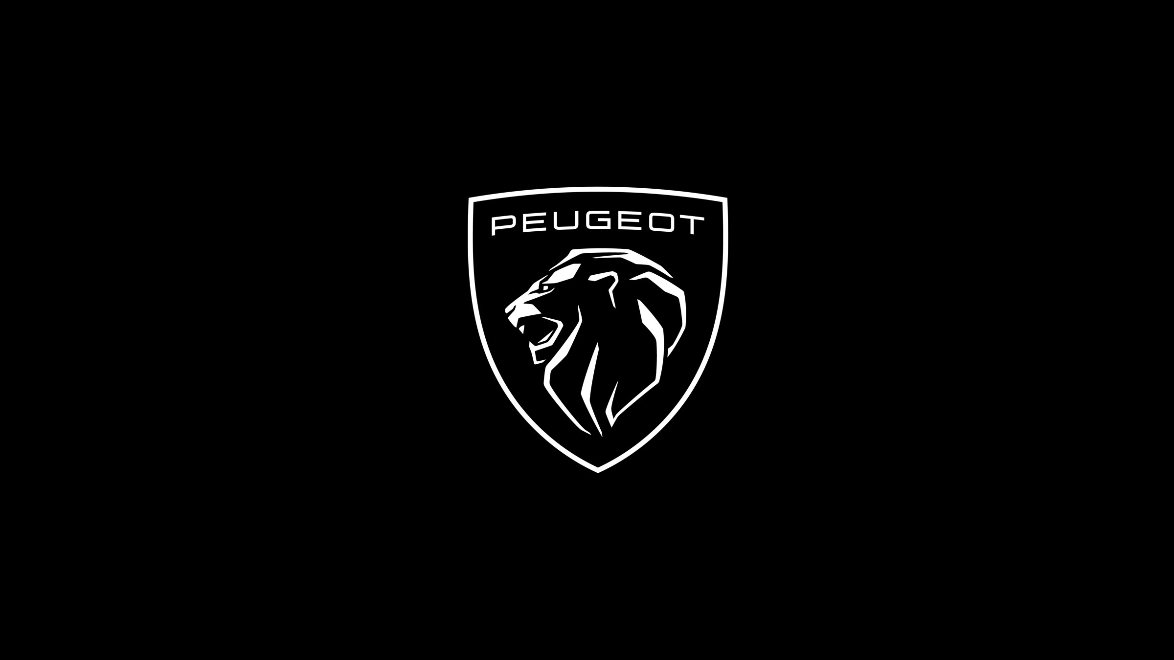
The PEUGEOT designers have created its new logo to last. This magnificent emblem, decorated with a Lion’s head in profile, embodies the history, present and future of PEUGEOT. The sculpture of the XXL lion, an ambassador with an assertive posture, was the first stone laid to define its style.
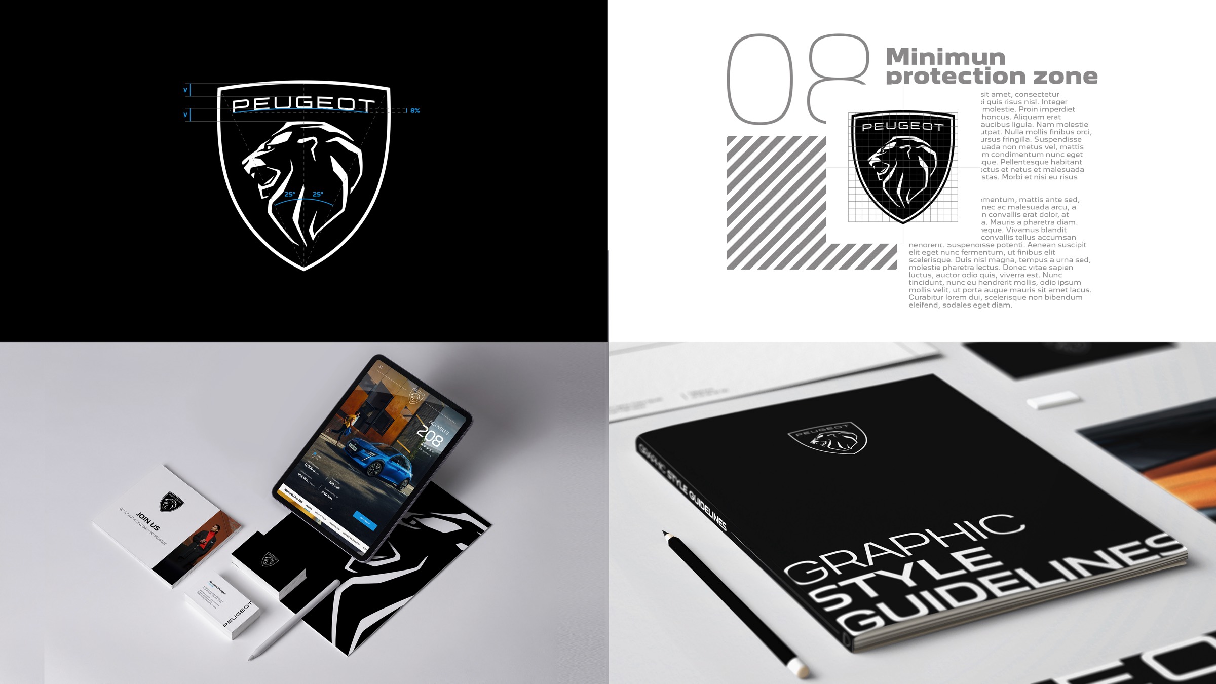
The profile of the lion’s head has established itself as a powerful indicator of feline grace and identity. It conjures up pride, strength and status, without aggressiveness. The shield is a protective, timeless element, faithful to the history of the brand since 1810. Its symmetry integrates it perfectly with the radiator grilles of the cars. Its design, as if cut by laser, uses the sharp and faceted style of the latest PEUGEOTs. The choice of the black background makes the Lion appear lit from above. This 2-D logo is part of the flat design trend, enhancing minimalism and pure lines. It is perfectly adapted to the digital world.
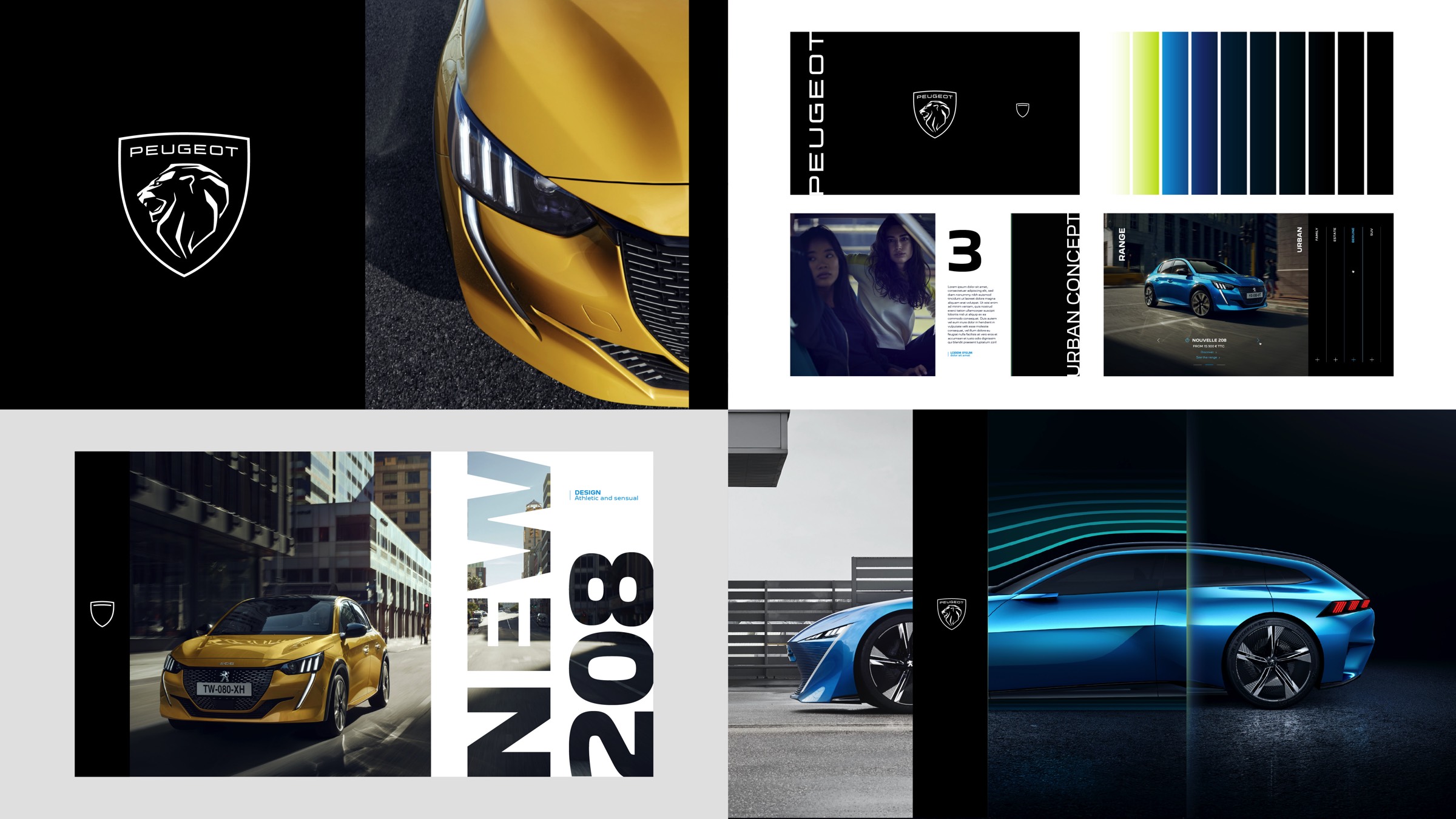
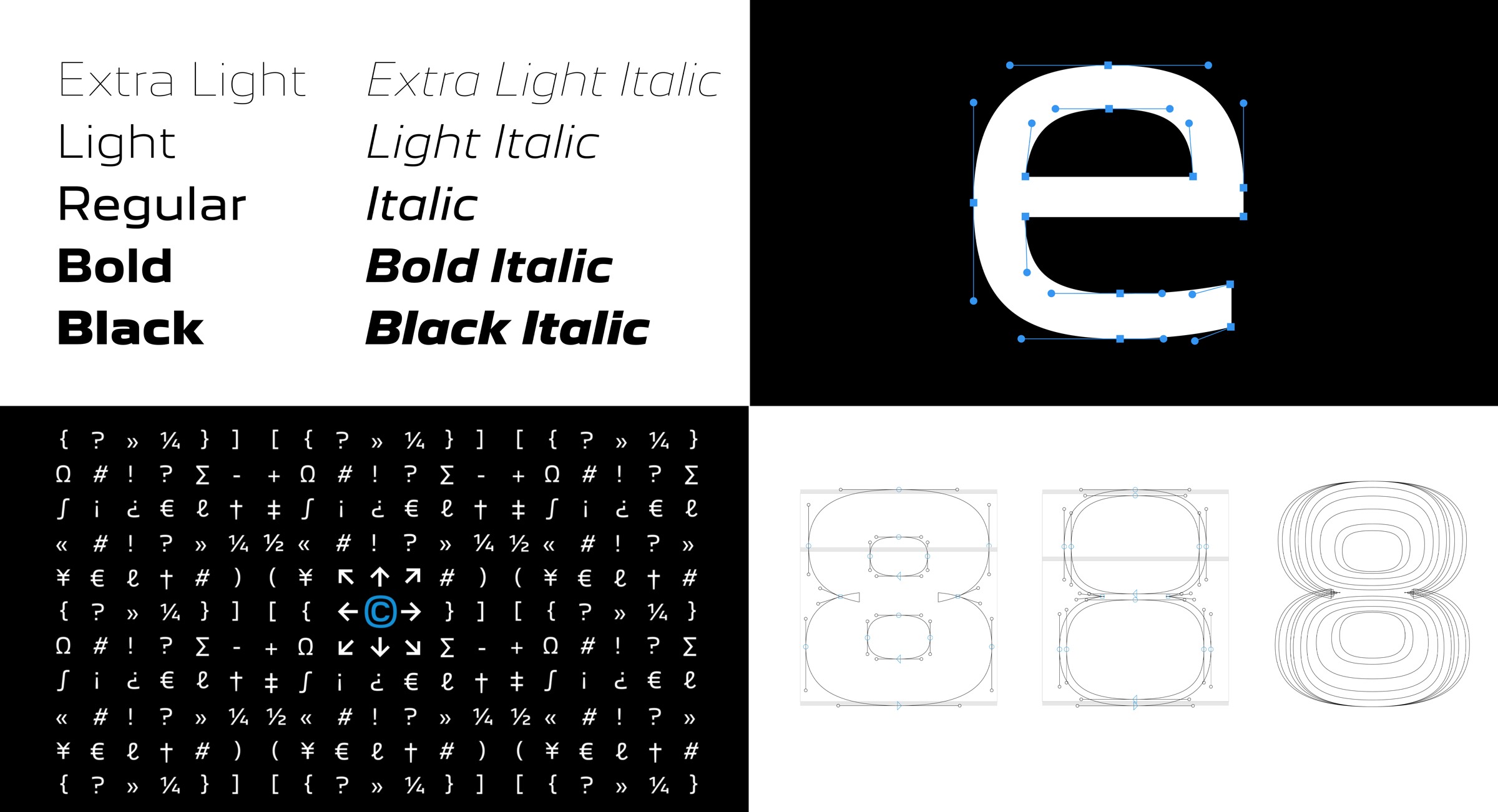
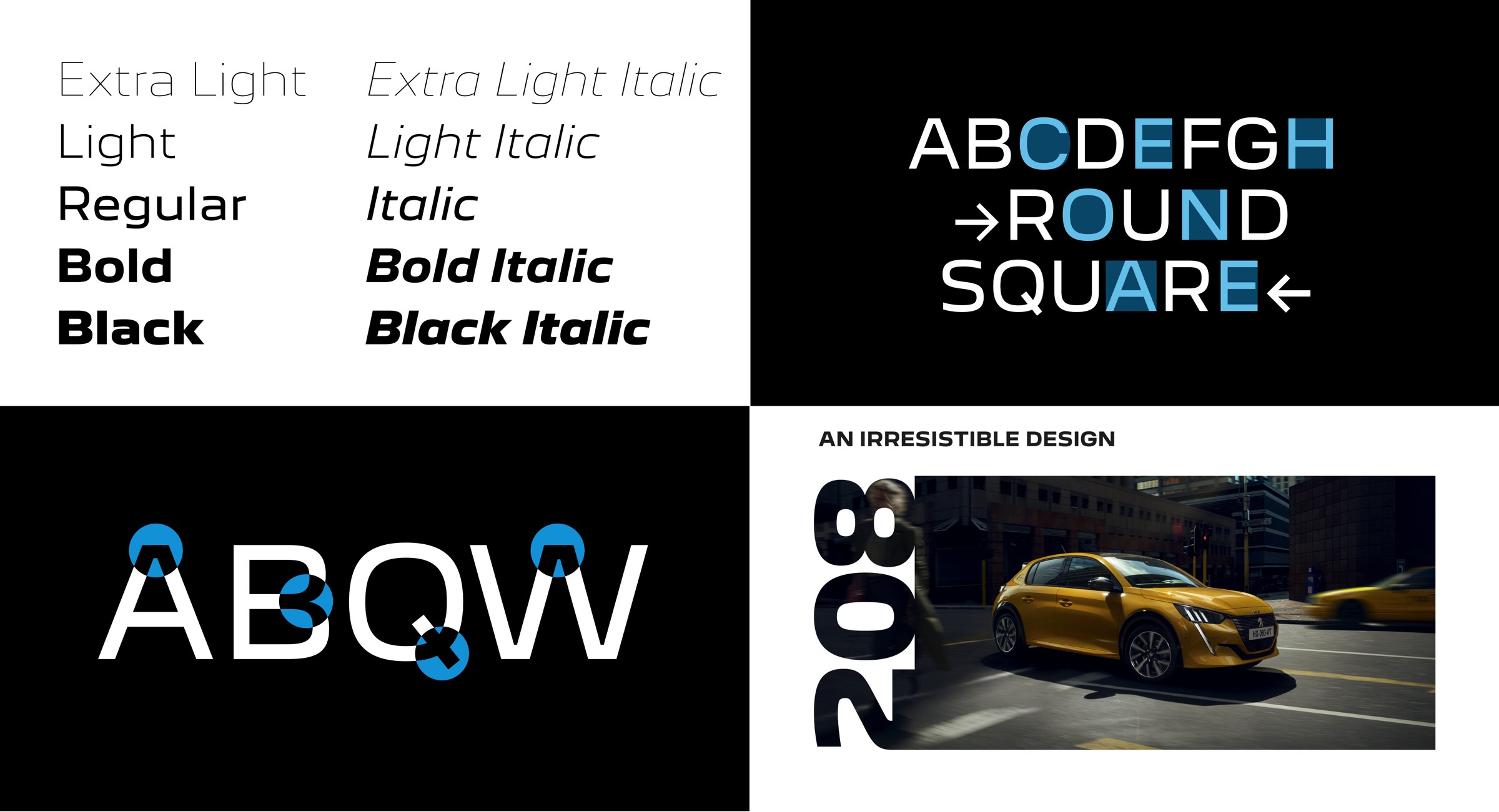
The studio has developed the New PEUGEOT lettering, specific to this new identity. It reflects the Brand’s assertion, without being flashy. Each character is precise and broad. The designers have created a new pure and timeless lettering, adaptable to multiple formats. The capital letters are imposing in the new lettering. It lends itself to dramatic graphics tricks, for example by blending into an image.
The studio’s designers developed the web user interface and the animations for the new PEUGEOT website with the aim of enriching the navigation experience. The new site has been developed in collaboration with the UX unit of the Stellantis Group and the MRM agency, making it intuitive, immersive, and easy to use for buying on line. The web users are immersed in three-dimensional settings. They are instinctively guided towards configuring electric, hybrid or internal combustion cars.
The W agency and PEUGEOT are developing a new visual identity.
The PEUGEOT Design Lab studio worked in collaboration with the W Agency. Both teams interacted to develop the new visual identity, which will be present on all of the touch points between the brand and its customers, including at retailers, on digital and print communications and at trade fairs and events.
“It is a privilege to be able to support a bicentenary brand in such a transformation. W is proud to have contributed to redesigning its new look which will proudly and confidently stand the test of time”
said Gilles DELERIS, Co-Founder and Creative Director of W.
This universe which includes the logo is the symbol of PEUGEOT’s new identity. Designed for digital use, it projects the brand towards the future. The meticulous care given to every detail reinforces PEUGEOT’s move upmarket.
- The vertical and horizontal bright graphic design is inspired by the tunnels at the end of the assembly line.
- The digital animations are spectacular, with a monumental opening effect that unveils the logo, a nod to the model reveals.
- The colour palette ranges from white to premium black, including a bright, modern blue.
- The responsive font adapts to horizontal or vertical screens when browsing.
- The Brand Icon, which is identifiable at first glance, is optimized for a digital use. It follows the outline of the shield and the line representing the Brand’s lettering.
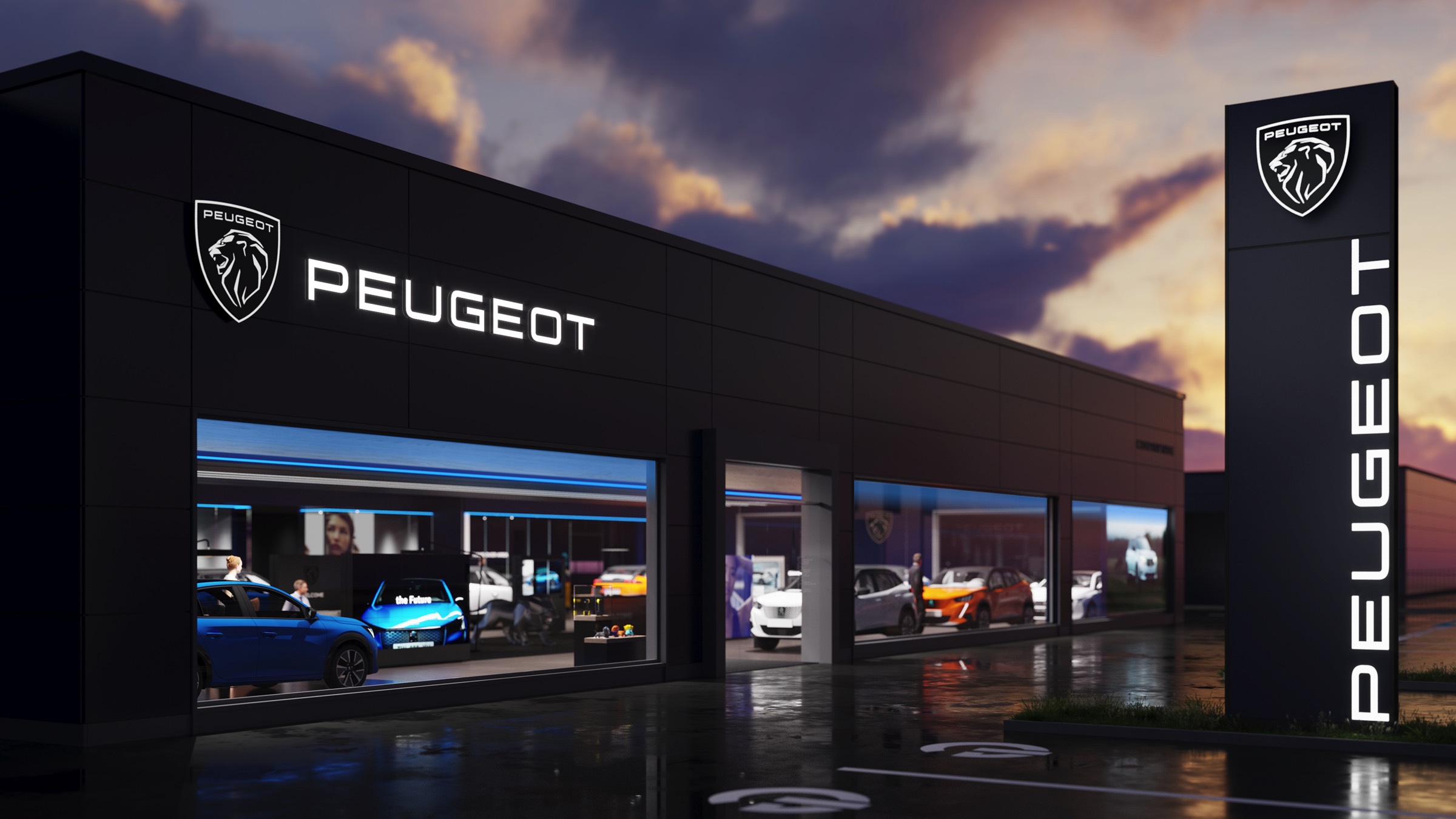
The design of the potential retailers of the future, which will be proposed from the end of 2021, was developed for PEUGEOT by the W agency, which has been a partner of the Brand’s for 20 years for the design and the architecture of the retailers. Customers will receive a phygital - physical and digital - experience. A comfortable central space within a more airy showroom is dedicated to them. Experts will introduce them to new technologies to make their time rewarding. From spring 2021, the signage of the new Brand Identity will be rolled out in the PEUGEOT network, setting up the new Brand’s visual identity.
The original and innovative broadcast, which revealed PEUGEOT’s new identity on February 25th, was developed for PEUGEOT by the W agency and Havas Event. With XR - Extended reality - technology, used for the first time for a Brand event, the presenters appeared immersed in spectacular scenery.
A Brand Centre has been designed by the PEUGEOT Design Lab and the W agency teams, in partnership with Havas Digital Factory. It is aimed at the internal teams and their suppliers as well as the general public. brand.peugeot.com is the worldwide platform for sharing and accessing the brand’s essential institutional contents: logotypes, graphic charters, corporate tools, animatic language, as well as assets from the brand’s heritage. This open and multi-device platform is the manifesto of PEUGEOT’s know how in terms of identity and digital experience. It asserts the brand’s pride and its ethos of transparency.
PEUGEOT entrusted its global brand campaign to the OPEn agency.
PEUGEOT launches a global campaign to support its new brand identity. This is a first for the brand in 10 years. Dynamic and international, this campaign appeals to PEUGEOT’s customers and more generally, the audience. It kicks off the collaboration between OPEn and PEUGEOT.
At OPEn’s suggestion, PEUGEOT is investing in a new universal resource, time. With a brand promise: to turn everyone’s time into quality time. PEUGEOT has legitimacy in regards to fulfilling this promise: through its 210-year history, through its upmarket generalist positioning and finally as a French brand, a culture that promotes the art of living and quality of life.
PEUGEOT is transforming everyone’s time into quality time, by offering rich, intense and even exceptional experiences at all points of contact with the brand. Buy online allow customers to configure their vehicle from the comfort of their own home, at any time of the day. The experience aboard a PEUGEOT is amplified by the i-Cockpit. At retailers, the customer, guided by experts, can explore the ecosystem of electrified vehicles. Their time becomes useful, informative and enriching.
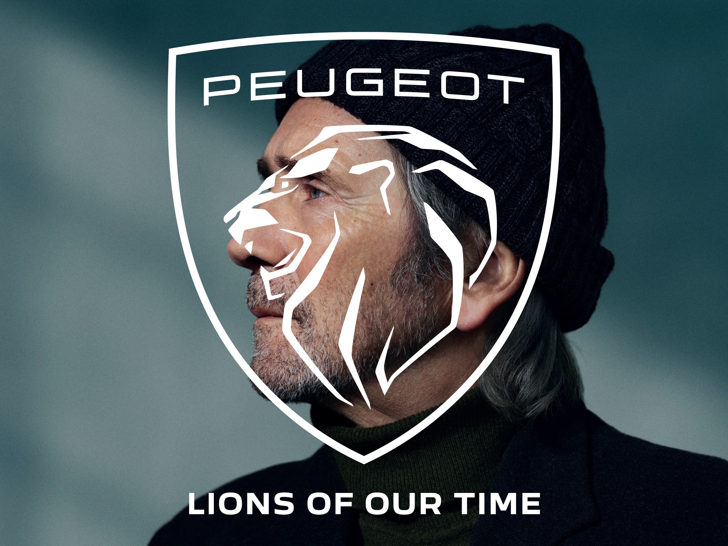
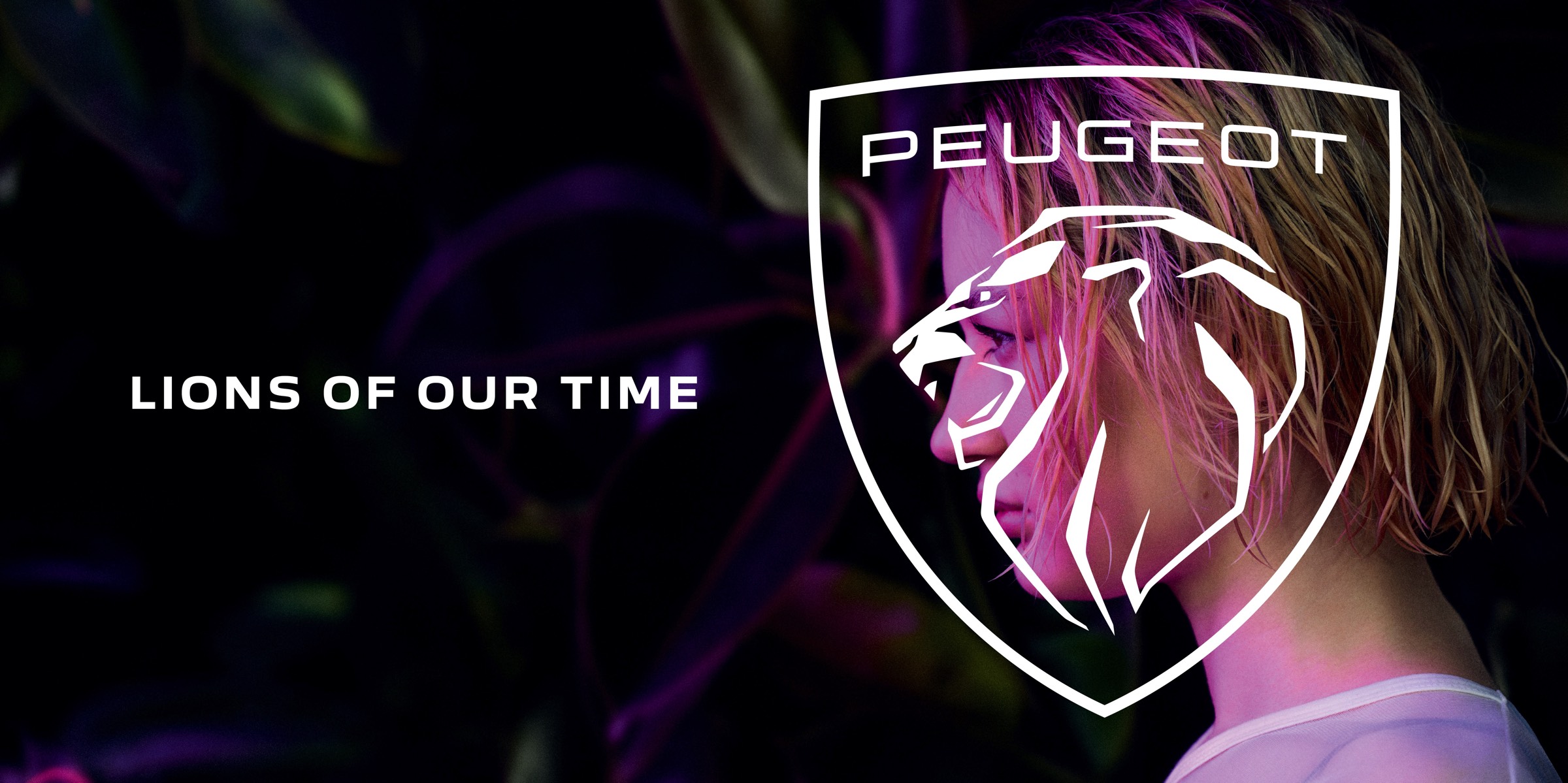
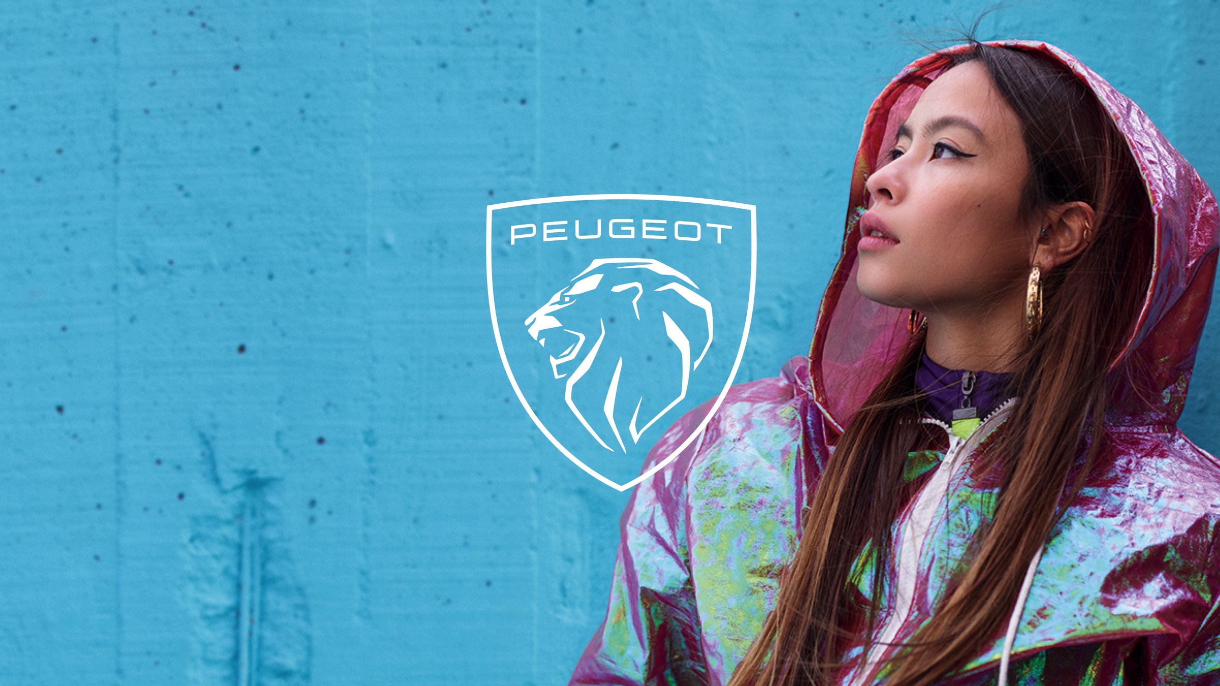
Called LIONS OF OUR TIME, the campaign invites PEUGEOT customers, as well as those who are not customers yet, to take back control of their most precious possession, time, to turn it into quality time. With this slogan, PEUGEOT is celebrating the “Lions of our time”, from different generations, cultures and backgrounds. The Brand is therefore redefining the mindset of a Lion in 2021: to go beyond the quest of power or money, to share the philosophy of those who class self-fulfilment as quality time. PEUGEOT is revealing this new look to the world as a brand in its time and encourages everyone to join the Lion community.
“You are about to discover the new face of PEUGEOT. With the LIONS OF OUR TIME campaign. PEUGEOT is introducing its new visual identity while redefining a new brand territory, a new narrative and positioning itself as a brand of its time, in touch with its time”.
Explains Eric PIERRE, Global Chief Creative officer for OPEn.
OPEn (Omnicom for Peugeot Engine) is a network made up of the best Omnicom agencies in the world with teams dedicated to PEUGEOT. The new LIONS OF OUR TIME campaign is the result of an international collaboration between Open Paris, Istanbul and Amsterdam. It reaffirms PEUGEOT as a major player in the international automotive industry. It is being launched in all countries with a 360° presence across TV, posters and digital, from 25 February.