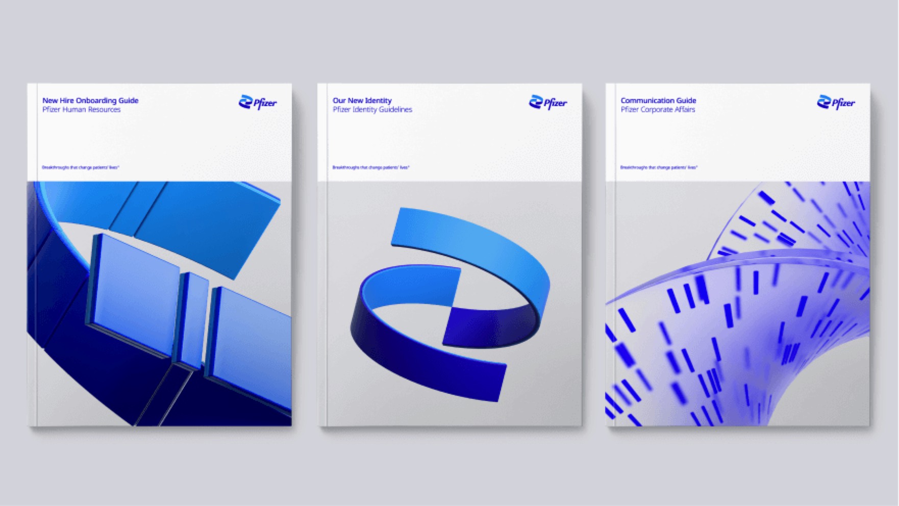
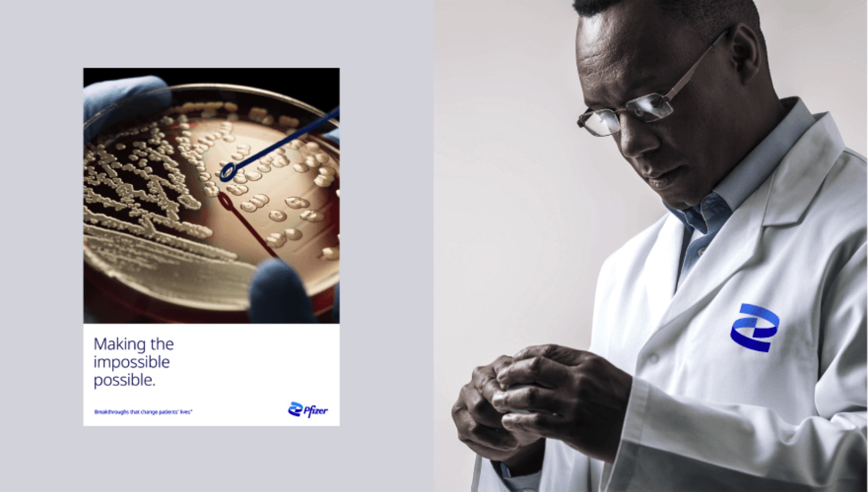
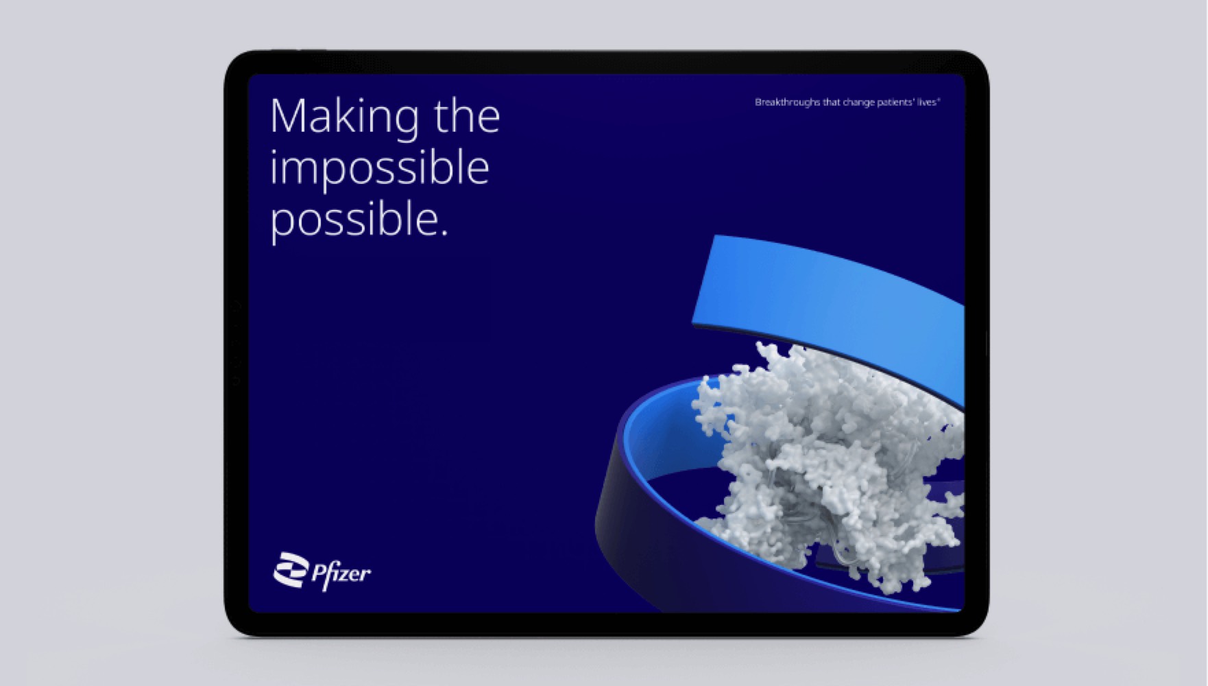
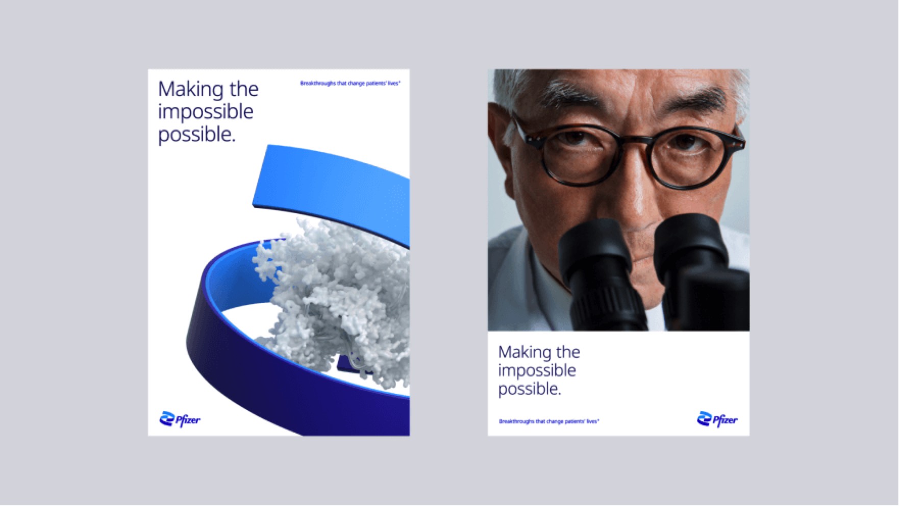
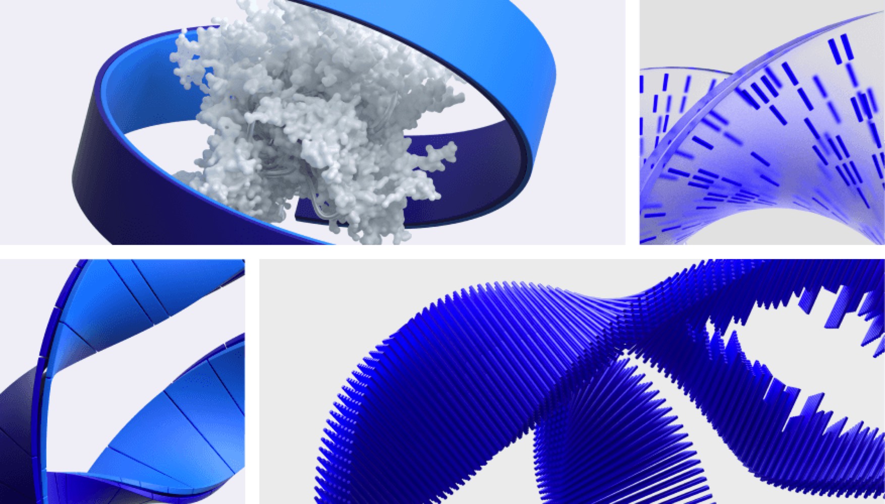
Pfizer has become much more than a pharmaceutical company. The new logo signals this shift from commerce to science. They’ve unlocked the pill form to reveal the core of what we do: a double helix, spiralling upward.
The logo is constructed of two interlocking forms. Their unity reflects the company’s passion and dedication to the science behind our innovations, and to the wellbeing of their patients.
I really like the concept of a helix. I just wonder how they would handle the black version. Perhaps the lighter blue part of the strips would just have a stroke and no fill? That might work.
Pfizer has been demonized for years as the epitome of “big pharma.” I wonder how this new branding effort is related to their new-found appreciation as the high-tech, wonder company that brought to market the first COVID-19 mRNA vaccine in record time.
If they’re ready for brand redo to help redefine the company, I suppose now is the time for them to do it.