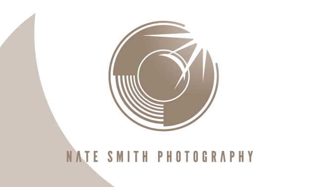
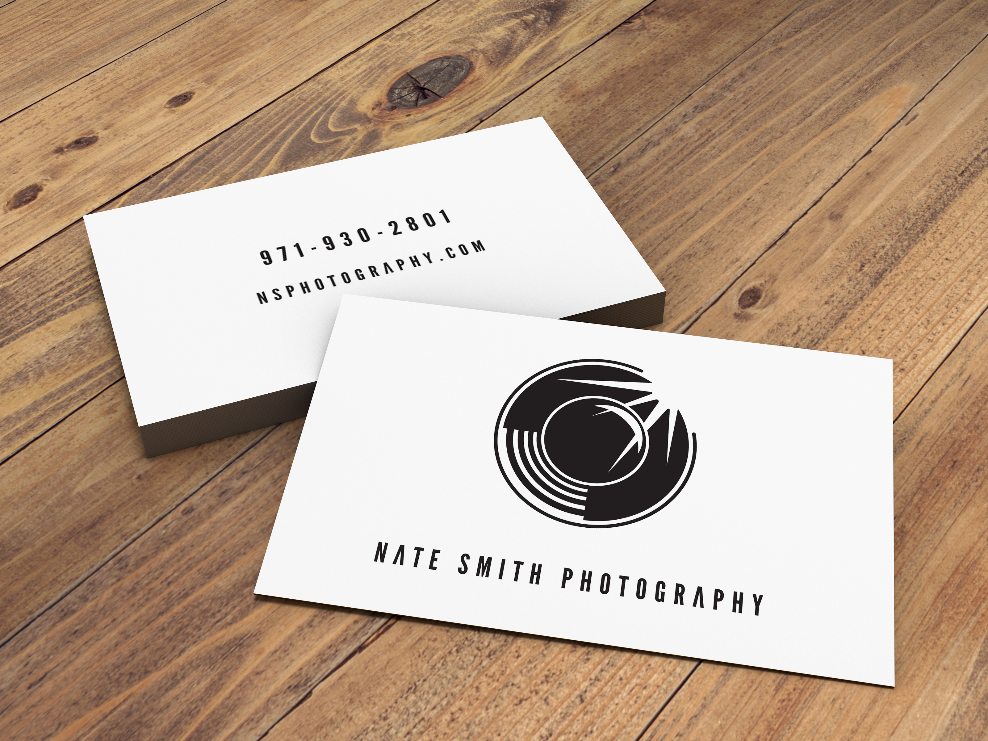
Please critique this photography logo concept I came up with. I was going for something bold, yet simple and minimal. I came up with three iterations with the angle of the flash reflection, one at 90 degrees, 45 degrees and one following the lines.
*note- this may not seem minimal to you but given my usual heavy-handed design, this is minimal for me.
This is better. Just keep in mind if you ever plan to print it, that subtle gradient, as visually aesthetic as it may appear on screen, is going to render as a solid.
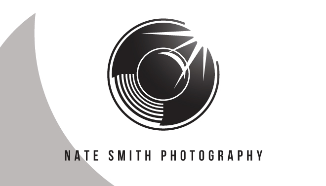
Or is it even still there is this rendition? Perhaps it’s just my eyes playing tricks on me.
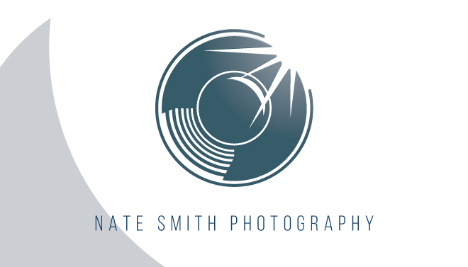
Also keep in mind how this might look at the required size for a business card. Those lines may yet be too thin.
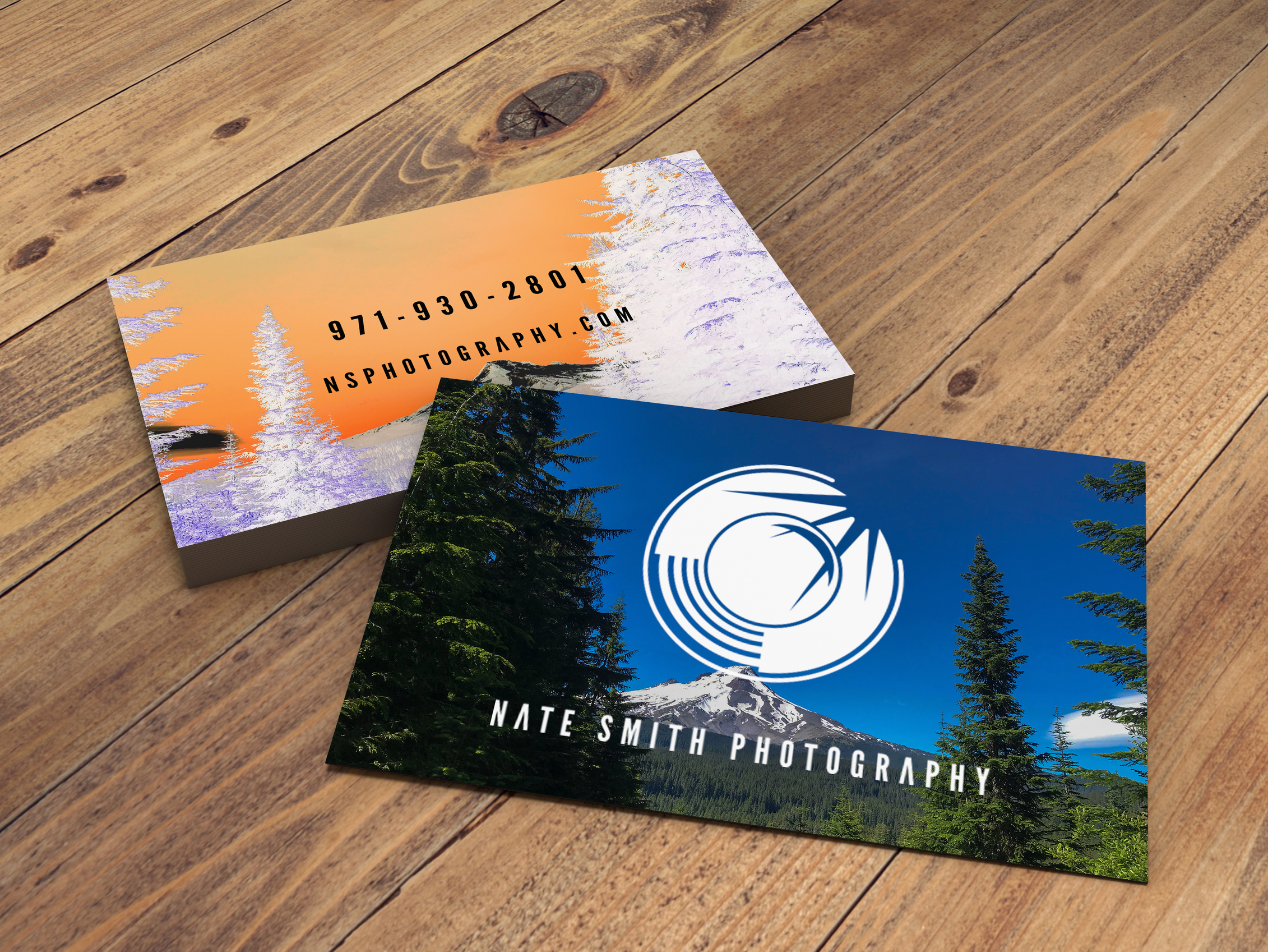
Nope, that’s your eyes playing tricks on you. It does that to me too. I printed out a couple mock-ups of the first design and I’ll concede it’s definitely going to disappear if used a site icon. Here’s a mock-up of two different designs I had and as a watermark on a photocomp I came up with.