Hi Everyone,
i am learning Graphic Design on my own. Today i learned about ‘Balance’ and ‘Proximity’ and i have made a design using these two concept. I would be highly obliged if you could provide your valuable insights.
Regards
Dev
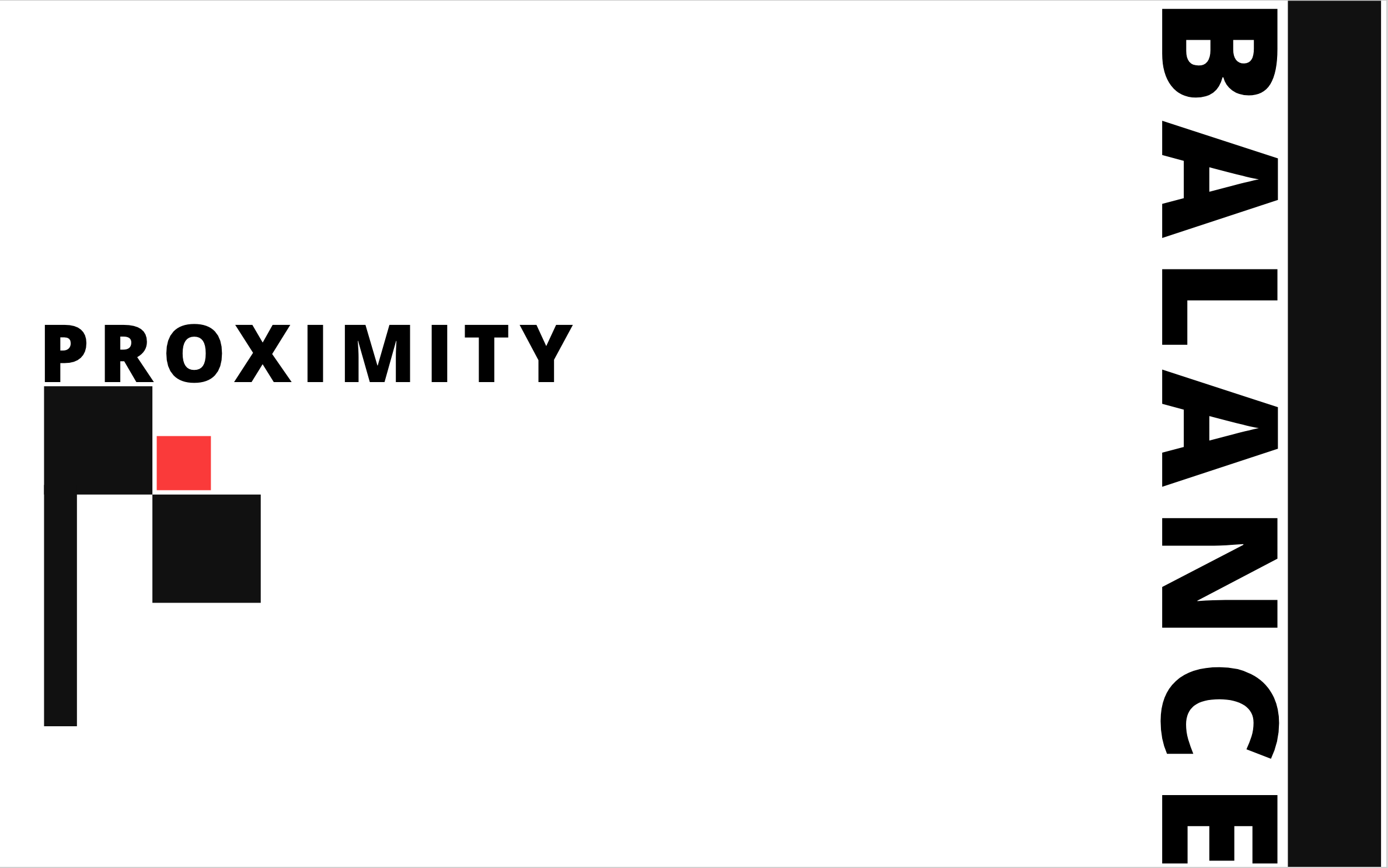
I take it your learning Gestalt Theory atm. Best way to practice it is to try to create a design that only shows each of the elements of the theory. (Figure-ground, Similarity, Proximity, Common region, Closure, Focal point). So with your Proximity example I would try and build a design that doesn’t use color to that shows the concept of proximity in action. With the color the element your most likely showing is actually similarity. Where the red is dissimilar to the black thus making it stand out and shows that its unrelated to the rest of the design which is against what you are going for with proximity making them so close together.
For instance:
Proximity and Proxi mity
just the space in between the words makes you see 2 different objects rather than one word.
or another easy example would be if you put a circle and triangle close together but a square far away that would be proximity in action. You would relate the circle and the triangle as together while the square being out of their relationship.
As with the balance design theres many ways you can look at it. It could be the balance of positive and negative space(black and white) which depending on how you crop that image could be balanced (if you give enough white space to match the black bar. It could also be the balance of the letters which isn’t actually balanced cause (Im trying to look at it sideways) The “A” which should be in the center is not actually in the center of the image. The Letter height is not equal to the height of the bar that would also be balance. The kerning(distance between the letters) also doesnt look balanced either. Overall I would say its an unbalanced design.
If your trying to learn graphic design on your own I would honestly tell you it would be a lot quicker and waste a lot less time if you just purchased an online course. I bought one off udemy for $14 when they have their sales to supplement my actual schooling.
1 Like
Thanks a lot MrChoob Sir for such a detailed critique. I leaned a lot. i added the red square to balance out the right side because in the right side i have used big font size and also a fat solid bar. when i was designing this, i thought of using asymmetrical balance. I have learned that one side can feel heavy than the other side in asymmetrical balance that’s why i added the red color square.
Once again Thanks a lot for providing your valuable feedback.
Regards
Dev