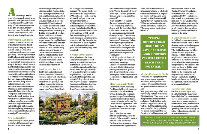
This is an assignment for a magazine spread. Any thoughts are appreciated since I am a beginner
!It isn’t often (as in almost never) that you see a full spread image where you have to turn the page to begin the article. It almost looks like an ad spread.
If this were the outside-inside of a folded single sheet, it would work a little better, but not for a mag spread.
I’d also adjust the rotation/crop of the image so that the buildings were vertical. Right now they lean to the right.
I agree with PrintDriver, you need to start the story on the initial spread. There’s plenty of room to do it there. If it were me, I’d consider starting the story out there in larger type than the body copy that’s on subsequent pages.
As for the body copy, it needs paragraph indents.
The subheads are just a bit anemic.
The cutline beneath the photo needs breathing room.
Also consider the design possibilities of rules, page numbers and other standing design items that contribute to the design consistency of the entire publication. Page numbers, for example, provide opportunities to do something interesting — they don’t just have to be purely functional items tucked into the corners.
Look at other magazines to see what they do to break up and make large blocks of gray text more approachable. There are tons of possibilities for adding interest that you’re not considering.
^All good observations and advice. But I’ll expand a bit:
Weird, but I thought the whole thing, headline and all, looked a bit crooked, so I stuck a ruler on the screen and sure enough, somehow the top of the D in AGRIHOOD is almost a full mm lower (distance form the top of the image), than the top of the A. Now this might not be the case in your actual layout I realize (indeed it could be on my screen only), but the whole spread seems tilted down on the right from some reason. Even if it is level empirically, the fact that it appears tilted is not good. Investigate and compensate.
Yes, either space before or a first-line indent—never both—always one or the other.
Subheads are like accents in music. They should stand out significantly, whereas yours here recede within the aesthetic of the page. Also, there are too many. Again just like musical accents, the more there are, the weaker their impact, relatively. For subheads to be truly effective, there should only be 2, maybe 3, in an article of this length.
Yes, that photo is jammed at the bottom of the page like an afterthought, rather than an opportunity to capitalize on the natural inclination of the audience to be “visual”. A single image on a page otherwise full of copy should be the star; the thing that makes all those words worth reading; the first thing the reader processes and within finds motivation to stay in and read on. To fulfill that role it must be positioned correctly, and the trailing position you have here never works. The upper-right quadrant of the page is where it should be.
Oh, and the all-caps pull quote? Nah.
All caps is best reserved for signage, and even there you should avoid it when you can.
Take a look at actual magazine spreads. Preferably “quality” spreads. Go to a bookstore and check out their magazines or even your grocery store, corner store, etc.
You’ve been given excellent feedback already. But if you’re looking for an online site that may give you some decent examples, you may want to check here as well. Not all of these examples are perfect either, but it may be a good resource to at least dig through.
- Drop caps should drop into the paragraph, not stand above it - the baseline of the drop cap should be level with the baseline of the 3rd or 4th line of the body text
- Fully justified body text would be better but if you want ragged right there is no need for hyphens
- Make the subheads bold or all caps to stand them out
- The pull quote should not be all caps and the quoted parts should be italic or different somehow from ‘Blunt says’
- The green box bottom right is too close to the body text above and it doesn’t need a border
Some of the points above are personal taste - I myself would not use paragraph indents with a subheader - but if you work through each of the ideas and see how they affect the layout you will get an insight into how this works.
Definitely agree; no indent on the first paragraph after any heading, but surely on subsequent “interior” paragraph-starts, if no space before.
I almost never justify text in narrow columns — it really messes with the word spacing.
That’s more of a stylistic convention determined by the overall design of the magazine. Personally, I think it looks odd not having the first line indented when there are subsequent paragraph indents in the block of text, but different people have different opinions on it. It’s sort of like the Oxford comma that copy editors like to argue about.

