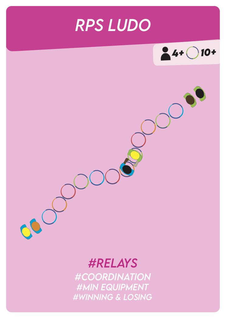
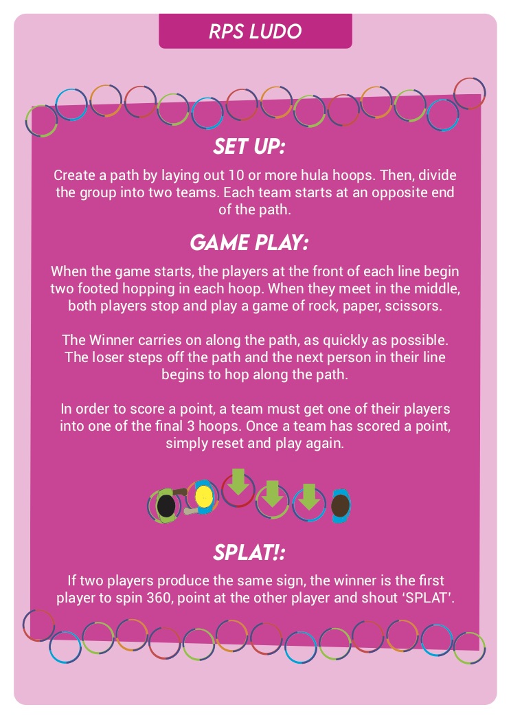
Myself and friend have been designing games cards for PE teachers, neither of us have that much experience designing and learning as we go, this is an example of one the cards.
We are not overly happy with the “children” on the front or back. Any input would be great. Let me know what in think about the “children” and the card in general.
Love the concept and the game you came up with. I am already curious what’s on the next card!
As for critique: The first thing that jumps out at me is the color scheme. I’d heavily reduce the number of colours, especially on the illustration of the hula hoops and children. Against the pink background it makes it hard to make out the depictions and there are some colours, e.g. the light green, that create a very jarring contrast that is hard to look at. So my main advise would be to work on your color scheme and try to chose no more than four or five colours that harmonize well with each other. Bear in mind there might be certain colours required for other games to make objects recognizable, so identity those first before you lock in your new color scheme. In any case, I am sure you will find that when you reduce the colours it will also force you to simplify your graphics a bit, which should make them a bit easier to understand as you have to flesh out the perfect object shaped to make things recognizable without relying on colours as much. Also your colours might then take on a new unified symbolism across your deck. I mean, I have not seen any of the other cards, but it might for example make sense to have the players always in certain colours (e.g. a blue and a yellow team) and the game equipment (e.g. the hula hoops) in another recurring colour.
In regards to your players in particular, I would probably opt to not depict them in such a birds eye view, but rather go isometric. That will also make them fit in better with cards for other games where birds eye view does not make sense to explain the tasks.
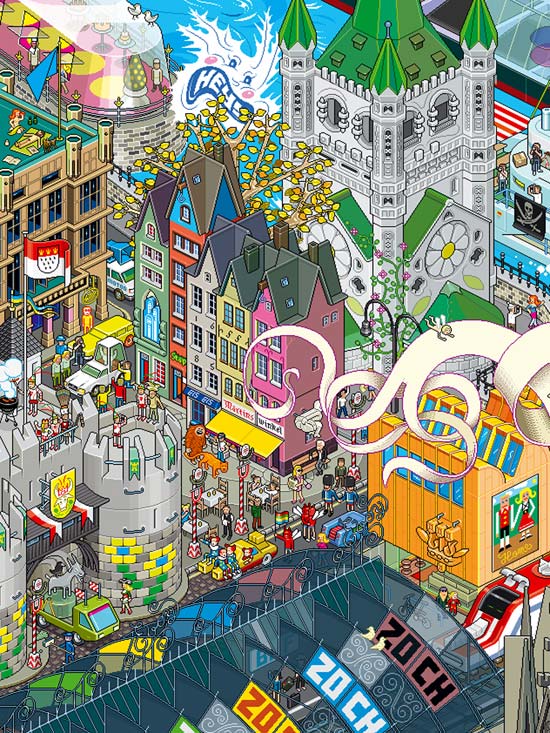
And if I may take this as an excuse to post one of the outstanding isometric artworks from eBoy for obscure reference, I’m not gonna pass on it!