Hi Everyone! I have made a pasta box for an (fake) Italian pasta company called Mangia. I am hoping to get some critique, as well as have some of my questions answered.
What feeling do you get when you look at the product?
If you saw this product on thr shelf would you buy it?
What is one thing you like and one thing you dislike about the product?
Thanks to all that reply!
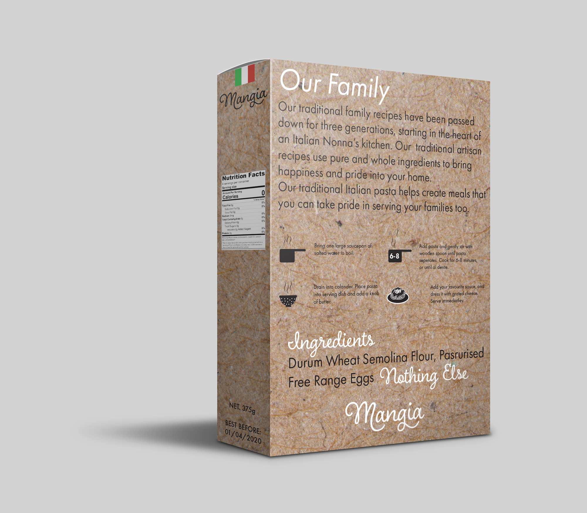
Excellent choice of script font. The text on the back is way too close to the edges though.
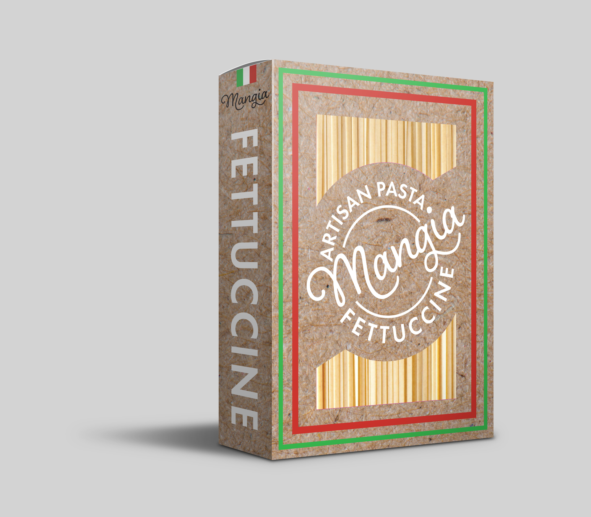
The background looks like some kind of raw material - not much to do with cooking or pasta but sending the right message.
Not a bad effort and definitely a package that could be created without significant production problems.
You’ve stressed the artisan nature of the pasta and listed two ingredients. One of which is misspelled, as @PrintDriver pointed out. Free-range also needs a hyphen since it’s a compound modifier of eggs.
Getting back to the point, though, you’re marketing this as a healthy, basic, traditional product devoid of a bunch of preservatives and chemicals. OK, that’s a good thing which sort of goes along with the chipboard packaging, which could be a cool idea if it were real chipboard, but it’s not. It’s a not-too-appetizing bit of fakery. @tonysprinkle commented on the color being less than ideal, and I agree. If it were the real thing, though, it might be OK.
Think about it for a second. The box would likely be made from some sort of brownish-gray cardboard with a laminate of white paper on which you’d print a cardboard or chipboard pattern. This would be the only practical way to get the red, green printing and white lettering to work as you’ve done, but it would be a whole lot more authentic and natural to skip the fake stuff and design something using raw, natural, unlaminated cardboard for the packaging.
Both the side and the back come across as a bunch of filler material that you’ve spread out in a way that looks as though you were mostly trying to fill the space. I also see a lot of inconsistency in where you’ve chosen to place elements, as in a lack of an underlying grid. As @StudioMonkey mentioned, you’re pushing some of the elements too close to the edge. This is also the case with the required product ingredients panel on the side. Things like this need comfortable margins — room to breathe.
I’d tighten the instructions up in the back and lighten the background behind it (maybe frame it). remember instructions are about information clarity not about pretty.
“Our Family” looks out of place on the back. Go with the script to unify the back more.
Introduce a little green and red to the back for accent and design unification.
You’ve received a lot of solid feedback; I’l try not to duplicate comments already made and just add a few others.
– The red and greed rule on the front need work. Right now, they seem too far apart which makes them seem like two separate elements rather than being a cohesive unit.
– On the front, Artisan Pasta and Fettuccine need to be smaller; they run too close to Mangia – particularly the Artisan Pasta.
– I wouldn’t mind seeing some color added to the logo / type on the front. Maybe it’s as simple as making the circle black or red. I just feel some contrast in color is needed there.
– The back really falls part, and this panel comes off like a bunch of disconnected elements thrown together. Work on this more.
– I’d be tempted to move the nutrition facts to the back and duplicate the large Fettuccine on the other side.
1-It seems delicious to me
2-of course, I’ll buy this because it watering everybody’s mouth
3-But I’m not satisfied with your color selection sorry for that because you have select dull color try some attractive color I personally suggest you light green.
Overall you have done a fabulous work.
You packaging really looks professional. the color the design and the outlook is absolutely amazing. You have also drawn two line which are red and green, both are eye catching color and I must say they are doing their job pretty well. The packaging is like some of the Italian branded pasta which are much more expensive than the local ones. Good job I think you can eve sell it.
Notes from packaging designer/production manager/lead design here, trying not to repeat others:
I would push down the Nutrition facts to the bottom. Oddly placed there not quite centered either. Then that gives you room above to make another long type like you did with the other side, but obviously use a shorter word like “Artisan” or something.
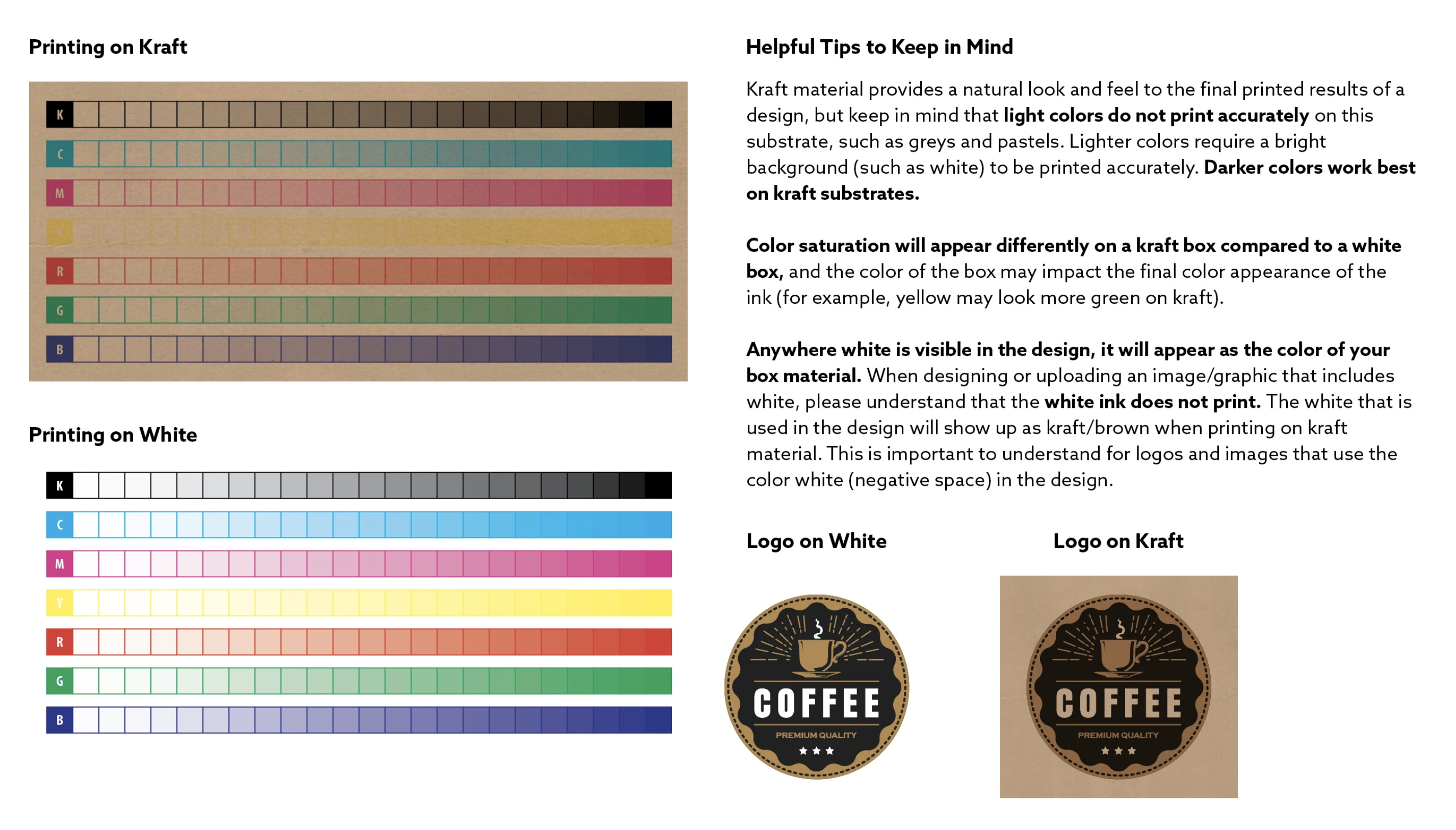
I agree that that’s not quite a kraft/brown board color. It’s going to be warmer and softer. It looks like that’s a super zoomed in scan of a kraft texture, the actual “fibers and bits” of kraft board are significantly smaller.
You’ll want to bold the text. Reading “light” or “fine” versions of text on kraft is a no-go as the fibers interact and could make it difficult to read fine black on brown backgrounds.
Unless you’re printing with UV inks, inks are, by nature, transparent. So they’ll take on the value of the board your printing on. This is especially important when printing on this kraft/brown stock. Those colors when printed will be dulled back significantly. The green and red will get darker, and white will be “washed” looking like a heathered shirt. A good way to see what this will look like is to put your colors on “overlay” or “soft light” mode to see a roundabout way of how colors will be affected. An alternative is to have custom opaque inks mixed, but that’s only financially viable for large quantities of orders (10k+) which I assume this is not going to be.