Please Critique my Poster on Elderly Loneliness

I am grade 7 and as a school project we were told to make a poster on elderly loneliness.
The rubrics for full marks are:

-Provides a meaningful call to
action that is responsive to the
advocacy cause.

-The writer’s word choice is
purposeful and precise. It
reflects a keen awareness of
the persuasive purpose and
maintains a tone appropriate to
the task. Word choice strongly
contributes to the quality and
clarity of the campaign.

-The campaign uses a
sophisticated or creative
headline that creates interest
in the topic and closely relates
to the body copy.

-The writer demonstrates an excellent
command of:

  1. sentence boundaries
  2. capitalisation and punctuation
    spelling
  3. subject-verb agreement,
  4. pronoun/antecedent
    agreement
  5. verb tense agreement
  6. other grammar and usage
    conventions

-Although a few minor errors may be
evident, they do not detract from the
fluency of the writing or the clarity of
the campaign.

All feedback would be greatly appreciated!

gdfmoving

Moved to the Student Forum

The challenge here is to provide a helpful critique keeping in mind that you’re in 7th grade.

Overall, I’d say this is a good start. The picture works, and the overall color palette mimics the headline.

What can you do to improve this? I think the biggest thing would be to change the fonts you use. Right now, the headline and body copy have roughly the same visual weight, so everything tends to run together. Try to create contrast between the headline and the body copy. This can be achieved by the fonts you choose, the weight of the font, the size of the type, and the color of the type. Bottom line, make the headline stand out more and the body copy stand out less.

I’m not sure the call to action is very powerful. I’d suggest you work on that. I understand this is a fictitious assignment, but I’d like to see something like “Visit www. w ebsite.c om for ways to volunteer / ways to check in on your elderly loved ones / whatever…” you get the point. Something a little more concrete. This isn’t a make or break thing considering the assignment, but I think it could help.

Lastly, and this may be limited to your computer / skills, I’d like to see some sort of texture or gradient on the right side. Maybe even storm clouds ghosted in the background. If this is outside of your skillset as a 7th grader that’s fine.

The biggest thing I’d suggest is to experiment with different fonts and work to create contrast between the headline and the body.

2 Likes

Its a step in the right direction, just as the previous poster mentioned about different font choices.

Its important to create a headline bigger than the main paragraph of text.
Different sizes have different purposes.

A call to action can be a website, a button, a QR code…

Thanks for the feedback! I think you are absolutely right about the fonts. I’ve changed them a bit but I don’t think I’ve nailed it yet. Also, my teacher told me to make a more meaningful Call to Action as the grading will focus slightly more on linguistic elements than visual elements.

How do I make the “storm clouds” look better? It doesn’t have much chemistry with the image on the left.

Given your age, it is pretty great – a lot better than some stuff by much older people who call themselves designers.

However, there are some issues – but you know that, or you wouldn’t be here.

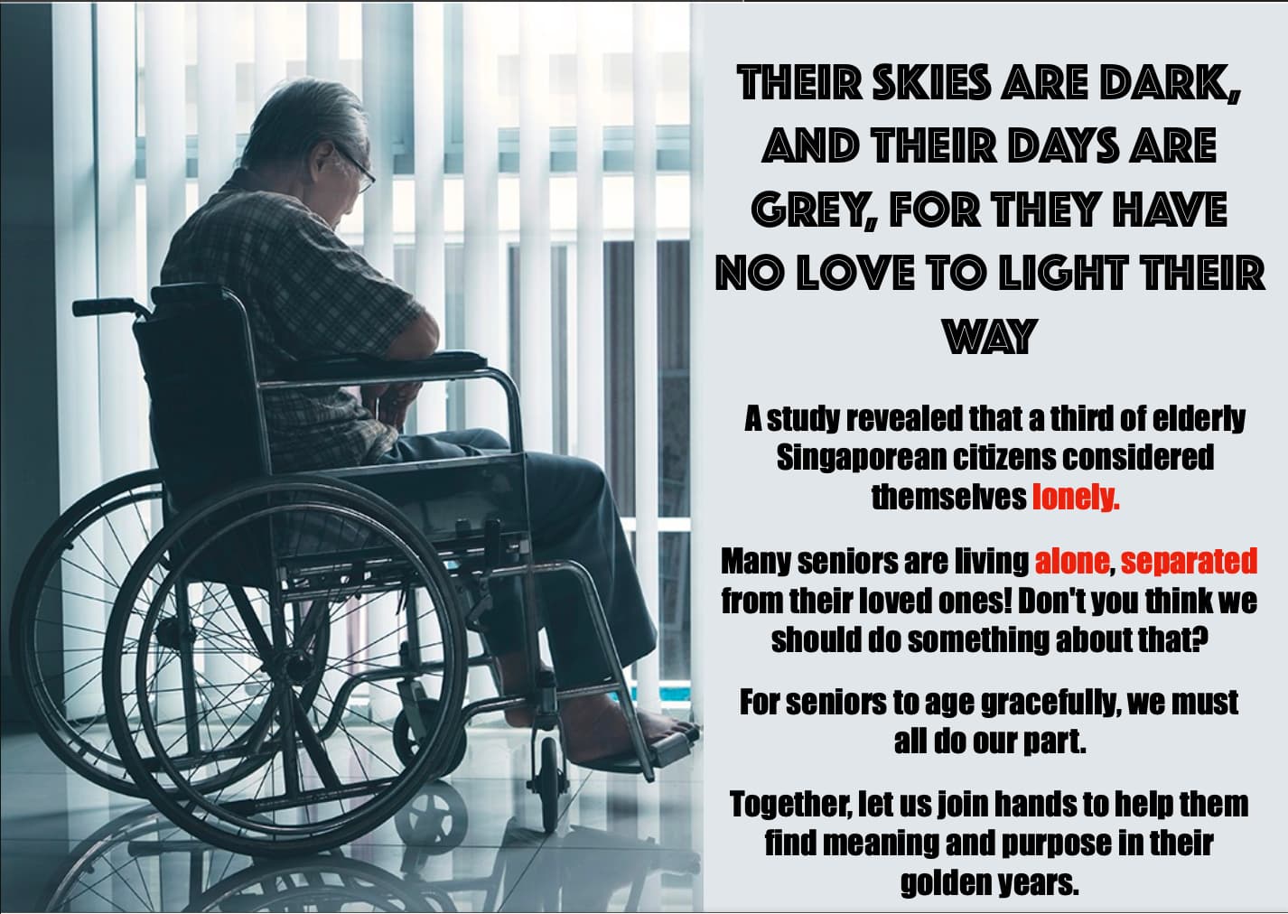
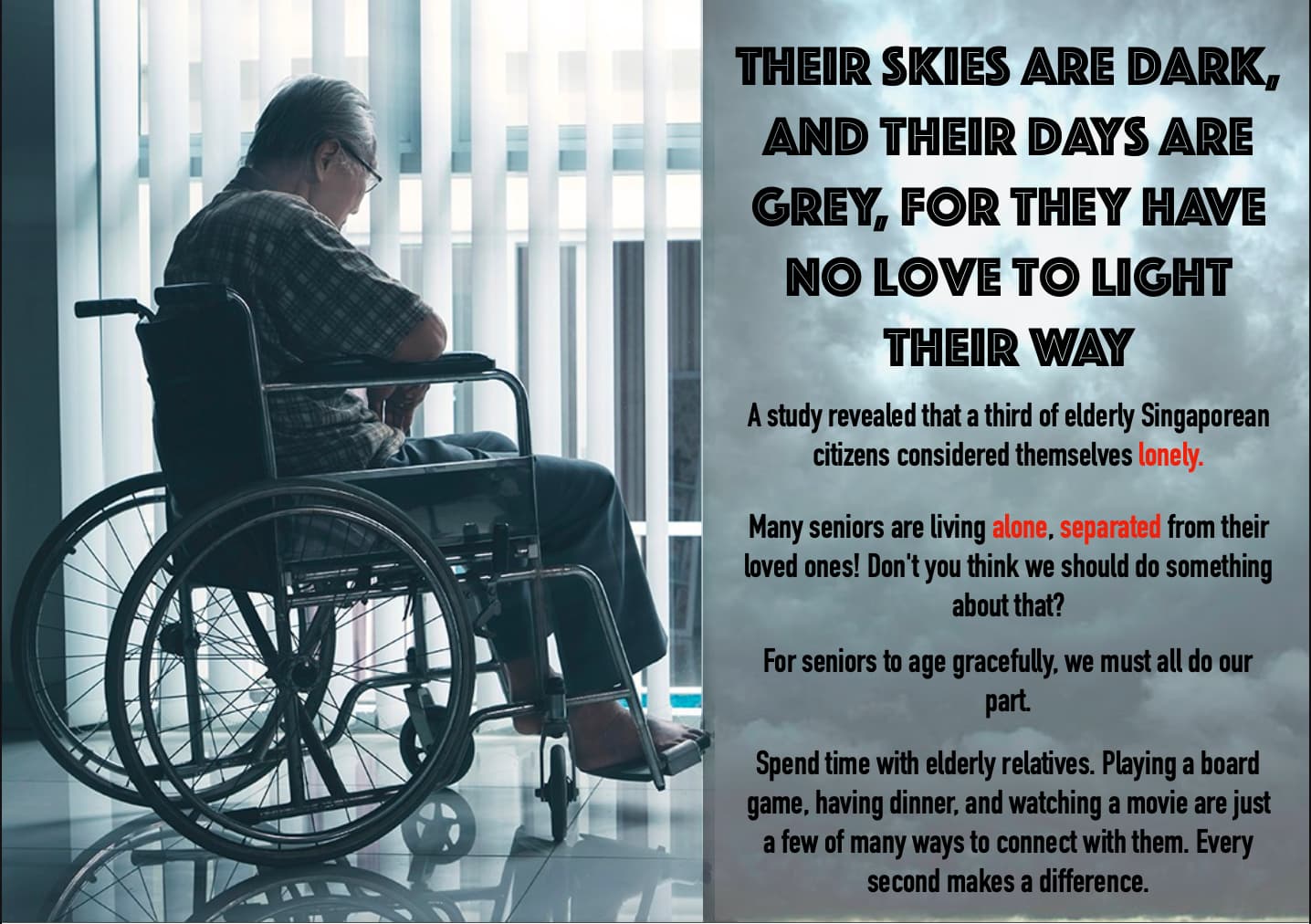
For me the most problematic is that, currently, it feels more like a press ad than a poster. Imagine, you’re late for the bus, preoccupied with your daily life. Would it grab your attention? The picture hits the right tone of abject loneliness, but the headline feels like second tier, drill down text. For me, It is crying out for an attention-grabbing, short, sharp headline to support your idea, that connects the text and image (both physically and conceptually). Something powerful and succinct that makes you want to read on. Something like, Storm Clouds Gather – but better! That was just by way of example, off the top of my head. I am sure you can do a lot better than that with a bit of thought.

At the moment, text and image feel too separated. They need connecting.

The new background you have put behind the text now impacts legibility. I’d either make it lighter, or make the small text on it, white.

Speaking of which, I think there is far too much text for a poster. A poster’s job is to give pertinent information quickly to make people want to find out more. You need to make this last part easy for them to do. If you are running for the bus when you pass it, you are simply not going to read it all. It is all about context. If it’s in a bus shelter, where people do have time to read the small text, they might … but you need to draw their interest enough to want to. Their minds are elsewhere.

You need to work out what you want people to do once you have got them to notice, then read the poster. Then make the poster do it. This is the Call to Action, or, CTA (Steve–O mentioned this already). It is the job the poster has to do. ‘Call this number now’, ‘Find out more’, ‘See how you can help.’, etc, etc. There are thousands of ways to do it, some subtle, some like a wet fish slapped around the face. However, it is done, depends on context and audience, but it needs to be there in some form, otherwise, it is just an information sheet and not working hard for your client.

Overall though, a cracking start. Well done. I’d say you have a burgeoning talent for this sort of thing. You have started with an emotive concept, rather than a more prosaic, pragmatic approach. That is exactly right, given the subject. You need to evoke an emotional response that directly connects to the viewer’s sense of empathy and compassion. Then get them to do something with that emotion.

Stick at it. Good job so far. Well done.

2 Likes

The clouds aren’t really working the way they are. You asked how the make them look better. If it were me, I’d leave the original light gray color in the background, place the storm clouds photo over that light gray, use a blending mode such as darken or multiply on the storm clouds, and then knock the opacity down to 10% or 20%. That way, they’re there to be suggestive and add texture, but not overwhelm the text. With the clouds the way they are right now, it’s a bit heavy handed, and I actually like the plain light gray better.

The type is a little better. You created more contrast with size. I’m not trying to be a jerk here, but it doesn’t come off as professionally set type. Which makes sense since you’re in 7th grade and this is a school assignment.

1 Like

At your age, you won’t know what this means at its true depth, but just to plant a seed in your mind, I’ll say: there is a considerable difference between typing and typesetting.

Your type is surely just typed. Pay more attention than that. Try to look upon bodies of type as graphical elements; notice their shape (justification, line breaks), their “color” (weight, density). Steve characterized your application of the clouds as “heavy handed”. I’d say the same about all the type in your design. Think about how you could refine it, reach for more finesse, a more subtle flavor.

WOW!—This is extrodinary work for a 7th Grader. You have received some good advice from Steve_O and Sprout already. I have little to add except this:

Your headline is a bit “wordy” (too long.) Remember that you only have six seconds to capture someone’s attention. If you do, then they will read your body copy. Maybe something as simple as this:

"One-third of our elderly citizens say they are “Lonely.” It may be you someday. So, do you care?

Then keep your body copy in Present Tense and as short and personal as possible. For example:

Imagine–suffering in silence, alone, and separated from loved ones.
Would you like to be their hero?
Here’s how:
(website/phone/or other contact info here)
(You can reference the Study in small disclaimer type at the bottom.)

Also:
(1) You have already taken Steve_O’s advice to use a simple, standard type face like Helvetica Regular (not Bold). But you used a narrow, condensed version. That’s a mistake. It’s too hard to read quickly. Use Regular face instead.
(2) Do not center body type. Make it Flush Left / Ragged Right instead.
(3) Use a darker background for dramatic effect with white type or white with cyan blue type highlights in harmony with the blue color effect on the photo.

Again, Shnerped, you have an amazing start on this project (I wish I could have done as well at your age!) I know that if you chose advertising/marketing as a career, you will be exceptional at it. I wish you the best of success, Youngling!

1 Like

I have a poster I designed many years ago in 8th grade. Yours is better than mine. :wink:

In addition to what others have said, it might help to provide a sense of hope in the poster. In other words, incorporate some cheerful colors and some optimistic words. The photo is sad, as are the dark clouds you’ve used. This sadness is an essential part of what you’re communicating, but another emotion you want to communicate is that of hope and how you, the reader, can bring joy to other people’s lives.

You might try experimenting with different semi-profile angles on the figure in the wheelchair, /but leave the head at the same angle. .

Two year old thread!