Hello, I am creating an ad for a couple of restaurant/bars on the island I live on. The ad will go in hotel brochures on the mainland given to tourists with their room key. The objective is to bring tourists to the island and get them to visit both locations (double sale). I was given the images and know the photoshop job is bad (just real rough until I get the OK to purchase stock images).Pic is just a screenshot from InDesign. I’m new to design, and am still in school so I need all the help I can get to improve. Thanks to all who reply.
Seeing as you are still learning and still in school, I am moving this out of the Crit Pit to the Student forum. This way no one will assume you are freelancing ![]()
1 Like
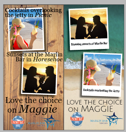
The photos are competing with each other. 1 or the other should be dominant.
The text on top of the photos hinder readability, especially if the background is somewhat dark and the text is thin.
The text and logos are too close to the edge of the page. The photos don’t need to be so close to the edge either. You can have the photos bleed off if you want to make them bigger without looking crowded.
Your original post about the 2 disparate images did pose a problem, but now you’ve used each one twice, which effectively only compounds the problem, rather than devising a solution.
Your proposal really has no concept; no focal point, and no cohesive message about either location. Of course I’m no expert when it comes to Magnetic Island and its trade atmosphere, but I did have a quick look at a map, and while it’s true that these 2 destinations are not far apart, I don’t see much sense in wedging them both into a single ad. In fact, you’d have much more freedom in designing a proper ad for each of them individually, and as a designer of such communications, it’s a big part of your job to steer the client toward the best possible solutions.
If you are indeed forced to formulate a single ad for both of them, you need to find something that plays the two locations (which appear to be in the same business, perhaps competing in some ways) for and against each other. A map stylistically showing their locations and some form of differentiation between the North and South shores of the island, for instance, might give you something that pivots the potential visitor toward one or the other. Such as this is, you’ve only forced the two to stand side-by-side, offered very little in the way of motivation to visit either one, and then doubled the failures. You can do a lot better.
1 Like
First recommendation I’d make is download comps of the images you’d like to use. Most, if not all, stock sites allow you to download a watermarked image. This helps your viewer see what you’re trying to accomplish. You need to also lock down a photo display style. Are you going to feature them like polaroids or simply outline them?
You’ll want to make your text more dynamic but you have to see how it will fall over the photos you chose if you want to keep that particular effect. In my experience, having text over a photo works better with larger photos. The less interesting the area is behind the text the easier it will be to read.
I see you went with the Polaroid idea I suggested.
The right image with the beach is better for the colors and type.
I would thicken up the weight of the type.
You could always overlay the Polaroids, and make one of the images smaller than the other.
Good Progress