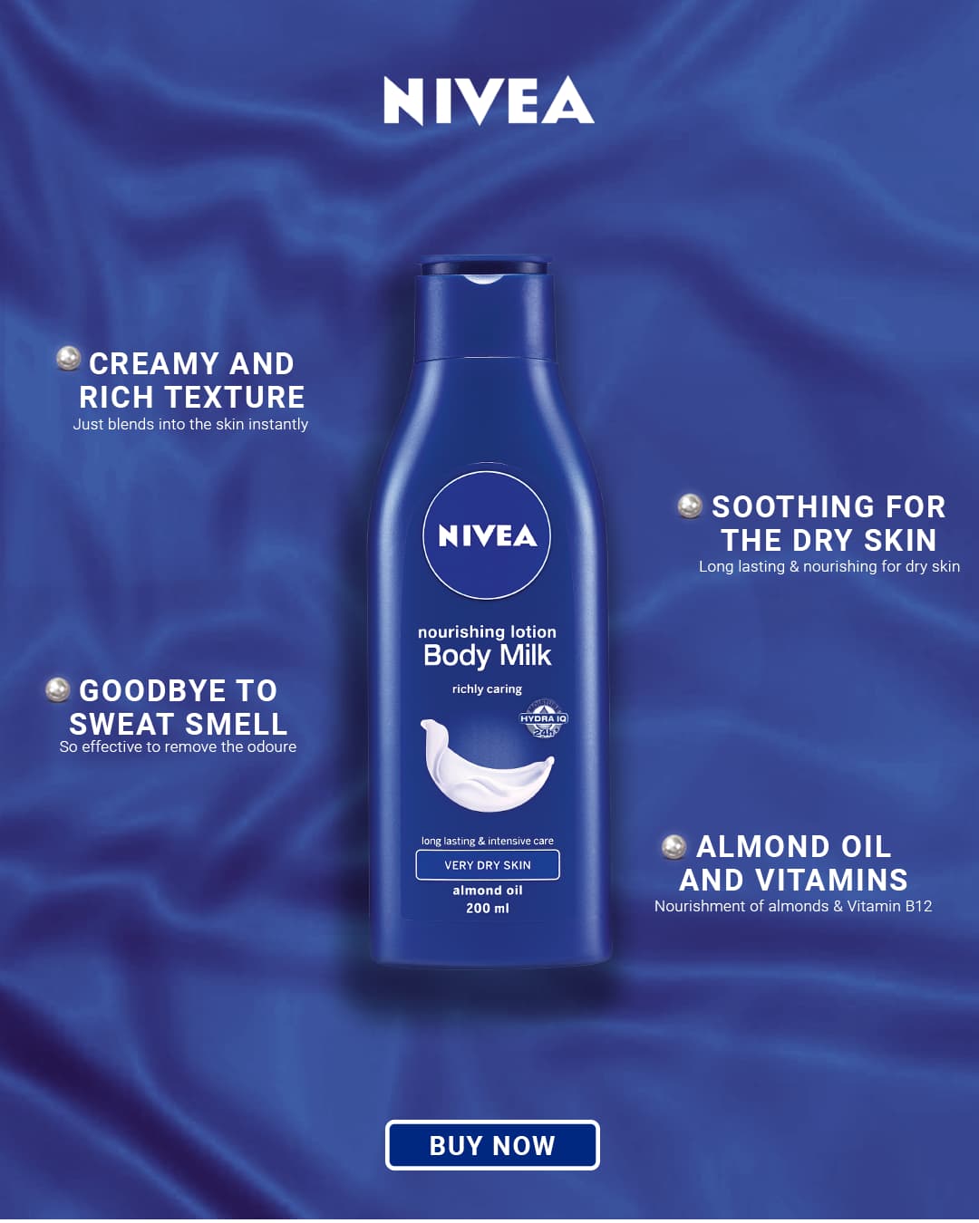
It is a practice poster with a fake brief, please tell me what do you think about the design and the areas I need to work upon, the brief was
Create an eye-catching and informative poster for Nivea’s nourishing lotion Body Milk, emphasizing its key benefits for very dry skin. The poster should maintain Nivea’s brand identity, using the signature deep blue color and clear, readable text.
What do you mean by a poster? I’m assuming it’s a social media ad and not a traditional poster since it contains a “Buy Now” button. Why is there an unidentifiable icon before each of the items?
If it were me, I’d make the product and the name of the project larger since that’s what’s being advertised. For that matter, the tiny lines of text are nearly too small to read at the size you posted it. After blowing it up to read, the writing needs improvement. There’s even a spelling mistake.
I do like the blue on blue, however. It’s a good start, but a few refinements will make it better.
I like the “bullet points,” but I would improve the alignment by making them consistently aligned to the right of the bullet point and also in a straight line with each other. I would also remove the small text underneath each one.