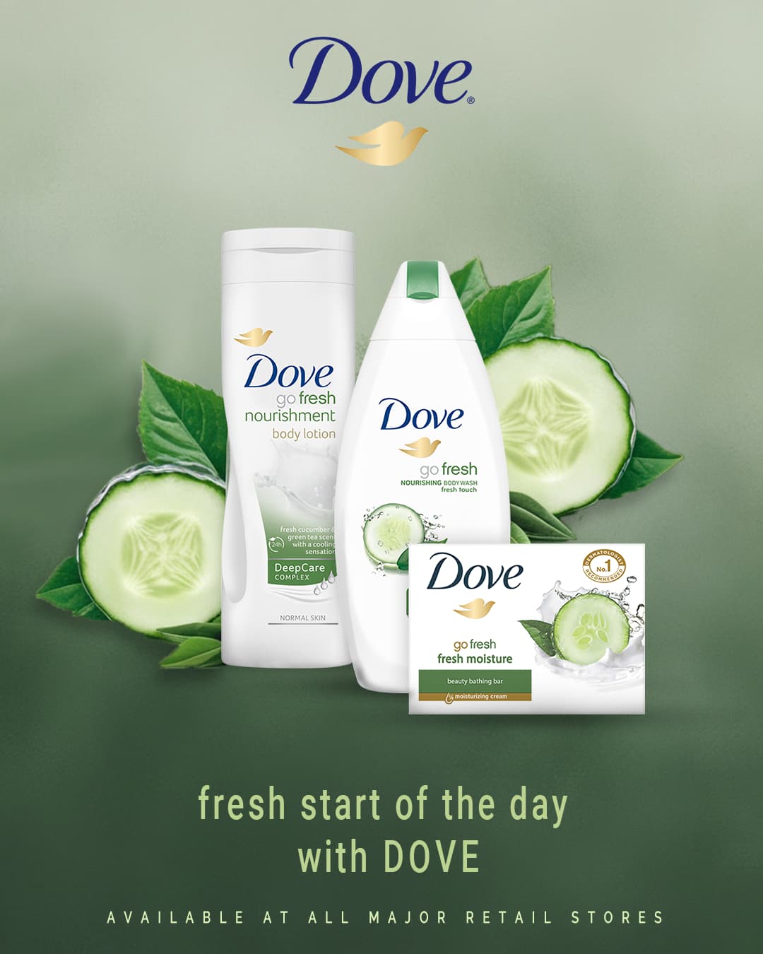
Hello I have created a practice social media post for the dove cucumber products, please take a look
Social media post?
Who is posting it?
and who is looking at it?
Does it fit on a phone screen?
The copy is sort of grammatically incorrect. “Start the Day Fresh” with Dove might work, but I’m pretty sure that is a tagline for a different product.
Just thinking of the brand itself, I wonder if Dove would allow their logo to be put on a green background? It usually seems to be blue on white or white on blue.
The product imagery is nice, but the “poster” design has problems. Did you do both, or did you borrow the product image from somewhere else?
The Dove bird logo blends into the background since it has nearly the same value as the background. Placing the Dove logo and wordmark at the top of the poster isn’t warranted since the logo already appears numerous times in the image. Even if it were warranted, it looks out of place.
The grammar and capitalization wouldn’t pass muster with a copy editor. There’s no need to tell people where to buy soap—they already know. In addition, Dove soap isn’t available at “all” major retail stores—it’s generally available only in retail stores that sell grocery items.
Your choice of a typeface doesn’t work. Its personality doesn’t match the brand’s personality or the typeface the brand uses.
The general look of the poster is nice at first glance, but the problems with the details I’ve mentioned really stand out at second glance.
