I made this logo for street wear at school
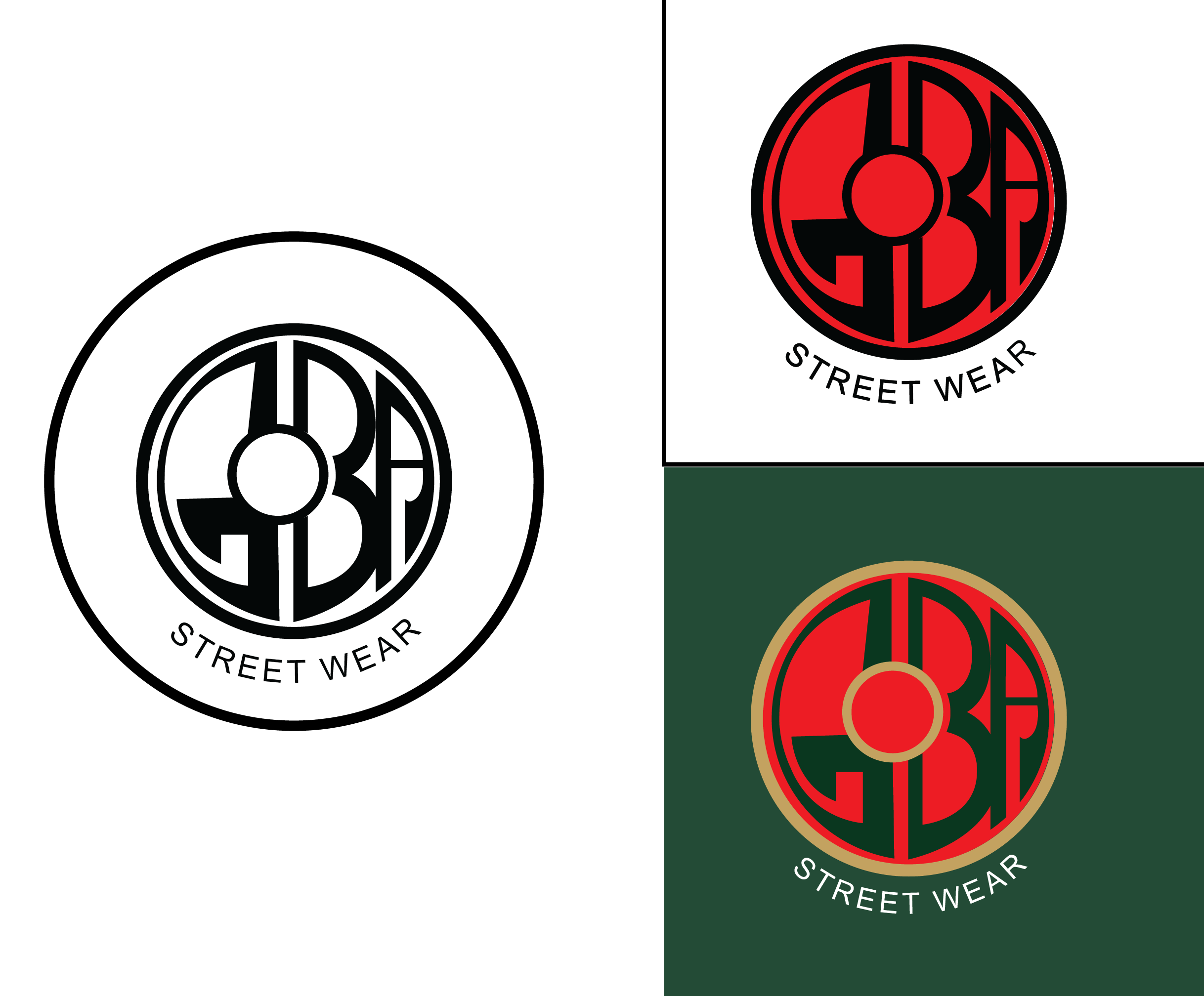
if u want me to critiique among these three.. i would say the third one(the one with red and green) is good…but it really depends on wat kind of mood ur achieveing for ur brand …without understanding the branding strategy of the brand its futile in judging the logo…but in terms of the color and style u hav used i believe its a bold design for a brand which projects itself as an unique ,un conventional brand! the red and green combination and the irregular shapes shows boldness.. … but the style u hav used does not fit if the brand is a cliche conventional brand …as the logo does not follow the stereotyping design trends …instead it appears u have broken the rules to achieve this (or not ![]() ) …
) …
1 Like
Thank you for critiquing, I just started graphic design and I was tasked with doing a logo of my choice. I had this idea and I decided to make it around a street wear brand
again its about proportions and other design elements … how u co play with them… read about “gestalt theory” ..its very usefull… the above logo uve designed still has many mistakes… like balance is missing …and bringing..smilarity in negative space.. and the colour is pungative .for a logo design!!..but u can also project them as a bold rule breaking design too… its about wat u try to showcase!!
2 Likes
Those letters forced into the circle feel uncomfortable to me. Also, I don’t get the concept in general. Is this a skateboard wheel? I would start over with a good idea.
2 Likes
Thank you very much. You have helped me a lot I’ll read about the theory you suggest
1 Like
I’ve moved this thread into the Student Forum so you’ll get more appropriate feedback.
2 Likes