What is it?
Hi @PrintDriver I’m beginner in graphic designing. Just learned how to use photoshop so i tried to make this
Graphic Design is a communication medium.
What is this communicating?
What is the call to action?
Who is the target audience?
Who is the client?
Those are just the beginning questions before we can even give any kind of feedback.
Realizing this is probably a self-directed exercise, you can ask yourself these questions and provide answers to give yourself a working brief.
Also…photoshop is an image editing/creation tool. It is (generally) NOT a layout program. While exceptions exist, Poster/Advertisement creation is not one of them.
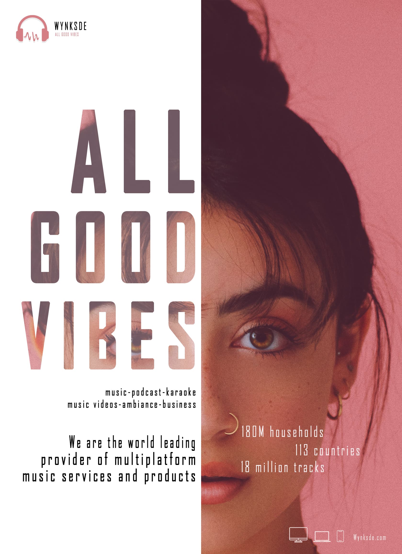
If this is meant for phone viewing, I can barely read the type on my 27" monitor.
I’m not sure what her connection is to the product. It might make more sense if she was wearing headphones.
Can’t make out that url.
Hi surbhi,
I agree with Mojo. How is she connected to the brand?
Also I find the white panel too harsh, I find myself straining to read the content. Have you tried another colour on this panel?
In addition to the things others have said, which, I whole-heartedly agree with, you really need to make sure the copy is proof-read too.
For example, the sentence at the bottom, needs to read, either, ‘We are the world’s leading…’ and make it a possessive or, ‘We are the world-leading…’ and make a compound. As it stands, it reads that you are the world and you are leading the provider – and for even that to make sense, it’s missing the article.
Further on in that sentence, multiplatform needs a hyphen to make it compound, ie, multi-platform.
These are seemingly ittle things, I know, but they all make a difference to polish and credibility of the product. Poor grammar and syntax just scream, ‘We don’t care enough’
The first thing I’ll say is that it looks nice, and that’s an important first step that shows talent.
However, the problems are in the details.
For example, why is each line in the headline a different point size?
There seems to be no particular point to the ad — only a declaration that this company (whose name isn’t even mentioned except in tiny type) is a world leader. Who is this ad directed at? What is its goal?
There’s too much emphasis on the woman’s hair. The eyes should probably be centered vertically.
I’m not even sure what the woman has to do with the ad. As Mojo said, if she wore headphones, her presence would be relevant, but as it is, she’s just a gratuitous, pretty face.
The typeface you’ve chosen isn’t very legible in smaller sizes.
As I said, the ad looks great, but what is it meant to achieve, and how does it further that goal? It isn’t enough for graphic design to look good; it must also help solve a problem for the client. However, what that problem might be is not obvious.
Hello @Mojo got your point thanks for reviewing
hi @TazzieCreator no i have not tried any other color panel i will surely try
hi @sprout i will look for grammar things too
hi @Just-B Thanks for reviewing i will change the font. Actually i am facing alot issue in selecting the font but i will figure it out
Thanks to all for reviewing
I agree with Just-B. One primary rule is to never use a typeface that is intended for headlines as body type. Chose a more readable typeface for body copy.