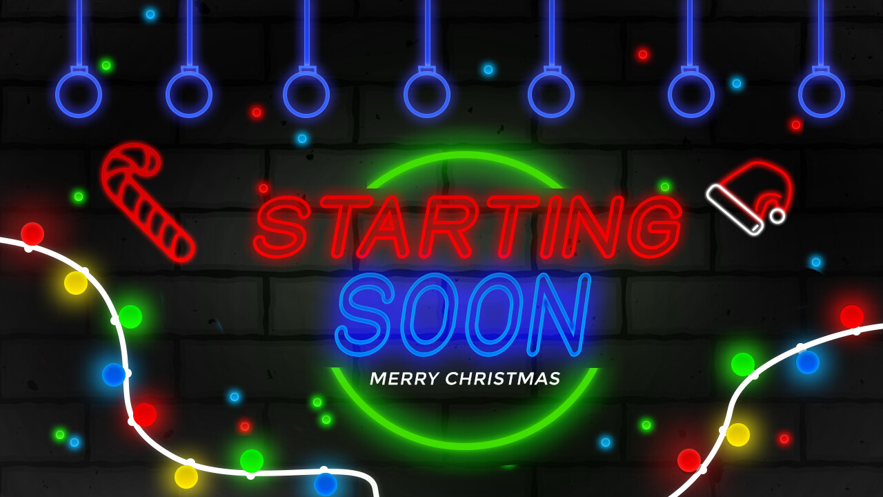
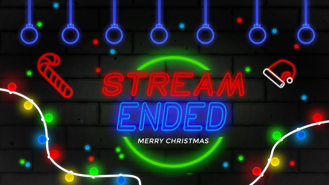
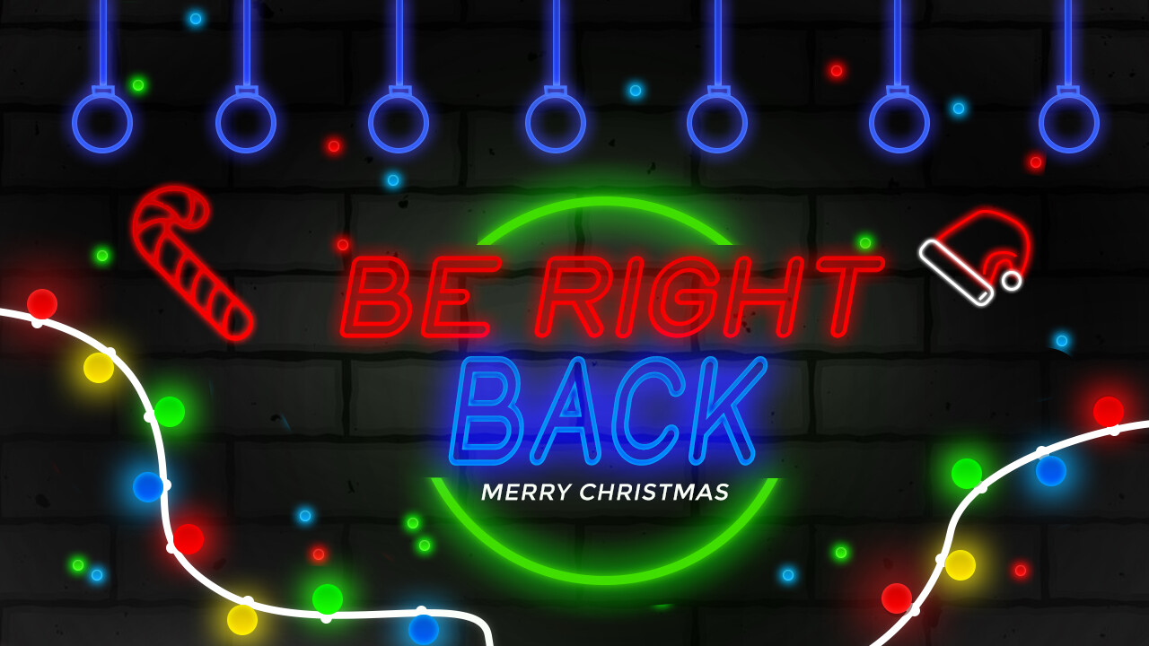
I have done 3 screens for youtube and twitch streamers The end screen, the start screen, and be right back screen. I am a beginner, but I want from u guys constructive criticism.
I removed your duplicate post since we don’t allow those here. Sorry.
You mentioned being a beginner, so the advice might not be what you are expecting. I’m not all that sure you completely understand what graphic design is, which is why I suspect others have been hesitant to respond.
It seems you might be asking us to judge how good your work looks, but as important as looks might be, more important in graphic design is whether or not the design solves the problem at hand.
You’ve made what might be called bookends, but whether or not these bookends are stylistically coherent with and complement the video content that goes between them is essential to judging whether or not you’ve solved the problem and not just made some fancy graphics.
Does the Christmas-themed, neon look fit the video of what’s being streamed? You haven’t given us any clues about that, which makes what you’ve done difficult to judge. For example, they’re awfully busy and might draw attention away from the videos or obscure the message they’re meant to convey. They all look roughly the same, so people might miss the words changing and assume that once they’ve seen the first one, any new words on subsequent screens are the same and consequently don’t read them. It’s as though your first concern here was making something artsy instead of something functional that serves its purpose and also looks nice. In other words, the message might get lost in all the decoration.
There’s a maxim in design that form should follow function. This isn’t a hard and fast rule, but it means that most designs, first, need to accomplish the function they are meant to perform and, second, should look good while doing so. It seems you might have reversed the order of those concerns and given far more thought to the decorations than you have in thinking through how well they serve their purpose.
1 Like
Thanks for your opinion, so if for example, I will change the upper lights for three other colors did this change a lot? But there Is one more thing I will do an animation for that the text is gonna Go out slightly and then light up. And there is no reason to apologize that u had removed my duplicate this is rules and that’s normal I have to apologize to you for making a duplicate. Sorry ![]()
The most important thing on these screens is the text. Communicating a message is the main reason they even need to exist. Concentrate on making the words the dominant element on the screens and relegate the decoration to background setting status. There needs to be hierarchy and sitting on top of that hierarchy is the message. Make sure that stands out more than anything. Pulsating the neon text like you mentioned would help do just that, which is definitely a step in the right direction.
Okay and is it a good idea To make light pulsating too, for example on the right downside the lights are too up gonna turn off and then lights to the down gonna turn on??
I think you may have missed the most important point of B’s post. It is extremely good advice, yet both of your responses have focussed on tinkering with what is already there.
I am sure you are invested in, and have spent a lot of time on your images, but sometimes we need to take a step back and re-evaluate.
What is the real purpose of them – as opposed to what they are? Do they add anything? If, for example, they were part of the over-arching brand for a channel that aired the individual programmes for a TV company and were being used as a seasonal brand awareness campaign, then I could see a reason. Just to add on to either end of disparate videos, they become redundant if, as B says, they bear no relation to the video itself. They just become eye candy, at best, or perhaps even just irrelevant visual noise you’d want to skip.
Why are you doing them? Is it for an actual job? Is it for you to learn? If the latter, it would be far better to spend the time learning what design is before learning how to do it. If the former, what was the brief?
On a more practical level, although not the worst thing I’ve seen (they are colourful, at least, if a little basic, which is not a criticism, as I am assuming you are pretty new to the game ), the type needs a lot of work, in terms of legibility and the kerning is very poor. Also, it is never a good idea to machine-condense or expand type, i.e., horizontally scale it. Far better to use a font with a condensed or expanded version.
I hope this isn’t all too off-putting. It’s not intended to be an assassination. More a nudge in the right direction.
Ok, thanks for giving feedback, but this is not for some tv-shows that is just for youtube streamers that play games. But thanks for ur time I catch a few things from ur opinion and I gonna ad Them to my life ![]()
I think as a beginner you have done great. Yes it is true that you have made something which is not what we call a graphic work. The theme that you have made is good as the background and the fonts are separated by mean of light and the fonts are glowing and you have managed to keep the background dull so that the upper fonts glow more brightly. Not bad as a beginner.