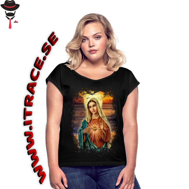
Hi folks, please give me feedback on my design at spreadshirt, visit my webshop! Thanks!
Well, two things.
The web address was very awkwardly placed, and is hard to read.
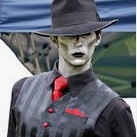
That little gap between the bend of the right arm and the waist of the woman. It screams “Eye for details!”.
Otherwise, it’s fine.
thanks man i appreciate your comment, the URL is for marketing purposes only.
Is it just the T-shirt we’re to look at? Or the whole piece?
If it’s the piece in its entirety I must agree with changing the typesetting and perhaps filling up more of the available space. When it comes to an add, use the space you have, and make the product and the means to get to product as prominent as possible.
As for the shirt, it looks like an image found on the web with a photoshop filter applied to it. Not much more to say.
That’s the very kind of imagery I’d avoid placing on a dark t-shirt. It’s not the subject matter (even though it’s not for me), but the continuous tone image on black fabric that’s the problem.
I haven’t looked at SpreadShirt’s specs for awhile, but typically this kind of thing requires laying down an opaque layer of white ink, then digitally printing the continuous tone image on top of that. You’ve made it even more problematic with the irregular edge where trapping and near-perfect registration would be required between the image on top and the white layer beneath it.
It’s doable, but you’ve thrown most everything into the mix that might cause quality problems. It’ll likely also be a short-lived shirt once the image begins to deteriorate, fade and the white backing begins to show though.
Printing on fabric always works best when the possibilities, limitations and difficulties of working with the medium are considered then taken advantage of where appropriate and avoided when they’re not.
As for the URL out to the side, you might not have been asking about it, but it’s definitely atrocious typography. Bevels, shadows, distortion and compromised legibility are all the hallmarks of beginner typography. Really, no kidding, don’t do those things with type thinking it makes it somehow better — it doesn’t.
Thanks man i appreciate your comment.
Thanks man i appreciate your comment.
Did you have a choice in your girl model selection? That girl so looks like she doesn’t want to be there. Kind of a “just take the picture I got better things to do” look. Not very engaging. Also quite often with T-shirt art, a model isn’t used. Human eyes draw human eyes. People will look at her face first, not your art.
And…
Haha, are you guys related?