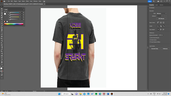
I am afraid it is impossible to critique without context. What was your brief?
All I can say at the moment is that it is yellow and purple, the type is pretty illegible and it is not centred on the shirt. I have no idea what the point is, other than you like Kobe Bryant (it took me a few seconds to work out it was his name).
The colours you gave used are RGB. If you printed that, the purple would not be quite so vibrant and would become more lost against the black, thus decreasing visibility – thus legibility – even further.
