Your logo will often be the first thing people see when doing research. Do you really want that first impression of potential customers tainted by something of lower quality than the quality of your resurfacing work?
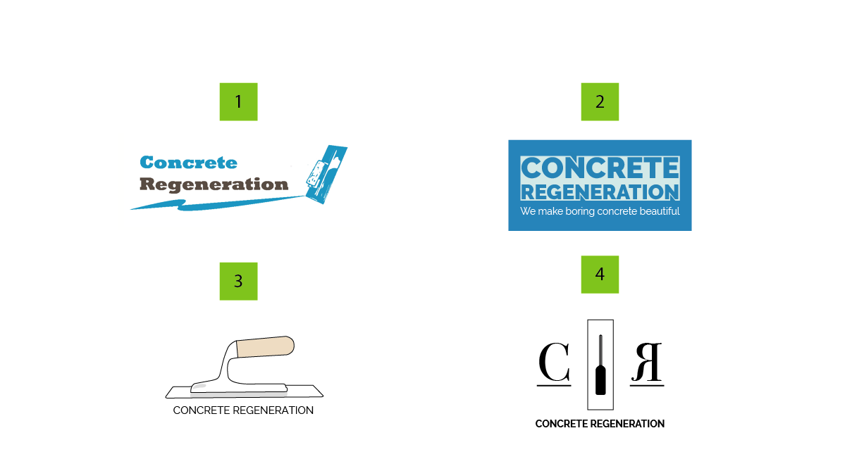
Anyway, logos 1 and 3 are quite weak. If it were me, I’d abandon them.
Logo 4 is marginally stronger, but it has a slight trendy hipster look to it that doesn’t have the personality of a company that works with something like concrete.
Logo 2, in my opinion, is the strongest. It’s not especially creative, but it looks solid, strong and befitting concrete. For a company that decorates concrete surfaces, however, it really would be nice to have more of an artistic flair, which isn’t really there.
My first recommendation is to hire a designer, but setting that aside, I’ll suggest removing the outer, dark blue box. You don’t need a box inside a box. After removing that outside box, I’d color the box around the letters dark blue (actually, I’d suggest you replace that blue with an earth tone), with the enclosed type colored white. I’ll also suggest adding a little more space between the letters and the edge of the box (type needs room to breathe). The little notches on the Ns are nice and give it a little personality.
I think the tagline beneath could also be the same color as the box. I’d also remove the word “boring” from the tagline. Everyone already knows that concrete can be boring, so there’s not reason to call it that and have a negative word in the tagline. Instead, just say, “We make concrete beautiful.”
These things, I think, will improve it. I still think you deserve better, though, but better probably means hiring a professional.