Hi, I just learnt some basic tools In making logos so decided to task myself with my personal logo, as a graphic designer of course and I would like your feedback on it.
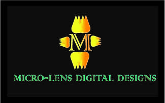
I know there are people more experienced then I that will also advise you, but there are a couple of visuals that really don’t work for me. The name at the bottom, that font just doesn’t work very well, it’s a little hard on the eyes to read, I’d advise going with a font that is more easily readable. Would you mind explaining the top portion, as it doesn’t really make sense or go with the name?
The top onion and the bottom onion are not lined up. Same for the left and right onions. Together it looks like a scarecrow.
They are also too close to the M. I agree that the font choice for the word mark has legibility issues. Overall this feels very dated and not well proportioned.
I do think the font for the M is interesting. The name doesn’t exactly make sense to me. If it’s your personal logo can you provide some more context? That might help.
Thanks for the feedback, I’ll make some adjustments on the spacing and the fonts, and post it again, but please if there are some other things i need to change just let me know
And also for the name, it’s still an issue for me I’m still trying to figure It out but I’m just focused on the logo and my abilities
The logo has a retro feel it, which isn’t good, as is communicates the wrong message to your potential clients.
I can only guess this is the first logo you’ve created and you may have learned the software — so much that you were excited and jumped right into designing a logo.
I’m not sure if you can control the name, if it is your own personal logo surely you can do that? If so, you may want to simplify the name before attaching any iconography with it. If you can’t change the name, I’d guess this was a logo for a crowd sourcing site.
However, take a step back and step away from the computer and any digital tools. Grab a pen or paper and just start sketching. Sketch through your ideas close your sketch book or pad of paper and sleep on it. Wake up and sketch some more — don’t forget taking a break and coming back to an idea is an effective solution to figuring out the problems with your logo.
Try only using one font (one weight) and one color.
Take your favorite idea and put it up on a walk and walk back 5 meters, 10 meters, 25 meters and see if any details are still recognizable. A logo should be able to scale and work well in many situations, ask yourself “Can my current logo do that?”
2 Likes